7 MIN READ
•
Design
How is the rule of thirds used in design?


Design can feel overwhelming when you sit down staring at a blank page, not knowing where to start. Thankfully, there's a simple rule that once you learn it, you'll never forget it.
Consider the rule of thirds the 80/20 of quickly crafting a beautifully designed layout.
What is the rule of thirds?
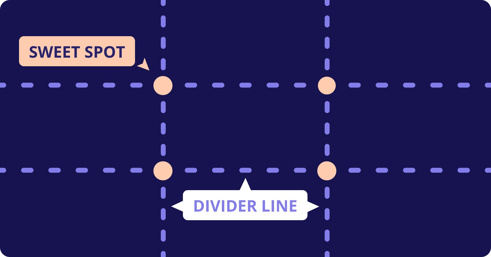
Simply, the rule of thirds divides up a frame or a canvas into nine equal parts. The lines and intersections create a mathematical grid for you to design visually interesting layouts from.
It's so simple in its effect, it can be taken for granted. But if you look at many well-designed book covers, Netflix thumbnails, or large billboards, it is consistently used across mediums.
The rule of thirds grid is based on our field of vision, and the rule is a guideline for placing key elements in popular paths where our eyes travel. Using this to our advantage, we can create a main focal point that our eyes are innately trained to focus on.
Here's a simple illustration of the rule of thirds grid. The two things to remember are the four sweet spots (or four intersections), and the four divider lines making up the grid. You're left with nine quadrants that divide up your canvas, giving you a simple structure to work with.
How the rule of thirds in graphic design is counterintuitive
Many non-designers and junior designers think great design lies in perfect symmetry. If everything looks and feels symmetrical, it must look good! But it's just not true.
In reality, we're naturally drawn to contrasting elements. Imperfectly designed elements that ooze depth, layering, and uniqueness.
The rule of thirds is deceptively simple in allowing us to create asymmetrically beautiful layouts. If you were to hang a picture frame perfectly centered on a living room wall, it would look too low. This is why we anchor a frame higher than we normally would think, so our eyes are able to gaze into the center of the art, and raise our eyes off of the floor. The art plays to the room's height, giving it a sense of balance.
The same thing happens when we use the rule of thirds in our design. Our eyes need help in knowing what to look at first, and the rule of thirds helps us naturally create a sense of visual hierarchy that opposes the tendency to center everything perfectly.
How to use the rule of thirds grid in your design
Creating the grid
To create the rule of thirds grid, draw out three evenly spaced vertical and horizontal lines. You'll end up with three columns and three rows, and four intersecting points.
This grid can be created easily in most design software, or by turning on grid view in your camera settings. Even the iPhone allows you to turn on a grid (Settings > Camera > Composition > Grid), which is based on the rule of thirds.
You’re welcome. You now have a rule of thirds grid to use.
Find your main elements
The human eye is the fastest muscle in the human body, which is where the phrase, "In the blink of an eye" comes from. It can focus on 50 different objects every second. Our eyes are constantly scanning, and processing information, and are designed to keep us safe.
So, it's difficult to design with the expectation that someone will find what we want them to see, without us having a hand in that. This is where the rule of thirds grid comes into play.
When you read a book, look at art, or watch a movie, our eyes are constantly moving around looking for elements to lock on to. We can help give visual priority to the field of view.
The first step before applying the grid in your work is to think about the focus of your design or artwork. Ask yourself, "What's the most important element someone should look at first?"
Every element that you decide to include in your design needs attention. It's up to you to pick the most important one, and align it to the grid, giving it the ability to shout louder than everything else.
If you have 10 elements on your page, rank them in order of priority. You can't have 10 elements with priority, so pick the most important one.
If you're taking a picture of a landscape, just pick one element in the field of view to use as your focal point. Like that beautiful snow-capped peak of Mount Fuji in Japan, or the lone farmhouse in the vast prairie somewhere in Montana.
The four sweet spots of the rule of thirds grid
This is a good time to talk about the specifics of the grid. The grid works because it creates a natural flow between elements. In design, we know that spacing is everything. Well, by adhering to the grid, it invokes natural spacing that lets the eye dance between elements more easily.
Now that you have your first element, we want to align it to one of the four sweet spots of the grid. The sweet spots are the four intersections you'll see after drawing the grid. They anchor an element slightly off-center, giving it a pleasant asymmetrical layout.
Each of these sweet spots can be used in your graphic design work, but limiting the use of them is how you strengthen the tension of a piece. The area surrounding the key elements works to create more focus.
Start by choosing just one sweet spot, and anchor your design to that.
Use the divider lines of the grid to structure your design elements
The rule of thirds can be used in various ways in graphic design. It can be used in web design to place a button at a critical spot on your landing page, key information about an event on a poster, or by pairing text with an image in a thumbnail.
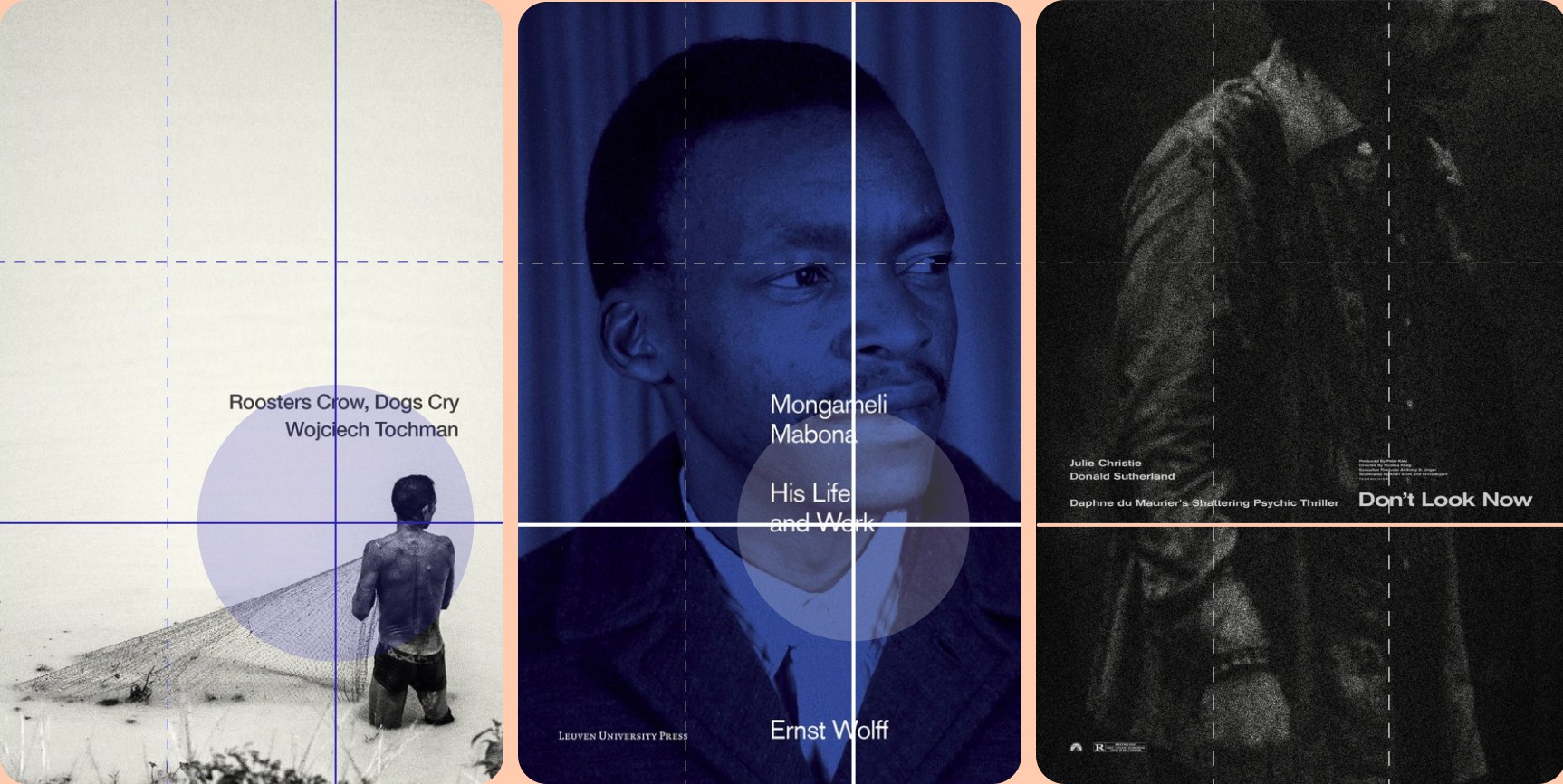
While there are four sweet spots to use to your advantage, you can also use the divider lines to anchor content. Book covers are a great example of how divider lines are incorporated into graphic design and the rule of thirds.
Creating visually stunning layouts
Since the grid is divided into nine equal parts, you have two vertical and two horizontal dividers to use in your design. Aligning content to these lines creates an asymmetric look, which drives up the visual intrigue of a piece.
Most book covers need to draw our attention by balancing design elements like the title, the author, a short description, and artwork. By putting these all on the page, they're competing for our attention.
Using the top horizontal line, we can create a visual balance that increases the visual flow between key elements, helping our eyes know what to focus on first, second, and third, without jumping chaotically around the page.
The lower horizontal line can also act as a sturdy anchor point and creating an interesting composition.
Use the rule to create visual interest
To create visual interest, you need to use visual contrast. Contrast draws our eyes in, creating tension between objects. Sometimes it can be between the foreground and the background, or between typography and shapes.
Using the rule of thirds lays the foundation for making better design decisions.
Advanced tips for using the rule of thirds grid
Using the rule of thirds in design is easy to get started with. I have it enabled on my iPhone's camera so I use it daily. But once you've nailed how to use it consistently, what are some ways we can push the rule even further?
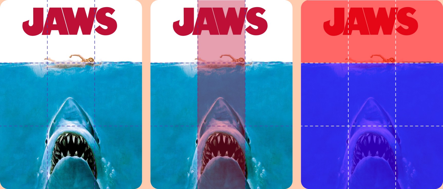
Using just the columns in your design
Normally when using the rule of thirds grid, you rely on the sweet spots or the divider lines to align your subject. Instead, you can use the columns to bring attention to certain elements in your design.
Note how the designer of the classic cover artwork of the movie Jaws used the central column to bring focus on the shark as well as the swimmer. The negative space in both the left and right columns is empty, creating tension between the two. There's nothing in either the bottom left or the bottom right thirds, bringing the viewer's eye straight to the center.
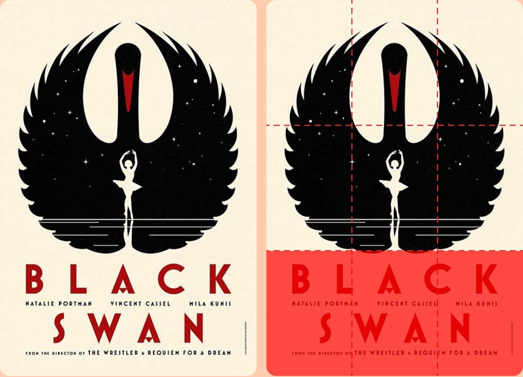
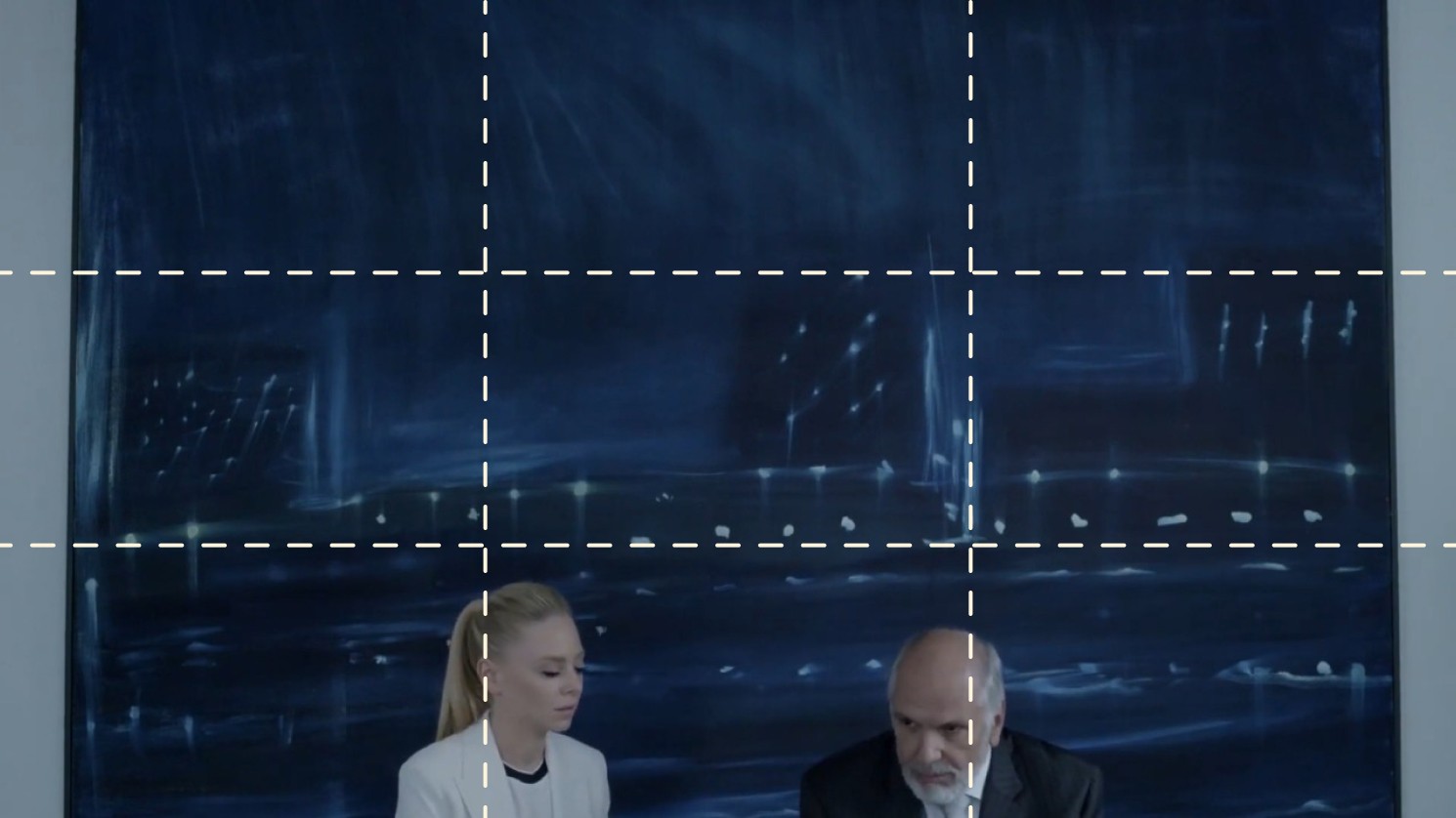
Using the row of thirds
Breaking away from the rule of thirds, let's apply the rule in a counterintuitive way. Just like we did using columns, another way to break the rule of thirds grid is to focus on using the rows.
By narrowing in on the rows of our design, we can use negative space to achieve a sense of balance between the grid lines.
Note how the Black Swan title spans between the bottom left and bottom right quadrants to grab our attention, while the top two-thirds are used for just the art. This is a common way to divide up your design and create contrast between the sections.
Use negative space to your advantage
It's not easy wanting to fill the white space in our designs. As a designer, even I have to constantly have to remind myself that I don't actually need to put a chair in the empty corner of my room. White space is a useful tool to increase contrast in our designs.
Another way to break the rule of thirds grid is to push things to the extreme, increasing the white space around the subject.
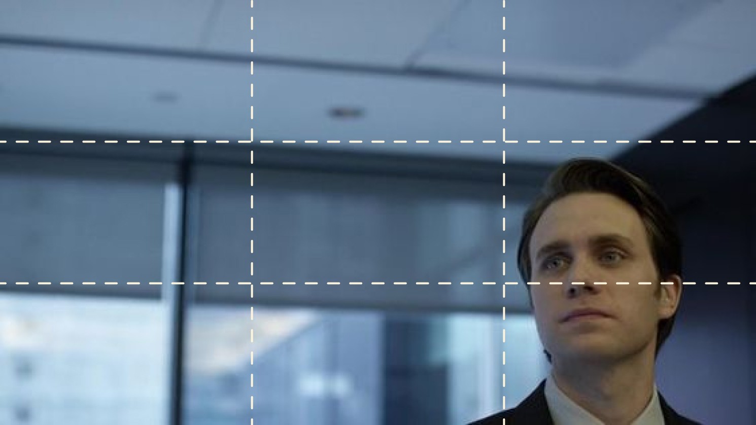
The Golden Globe Award winning show Mr. Robot does this consistently in many of its shots. By placing the subject in the bottom left or the bottom right, the intensity increases the closer to the edge of the frame they are.
By pushing past the grid lines, you'll add a distinct look to your piece that is unconventional, immediately creating intrigue.
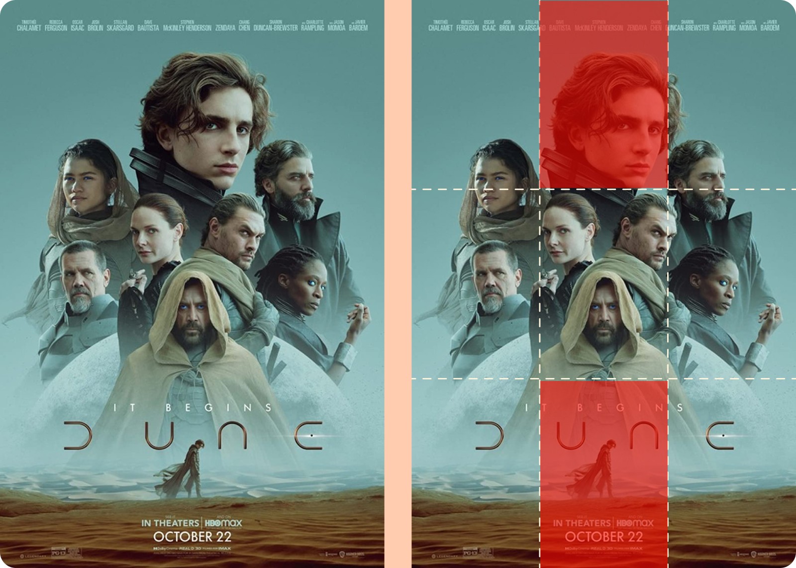
Use opposing quadrants to increase contrast
Another unique way to use the rule of thirds is to use opposing quadrants to draw your eye in intentionally. You don’t want to draw focus on two areas sitting side by side, since it reduces the amount of flow and eye travel.
But by creating focus in spaces opposing one another, you can introduce drama or tension in your design.
You can see how this work in the Dune example. In both the top and bottom quadrants of the rule of thirds grid, Paul Atreides is shown as the largest (in scale) subject of the cover, and the smallest. He is at opposing ends vertically and uses in just the center column.
It creates a very dynamic and intriguing layout, based on this emotional tension.
Four unique examples of the rule of thirds in design
Using the rule of thirds in web design
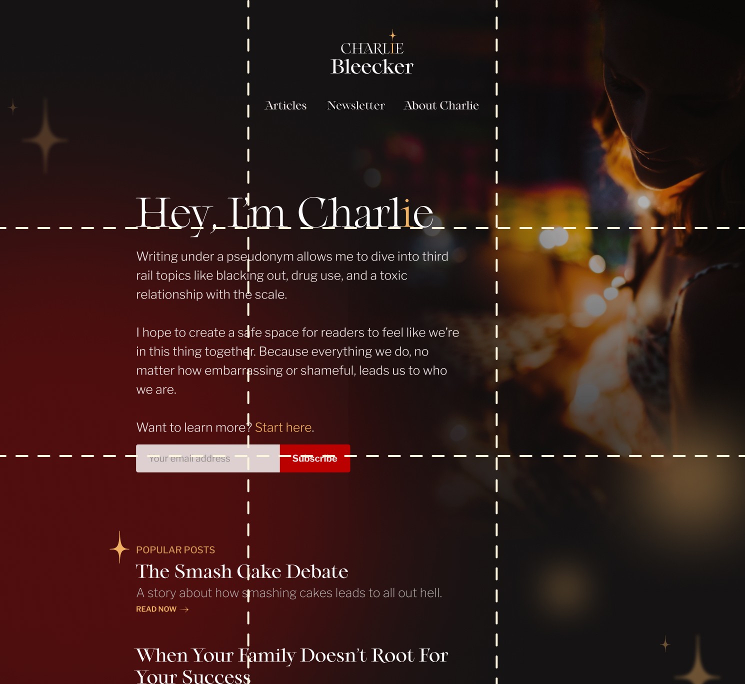
One of the most effective ways to use the rule of thirds in web design is to place the call to action either in one of the four sweet spots, or along the divider lines.
Because call to action buttons are usually higher in contrast, pairing the graphic in a sweet spot will help naturally draw a visitors eye to that area. It's a fairly straightforward way to design, which is why you see many templates follow this tactic.
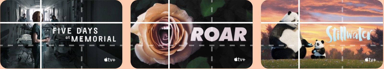
Rule of thirds used in thumbnail design
Thumbnails can be difficult to work with, because there is a limited amount of room.
Usually you have only some text and an image to use, so it's not easy to know what to do. If you look at what Netflix, AppleTV, HBO, and Hulu do, it's actually a fairly consistent layout.
To stand out, you need to make sure your thumbnail is legible, tells a story, and uses contrast accordingly. Oh, and of course the rule of thirds helps with all of these elements.
Because you're dealing with a 16:9 ratio, most thumbnails use the vertical line divider lines to place objects. Text on one side, and imagery on the other. The placement can be somewhat loose, but if you're consistent with this, you can do a lot with just a little bit of room.
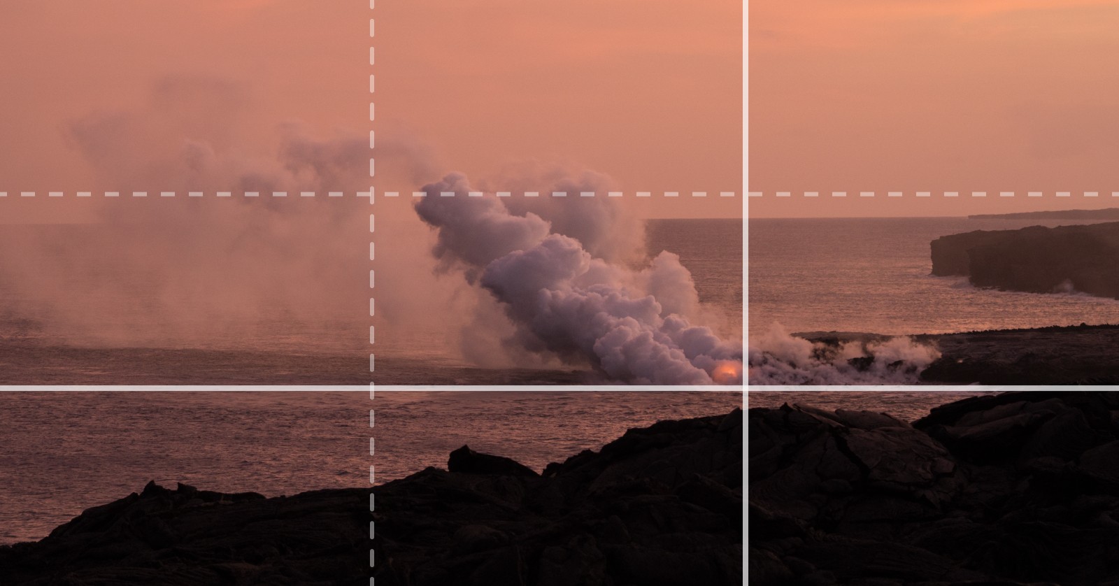
Rule of thirds in photography
Great design relies on great photography. And many of the above examples rely on images that have a composition with space to apply text and other designed elements.
One of the easiest ways to use the rule of thirds in photography is by aligning the landscape to one of the divider lines of the frame. Instead of trying to center the horizon line, give preference to a focal points—either the sky or the landscape—and helping the audience focus on one first.
In portrait photography, you can utilize the rule of thirds in your image by aligning the subject at one of the sweet spots. Popular ways to use this are focusing on the subject's eyes at one of the four intersections, drawing us in immediately.

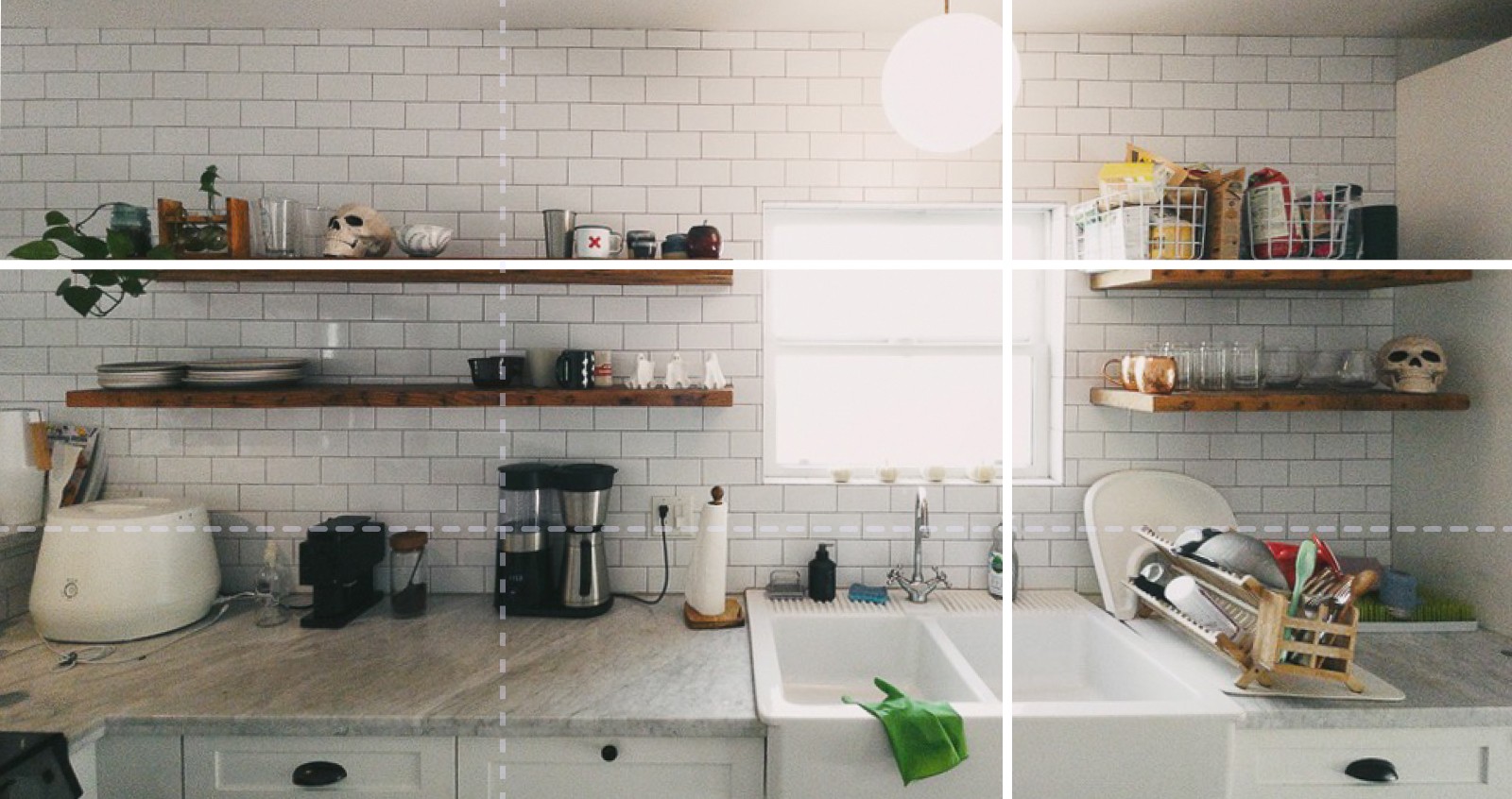
The rule of thirds used in interior design
Most of us don't have the convenience of building our own homes from scratch. If you're like me, maybe you've moved nine times in ten years; don't hate. So if you're like me, you're left with oddly sized walls and nooks almost useful for nothing.
But, because the rule of thirds relies heavily on asymmetry, we can use this to our advantage.
Think about how to divide the room up into thirds, and start by placing artwork along the upper horizontal line, or spacing your shelves out in thirds, rather than haphazardly piling things up.
In our kitchen, notice how our exposed shelves create harmony because one is a bit longer than the other, anchored by a slightly off-center window. It's not perfect, but it adds warmth to the overall space.
Look for other ways to apply the rule of thirds to your bedroom, bathroom, and living room spaces.
Conclusion
The rule of thirds is just a rule of thumb. But it's a great way to adhere to a simple guideline while giving your design some structure. Many designers use the rule of thirds in web design, print design, YouTube thumbnails, slide deck design, and much more.
Once you see it, you'll never unsee it. And if you want to get better at using the rule of thirds in your own designs, take the 80/20 design challenge.

Join 3,800+ solopreneurs & professionals who are:
Building trust with personalized branding
Increasing sales with premium packaging
Creating clear offers that convert
Get dollar-driven design tips in your inbox 2-3x a week.
More Posts