7 MIN READ
•
Design
How to flip a free workshop into an evergreen product landing page that sells itself
How I tested, built, marketed, and sold my free workshop and launched it within a week


I recently turned a free 90-minute workshop into a small but profitable digital product in under a week.
When building and selling small digital products, being good at just one or two things isn't enough, especially when doing everything yourself.
It's easy to focus on your strengths—like design and writing for me—as they bring positive energy. However, your long-term success requires addressing your weaknesses.
Failing to improve or seek help in areas where you're not great can reduce your chances of success, much like a frozen car battery in a Minnesota winter.
And you don’t want that.
In case you missed it, here are the other three parts:
Part 3: You're here!
Part 4: How to design a landing page for a $1,000 product or service offering
Here are four steps we’ll cover in this article:
Test your idea
Build and design your idea
Market your product
Sell and build post-purchase relationships
The four components to build and sell a digital product
To sell anything online, you have to focus on four essential components.
The book, The E-Myth, states that people that go into business are three-people-in-one. The entrepreneur, the manager, and the technician.
Many builders are great technicians, which means they're great at working in the present moment. One step at a time.
But if you're lacking the vision of the entrepreneur and the foresight of the manager, you'll burn out, only to work harder the next day at the task in front of you.
So each of these four steps helps you think through the entire lifecycle of a product, without diving headfirst into building.
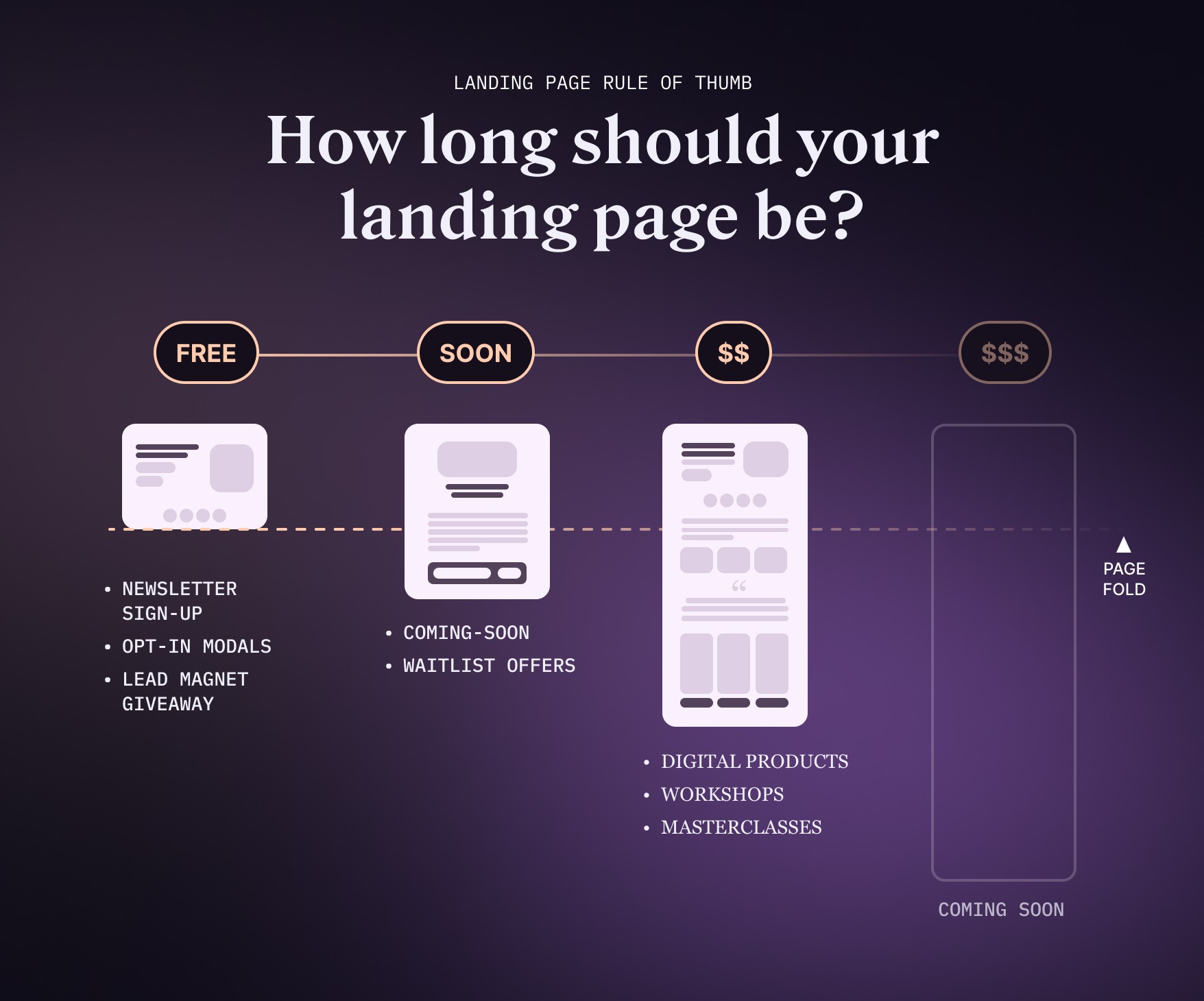
1. Test your idea before you build
In software design and development, you want to test the validity of an idea with a combination of customer interviews and simple prototypes.
You're trying to solve for a *real* customer pain point, that focuses less on the features of how they get there, but the "What's in it for them?"
In this case, I did two things:
I sent out a Twitter thread based on a simple idea: How to apply the rule of thirds in design to your thumbnails without using YouTube as a reference. I wanted to test whether the idea had a strong enough hook with non-designers, before doing anything time intensive. I did this to test out a theory, and it seemed to work!
Co-host a free workshop to talk deeper about this topic. I knew if I could get at least 50 signups, I might be able to define whether or not there was interest in a more specific topic.
I used Luma to set up my free workshop, which handles all of the registration, invites, and feedback for the event.
Most of the signups came from my newsletter and Twitter.
2. Build and design your idea
Once I had tested the tweet thread and the workshop with 92 signups, I decided this was enough data to create something from.
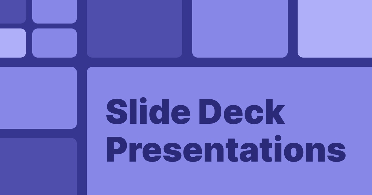
Because I knew this going into the workshop, I spent a little extra time on the slide deck presentation.
Part of the build process requires a few steps.
Write the copy
Design the landing page
Package your product
Both of these are worth much more than the bullet points they're given, but designing a landing page and getting it live has become much easier than it used to be.
Write the copy
Everything I have learned about copywriting has come from books, courses, and communities I've been a part of. I don't claim to be an expert, but I do
Craft a powerful headline
Your headline should grab the reader's attention and communicate your offer's main benefit. Keep it short, concise, and use action words to motivate users to continue reading.
Remember, the main goal of the headline is to get someone to read the next line.
One way to do this is to focus on how you can appeal to the reader. Instead of making a vague attempt at a feature of your product, tell them how your product will change them by the end,
Focus on the benefits, not the features
Instead of listing product features, emphasize how your offering will solve a problem or improve the user's life. Use bullet points to highlight key benefits in an easily digestible format.
Address potential objections
Anticipate any concerns or questions visitors may have and address them in your copy. By providing answers upfront, you minimize friction and make it easier for users to convert.
Utilize social proof
Incorporate testimonials, case studies, or other forms of social proof to build credibility and trust with your audience. This can help reassure potential buyers that they're making the right decision.
Write with clarity and simplicity
Avoid using jargon or complex language that could confuse readers. Keep sentences short and break up large blocks of text with subheadings or images for better readability.
Create a sense of urgency
Encourage visitors to take action by creating a sense of urgency through limited-time offers or exclusivity. This can help increase conversions by pushing users to act before they miss out.
Include strong calls-to-action (CTAs)
Make sure your CTAs are clear, concise, and prominent on the page. Use action-oriented language like "Get Started," "Download Now," or "Join Today" to encourage users to take the desired action.
By implementing these copywriting best practices on your landing page, you'll increase engagement and drive higher conversion rates for your digital product.
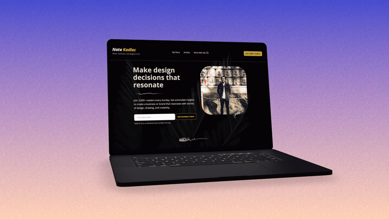
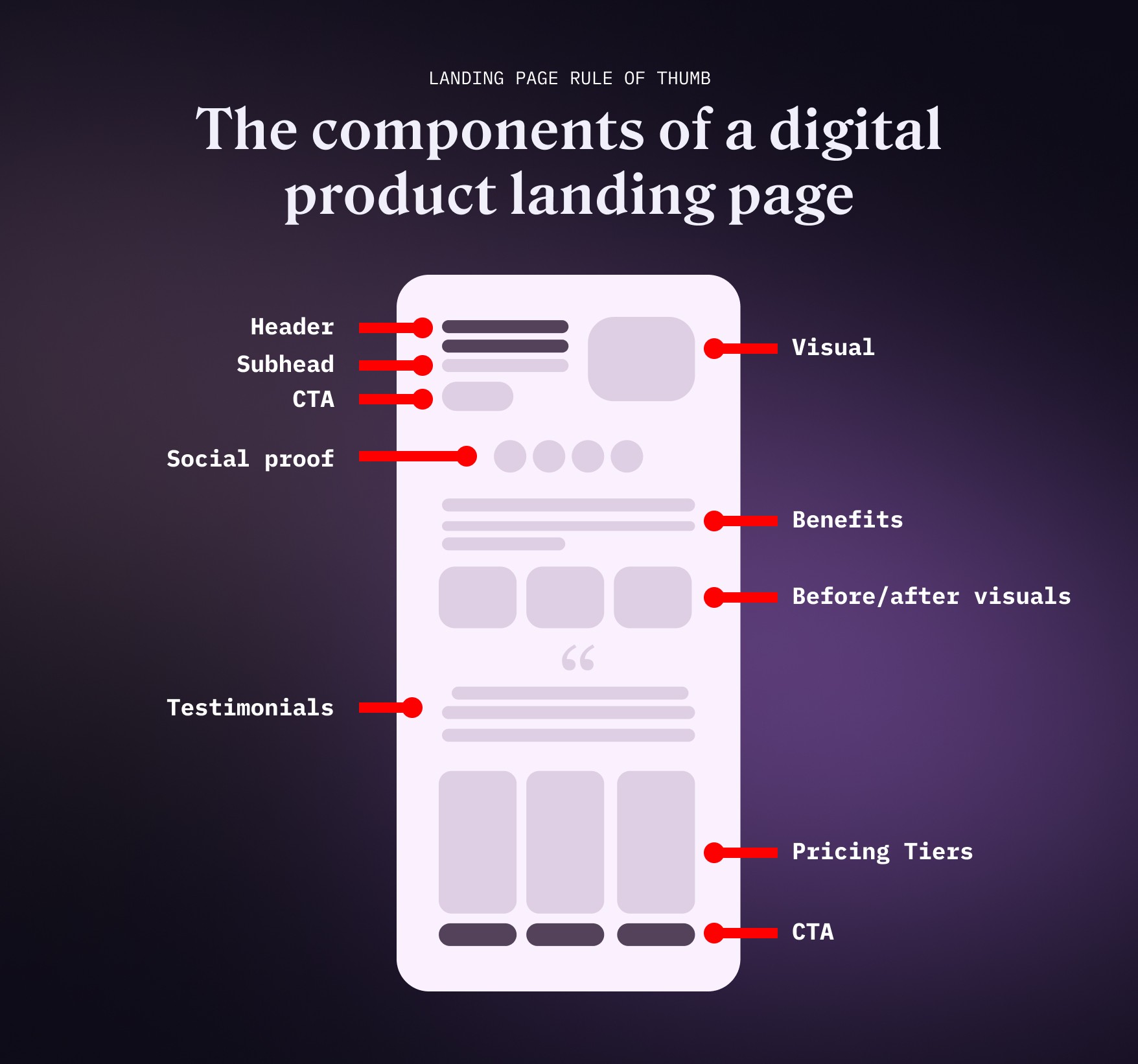
Design the landing page
Because this lives on a site called Approachable Design, let's dive more into the design of a landing page. Two elements play an important role: design and writing.
If you’re in a hurry, here are 20 unconventional tips to improve your designs.
Designing a landing page is near and dear to my heart.
Apply a consistent visual hierarchy
Establish a clear visual hierarchy by using different font sizes, weights, and colors to guide the user's eye through the content. This helps users understand the importance of each element and enhances readability.
Use high-quality visuals
Incorporate relevant images, illustrations, or videos that support your copy and showcase your digital product. High-quality visuals not only make your landing page more visually appealing but also help users better understand your offering.
Leverage whitespace
Ensure there's enough whitespace between elements to avoid clutter and increase readability. Whitespace (or negative space) improves visual flow and helps users focus on critical information.
A great way to help you with this is by using the rule of thirds.
Optimize for mobile devices
Design your landing page with a responsive layout that adapts seamlessly to different screen sizes and devices. With an increasing number of users accessing websites via smartphones and tablets, optimizing for mobile is crucial for enhancing user experience and conversion rates.
Increase visual intrigue
A few best practices to create visual intrigue stem from using contrast. Prada and Gucci use high-contrast colors to increase visual intrigue and establish luxury in their brands.
You can use contrast between font choices, imagery, and more to create visual intrigue in your landing pages.
For example,
Left align your text in 99% of the cases
This seems like a small thing, but the left edge in text alignment is easy to read and skim very quickly.
Center-aligned text disrupts this natural flow and forces us to read jagged lines from left to right, exhausting our poor little eyes. Too much of this can cause us to associate feelings of tiredness, anger, and fatigue directed at your site, and therefore your brand.
Use center align text for elements you want to cause someone to stop and read, and no more than 2-3 sentences in length.
Use 2-3 colors
To simplify your color choices, limit the colors to 2-3. To increase your flexibility, you can create light and dark variations of your primary colors to give you more options.
So if you choose 2 primary brand colors, you’ll have at minimum 6 colors to use, but the sky is infinite if you only choose variations of those hues in your designs.
Make your CTAs stand out
Use high-contrast color and text to help your buttons stand out. Don’t use low contrast background with white text that would make it difficult to read clearly. Think about those with color impairments, and look to create legible buttons that anyone can read.
Package the product
One of the biggest problems I see with video products is the lack of insight into what you’re getting.
I get it, showing screenshots of the video itself isn’t all that compelling.
One thing I did was record my screen using Screen Studio while panning around some of the boards I used in my presentation and compiled a simple but more elegant rendition of the video itself. Talking headshots are not that interesting!
After editing the video itself, I also reshot the intro so it was a bit more precise and jumped right into the presentation. This helped with retention and delivered value almost immediately.
I also created a few resources to include in the masterclass, adding more value to the offer instead of just the video. People have told me this was worth it in and of itself.
Lastly, I wasn’t sure how I was going to host the video. I toyed with the idea of using Circle, or YouTube, but it felt cheap to just publish the video on a page without giving it a premium feel.
So in the end, I decided to build out a page on my site—which uses Framer—and host it directly. I added links to download the resources there and added a bit more about the workshop itself. This way, I can customize the page however I want and update it when I need to.
The video itself is hosted on Vimeo, mainly because I prefer the user interface there to YouTube.
With a fully packaged product plus bonuses, I was ready to market and tell people about it.
3. Market your product
Let's be honest: marketing happens in and around everything that is happening. It's happening when you tweet out a thread, respond to DMs, design a public-facing landing page, and write emails to your audience.
Marketing is one of my least favorite activities, but this is where the E-Myth book comes into play. If you’re not working on the business, you’re working too much in it.
Here are a few things I did to try and get the word out:
Announce the event ahead of time to my email list
Upon agreeing on a date just a week away, I didn’t want to waste time emailing my newsletter list (at the time it was ~3,150). I sent out a quick note and directed people to my Luma page to sign up.
This alone brought in a few dozen signups. One intangible advantage of this was I discovered who on my list cared about YouTube, so it could help me with future products or decide how to use that info later on.
Co-host the workshop with a friend
With Paul Millerd prompting me with the initial invite, it took a lot of anxiety away because you knew your friend would be there to help and support you.
Along with the support, you get to tap into their network and discover more people who are interested in the same idea.
Marketing works!
Announce on Twitter
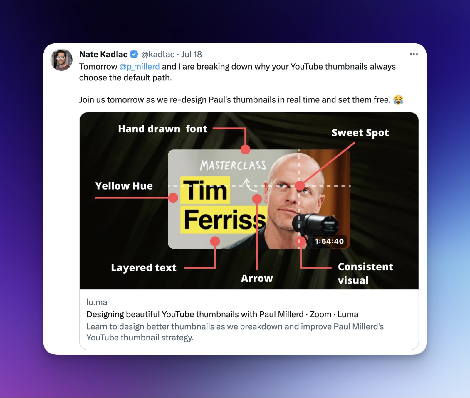
For the event, most of our audiences were on Twitter or our newsletters. Our public announcement came on Twitter where we brought in an additional couple dozen people, a few of whom I have looked up to and admired their creator journey.
The key here is, don’t be afraid to talk about what you’re working on, even if it feels extremely small in the big picture.
Reward the people who show up
Ahead of the event, I knew I didn’t want to charge the people who came anything, and I wanted to give them as much as I could for supporting me.
After the event, I reached out and sent DMs to several people, then emailed the entire list with free resources I was planning to include in the paid product.
Because of this, I earned some gratitude and some testimonials from those who joined.
Email the early bird discount a few days before the launch
I knew I wanted to reward those who knew about the event but couldn’t make it, so I took a lesson from Josh Spector and created an early-bird event with a 50% discount for those who wanted it right away.
In the meantime, I was building the landing page and getting it ready to showcase.
Create an early-bird event with a discount
Lastly, I held an early-bird special for 72 hours, prompting people to sign up with a 50% discount on the first two tiers. To do this, I set up an automated email sequence using ConvertKit, sending out seven emails during those three days.
4. Sell and build post-purchase relationships
It’s never been easier to sell online. There are simple solutions like Gumroad, LemonSqueezy, and ConvertKit Commerce. I use ThriveCart which gives me some additional functionality to customize the experience. (I’m a designer after all!)
Tip: If you’re stuck, I’d recommend starting with LemonSqueezy, an affordable option that looks great.
But sticking a price on your product and calling it a day is leaving quite a bit of money on the table. Everyone has different needs as you have learned from your testing above, and so it’s good to think about your offer.
Persuasive pricing
I recommend setting up 2-3 pricing options.
Part of this helps anchor the price to help increase its perceived value. But, we’re not trying to manipulate anyone here—we are aiming to help differentiate the value in a couple of different ways.
What I did with The YouTube Thumbnail Masterclass was to offer the standalone recording and a few different options, next to a 1:1 offering if you need some of my help.
You’re now serving two different types of customers with different needs, and helping establish the value of what you’re offering.
Building relationships after purchase
Selling isn’t the end, but rather the beginning of a relationship. Those who miss out on this step are missing out on future revenue, testimonials, and nurturing fans who will support you no matter what.
You just established an implicit amount of trust in being able to deliver and help someone become a better version of themselves, as superfluous as that sounds.
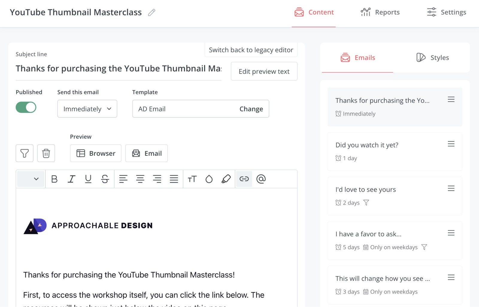
Many email tools let you build sequences, but I prefer ConvertKit. Each product I sell has a different welcome sequence.
Creating a strong welcome sequence helps continue to deliver value after the purchase, by highlighting tips, strategies, and how to get the most out of your purchase. I believe people expect this after a purchase north of $100, but providing this strategy on products above $10 shows enormous value.
And we know that selling to repeat customers is much easier than attracting new customers.
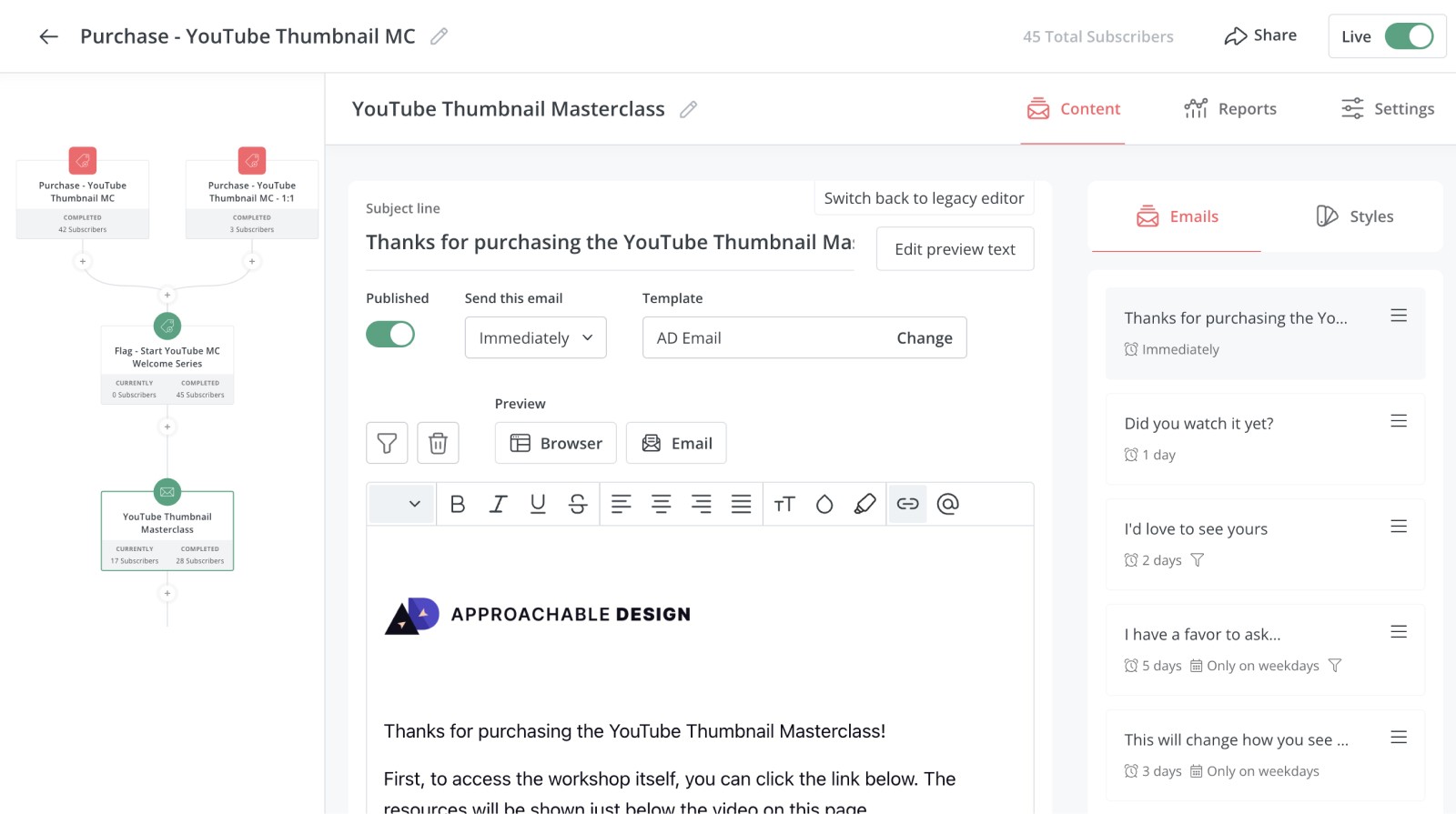
Your customer welcome sequence:
Email 1: Welcome (Sent immediately)
After purchasing, your customer should receive two emails. The receipt which is automated by your payment processor, and a welcome email from you. Have fun with this message and personalize it!
The welcome email should be short and to the point.
Introduce yourself, and say “thanks” in three sentences or less.
Then, state the benefits again of the purchase and provide clear instructions on how to get your product. Is it a download? Tell them to click a big button. Is it a course? Tell them how to log in and access it.
This email should be straightforward without any fluff.
Email 2: The “How’s it going email?” (Sent 24 hours later)
Most people might never click right away because we’re all busy with our lives.
24 hours after purchase, I like to send another email making sure they received the link and to quickly talk about one of my favorite features they might benefit from.
Or, you could quickly mention the benefits of just starting now if they haven’t yet, and reply with any questions. If you receive any, these could be great topics to write about in the future.
Email 3: “My favorite tip” (Sent 48 hours later)
Sometimes people need a little hand-holding or want to know a shortcut to success. This is your opportunity to share some of the more hidden features and benefits that you may not have been able to get to on the landing page.
This email should be quick and to the point, sharing one actionable tip they can use immediately.
Email 4: “I have a favor” (Sent one week later)
At this point, the hope is that your customer has enjoyed or taken something from your product. Hopefully, your gentle nudges have helped them through the process, and they’re either enjoying or found some way to apply your product in their situation.
This is a great time to ask for a testimonial or a review. It’s been a week, and you might even be able to capture a testimonial or two, which you can apply back on your product page as social proof.
This helps the page become even more evergreen, strengthening its position of value over the long haul.
TIP: I use Senja for my capturing my testimonials
Email 5: “Here’s what’s new” (When there’s a new update)
We love new things. We especially love to get free updates on the things we have already purchased.
These small updates are fantastic if you can remember to send them. When I update or add to the product, I’ll try to send out a quick and personal email to remind someone there’s something new.
I have an evergreen product called the Design Vault, which includes a collection of hand-picked websites that I’m growing to 1,000. As I add 10-20 new sites, I’ll send a quick update to my customers to let them know some of my favorites and the continued value they’re getting from my product for free.
I’m also reminding them of the price they got it at because it increases over time for new customers. I can either use this opportunity to ask for a testimonial or to share it if they found it meaningful.
Play the infinite game
There are always a couple of ways to sell a digital product.
You can fully depend on luck and hope that it sells well. Or you can put some extra effort into launching and packaging it in an evergreen way, extending the window of opportunity to sell.
For me, even though this is a $50 product, it’s something I can use in many different ways outside of being just a simple product. Your options start to increase as you build more, learning the ropes of testing, building, marketing, and selling.
I’d love to see what you build!

Join 3,800+ solopreneurs & professionals who are:
Building trust with personalized branding
Increasing sales with premium packaging
Creating clear offers that convert
Get dollar-driven design tips in your inbox 2-3x a week.
More Posts