6 MIN READ
•
DESIGN
How to pick colors with confidence
Making timeless color decisions starts with choosing your first primary brand color


“Does this color look good?”
This is the most common design question I get from creators.
Choosing colors with confidence takes a lot of internal willpower.
When you make decisions about color, you’re also making decisions about your identity, and how the world perceives you.
Choosing a color is like revealing a dark secret. It forces you to publicly announce that you secretly love the color brown and now the world knows you love it when a UPS truck drives by and what if they hate it?
Tough spot!
You probably know what color you love, but you might be thinking it’s not the right color for your audience or brand.
Color is important because it is such as personal decision, and it’s something you can own visually if you use it with confidence and consistency. But it’s also easy to dismiss and just copy someone else doing it well.
Then in 6 months when you’re bored with it, or when some new trend comes along, your choice quickly feels dated or detached.
But, if you want to confidently pick colors that last, you need a competitive differentiation. Thankfully you have that.
It comes from your own personality and experiences.
This will be the basis of our process, which is something I refer to as inside-out design thinking.
And you can use this process for your personal creator brand or a multi-billion dollar business like Tesla.
Why you should ignore color theory
Let me be clear: color theory does exist and when immersed in it, it can absolutely nudge us into a buying mood, eating mood, or sexual mood.
But generally speaking, this requires a more immersive environment hitting all of our senses, like standing in the plant section at Ikea, sitting at the bar of a restaurant, or standing in a Victoria’s Secret.
But when you’re browsing the web and being pummeled with flickering ads, kids crying in the other room, and your ADHD kicking in while online shopping, the blue you used for your newsletter sign up button is not going to instantly calm someone down and hook them in.
These are tricks to help manipulate how we feel, so there’s an element of psychology when looking at colors as a whole. But we’re going to set that aside for now, because we’re not seeing tricks. We’re seeking timeless color decisions.
Here's a quick interview I did with Josh Spector on how to choose brand colors.
Start with the inside-out
To make confident color decisions, you need to connect your decisions to your experiences.
Ultimately you want to create a list of 5 keywords that define you. But first, we’ll start with writing out 20-30 words based on the questions below.
These are prompts to help you think about your own experiences. Think through each question and write out a word or two that comes to mind. Feel free to time travel and answer these questions at any point in your life.
For example, when I was 19 I traveled to California for the first time. At the time, it was my favorite place in the world.
What comes to mind is the sun, the sand, and palm trees. I would write these down and move on to the next question.
And if the same word comes up more than once, that’s a good sign as you’ll see.
*Spoiler alert: These keywords are the premise of my own personal website.
Step 1: Spend one minute on each question and write 2-3 words for each:
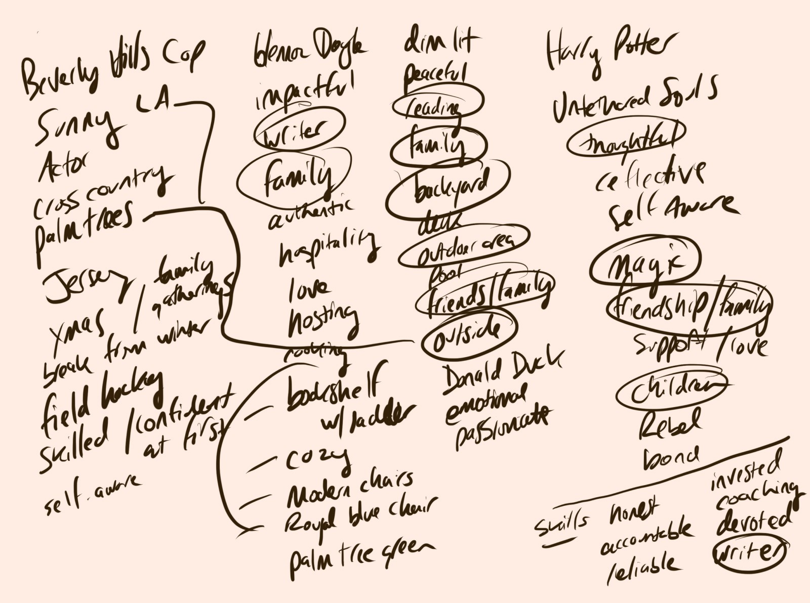
Where is your favorite place in the world?
What brings you joy?
Describe the room you’re sitting in right now
What are you great at?
If money were no concern, how would you spend your days?
What are you obsessed with?
Where are you from?
Is there a fictional character you relate to? (novel, movie, TV show, etc)
Do you have a favorite book?
What does your morning routine look like?
Step 2: Pick 3-5 keywords that represent your best self

Much of this process is about laying down all the seeds of our personality, then standing up and spotting patterns.
Start by taking your 20-30 keywords and look to see how they make you feel. These words are like loose puzzle pieces to your personality. You want to pick the ones that best represent how you view yourself, and narrow your collection down to 3-5 words.
First, look for the words that you mentioned 2-3 times, and circle those. If you don’t have enough of those, then pick the next single keywords that you feel represent you best.
Step 3: Save 3-5 images for each keyword
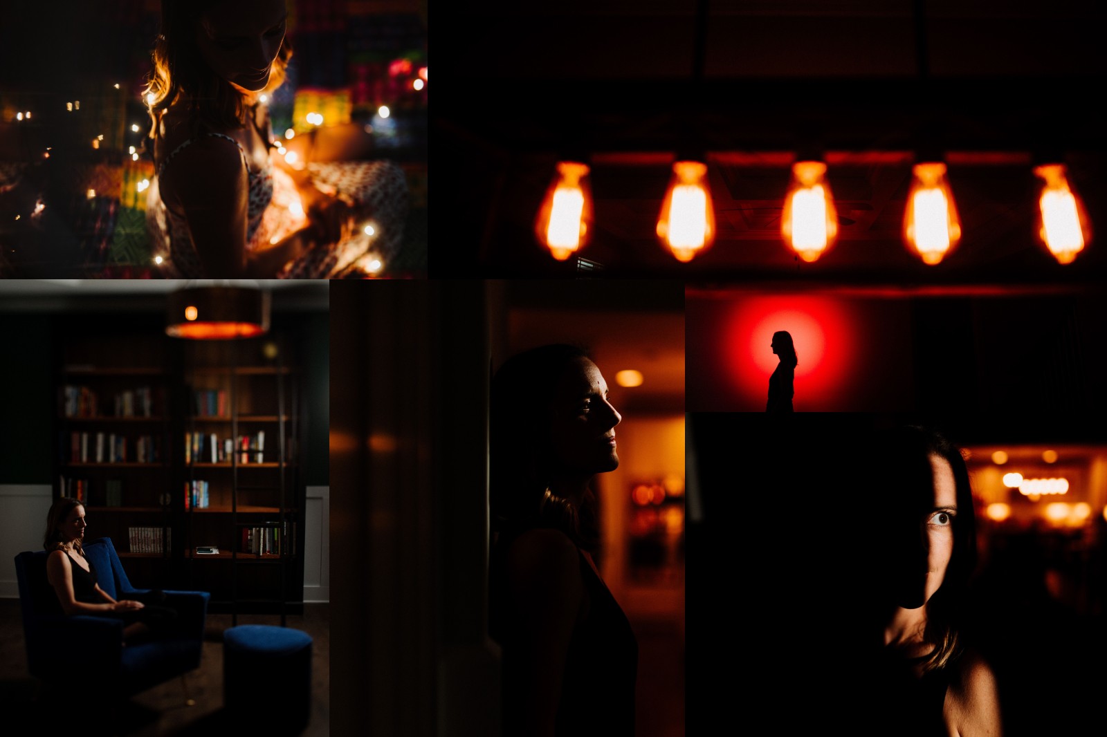
This next step is where we apply a visual aesthetic to your keywords. Each word serves as a launching point for choosing your images.
Use each word and search Unsplash.com with it (or any image search) and start to pick images that you feel connected to in some way. It could be because of the vibe, the colors, or if it reminds you of something in your life.
Images are great because they’re natural, and can easily create an emotional connection through the use of color and natural elements.
But we’re really paying attention to how it makes you feel. I tend to opt towards finding images you love.
Take all 15-25 images and lay them out on a board. I tend to use Figma (It’s free for personal use) so I can see them all at once. This should feel like a mood board, and when you look at it, you can see yourself using this general style.
Tip #1: Try to ignore people in the shots and base your decision off of the overall aesthetic.
Tip #2: Stay away from graphic designed elements like posters or book covers. These have been designed for someone else, and we want to make decisions for ourselves first.
Tip #3: At any point you feel like you chose the wrong keyword or image, feel free to go back a step or two and repeat it.
Step 4: Loosely grab 10 colors from your images
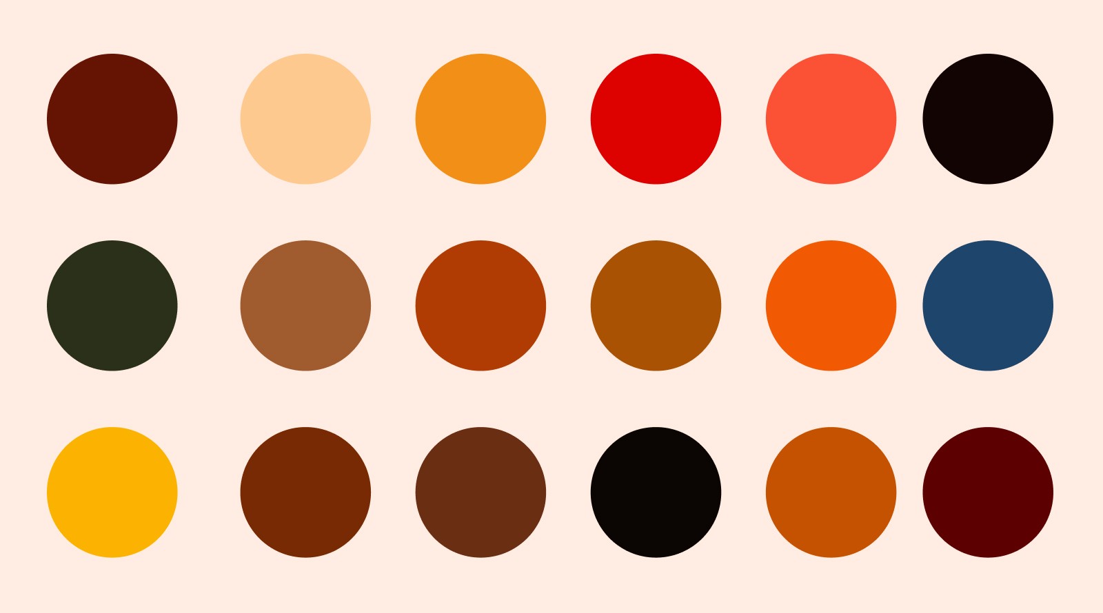
Gather your images together in Figma (or any design program that allows you to set all of your images together) and select 10 colors.
At this step, you’re again looking for colors repeated in your images. Using the eyedropper tool, you can sample the most common colors and set them aside.
For example, you might have selected a few images that include water in them. You could try to grab a couple of blues that speak to you and include those in your 10.
Tip #1: Squint your eyes to blur the images together to find the most common colors.
Tip #2: In Figma, I’ll create small circle swatches first. Then I’ll sample the image using the eyedropper tool and change the swatch to the desired color.
Step 5: Choose 1 or 2 colors to use

Now comes the moment of truth!
Looking at your 10 colors, it’s time to pick 1 or 2 colors from the set. At this point there are no wrong decisions, because all of the colors you’ve chosen have been filtered down through your personal stories and experiences.
Picking one color from the bunch might feel difficult, but just follow your instincts and select one that speaks to you.
Step 6: Name your colors
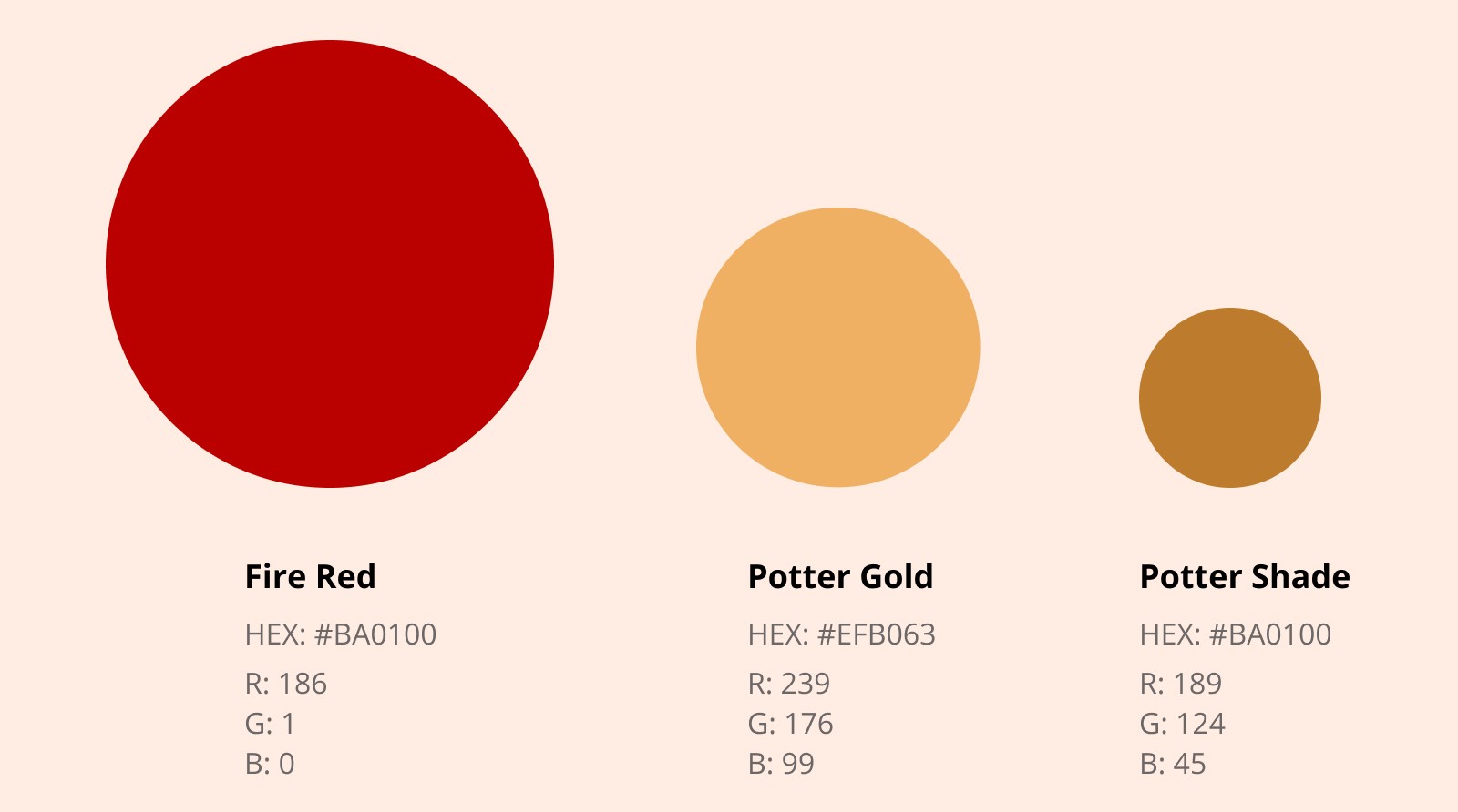
The last step is to name your colors. You can name them anything you want, but I recommend naming them with [color] + [noun].
For my gold color, I used Gold Sun. For my off-white, I call it Sandy White. These are simple names but now they’re my names.
Anytime you reference them later in your designs, it’s an easy way to communicate it to a designer or someone else you’re working with.
Tip #1: I like to use Color Namer to enter my hex value and to get a unique name.
—
You just did something most people have never thought about. You now have a color that defines your starting point. It’s personal and connected to your own experiences. Even if you go back a few steps to select a different variation, it all stems from your own personal story.
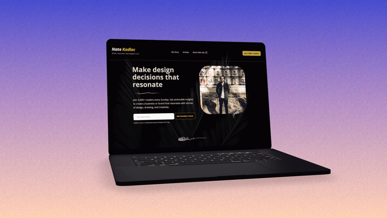
Just like I use gold, green and a sandy off-white in my own site, they all come back to the sun, sand and palm trees from my first trip to California.
Having this one color is the centerpiece of creating your own unique palette. It becomes the starting point for things like your YouTube thumbnails, slide decks, and anything else you create.
This is how you start to build your entire design system from the inside-out.

Join 3,800+ solopreneurs & professionals who are:
Building trust with personalized branding
Increasing sales with premium packaging
Creating clear offers that convert
Get dollar-driven design tips in your inbox 2-3x a week.
More Posts