5 MIN READ
•
Design
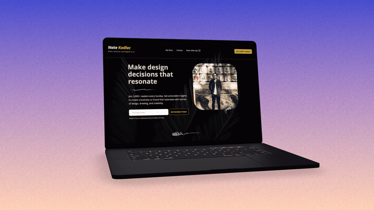
20 unconventional design tips for non-designers
Simple design decisions so you didn't have to think about it.


You make design decisions every single day.
I just made three in trying to choose the font sizes for my header, subhead, and body text.
But, if you’re a non-designer, these tiny decisions are frustrating to make every time. And each word doc you create, every web page you have to update, or presentation you put together, forces you into making a new decision. Because you’re not a designer, this is a waste of your brainpower.
Unfortunately, most people don't have the time to teach themselves the fundamentals of design. If that's you, these 20 tips are for you.
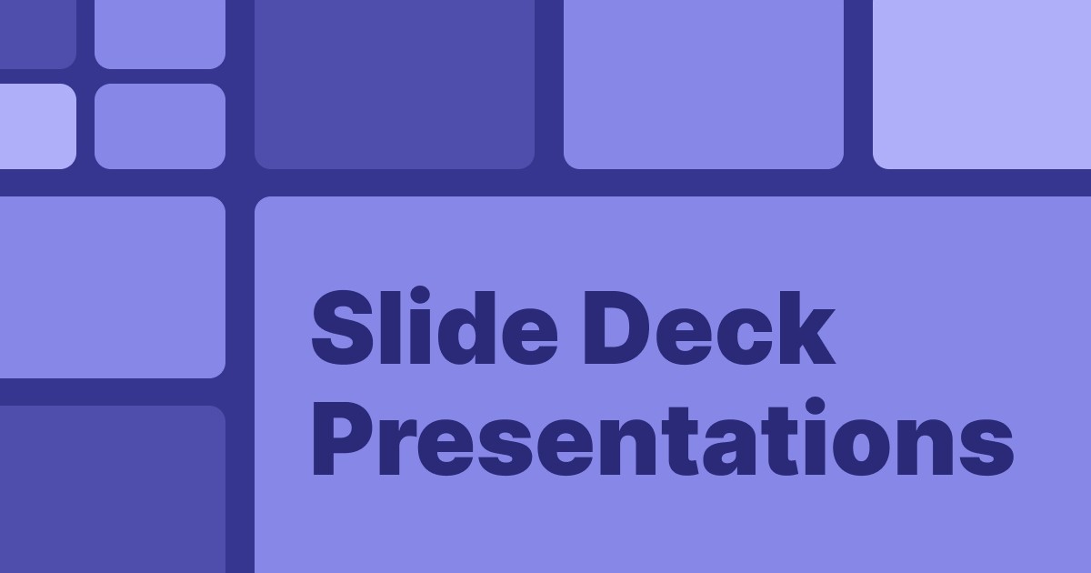
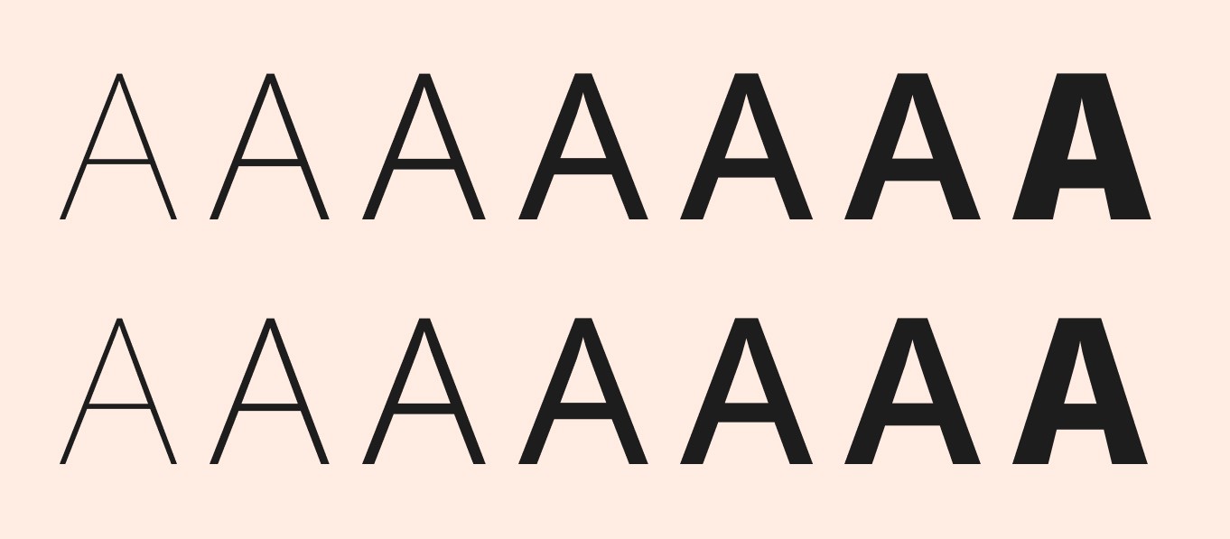
Design tip #1: Choose one typeface with more than 3 styles
The biggest brands use just 1-2 typefaces. How do they get away with this? The secret is that each of their typefaces has many different styles to play with.
Typefaces with only regular, bold, and italic can feel limiting. This is why you might feel compelled to find a couple of more fonts to download when you don't have a lot of space to work with, like YouTube thumbnails.
But, if you choose one like Noto Sans—which has 18 styles!—you have an unlimited amount of combinations that are designed to work well together.
These flexible families come in handy when you're designing YouTube thumbnails, podcast cover art, or other odd-sized assets you might need to use for your brand identity.
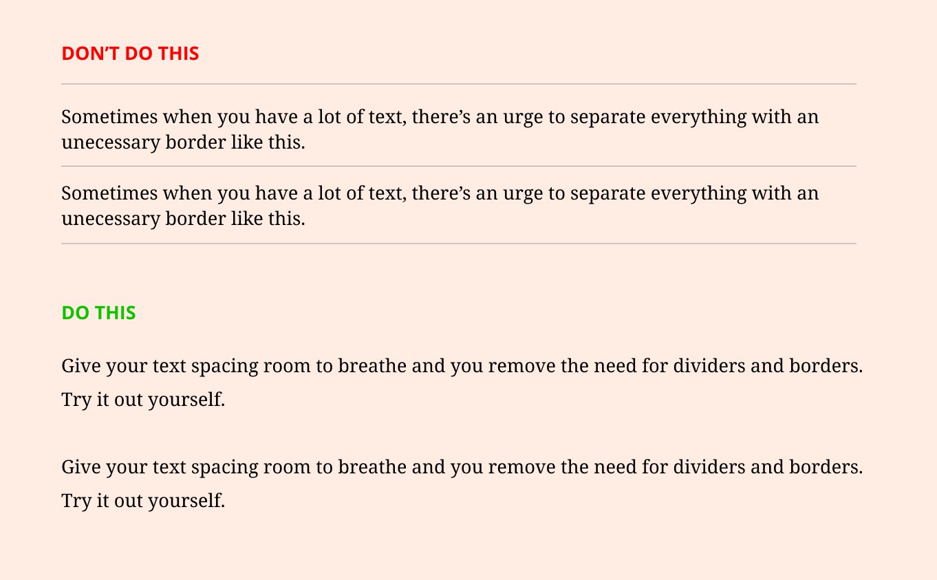
Design tip #2: Use padding instead of borders
Every element you add to the screen needs attention. (See #7)
You might have a lot of text boxes on the screen, and you’re thinking, “this box could really use a border so it doesn’t bleed into the text next to it.”
Stop. This is why we can use spacing and padding to achieve an invisible border. By adding a little bit of extra spacing, it gives the illusion of a border.
Design tip #3: Ignore color psychology (Hot take!)
Does color psychology exist? YES.
Should it matter when making design decisions for yourself? NO.
It’s easy to get caught up in what color means, but let’s set that aside for now. Yes, Ikea and Best Buy use yellow and blue because they are high-contrast colors used to affect our moods when we walk through their stores.
But, you should be making design decisions that connect to your story as a human being. My colors are all based on my love of the sun, the sand, and palm trees. Everything starts with those elements. By mixing these elements together consistently, I can create a unique color palette for myself, bringing me joy—and saving me time—each time I look at it.
Do this for yourself and you won’t be swayed when everyone uses the new color of the year in all of their projects, only to change it next year.
Design tip #4: Stop looking at trends for design inspiration
Personalize your design decisions using inspiration from your own stories and experiences. Did you recently take a trip to Tulum and find joy in the hand-tied knots of your hammock, while staring up at the palm trees swaying in the wind above you? Take those sandy off whites, palm tree greens, and notted textures and work them into your brand so start connecting to your decisions.
The reason why you’re bored with the design of your slide decks or websites is that we don’t see ourselves in the choices we make. This is when you start to look elsewhere for inspiration, which becomes an infinite rollercoaster of never being satisfied.
Design tip #5: Use contrast to stand out
Don’t be a wimp. To create visual interest, you need visual contrast.
The contrast between elements can be created using scale, imagery, color, and shapes. By using light and dark, large and small, serif and sans-serif, or thick and thin, you’re immediately creating intrigue.
See tip #6 for combining contrasting typefaces.
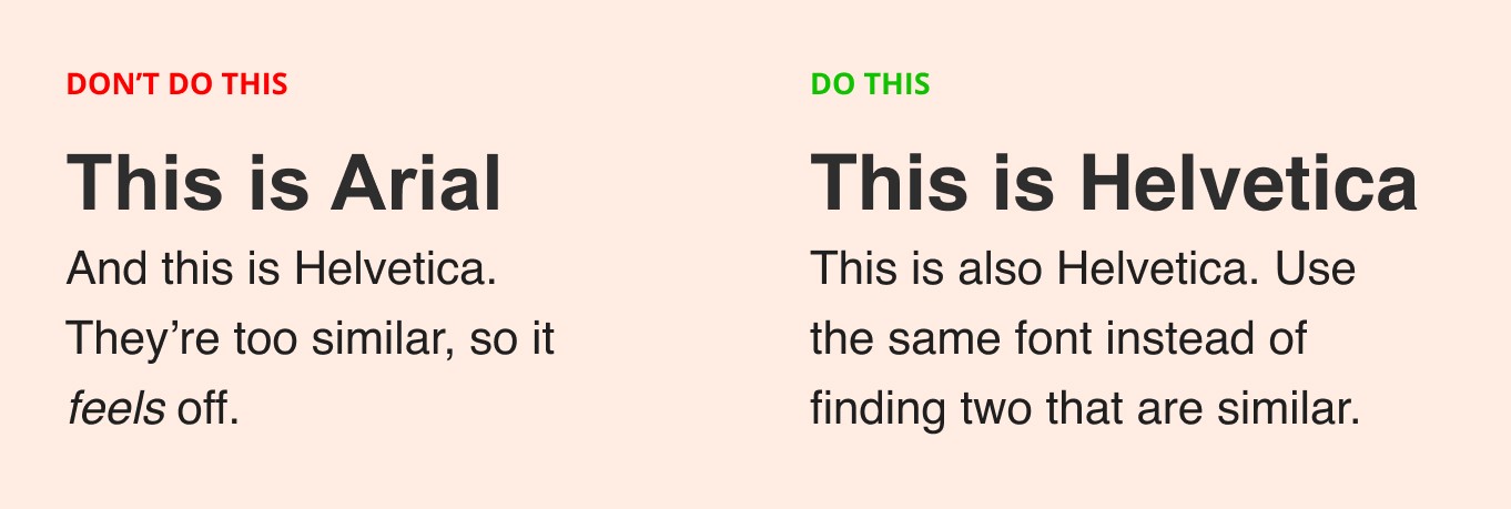
Design tip #6: Don’t use similar typefaces
If you need to combine typefaces, (I recommend #1 again) don’t use two that look similar like Helvetica and Arial. This confuses the reader because something looks off. But they can’t quite figure it out.
Instead, combine two that have high contrast in style, like a serif and a sans-serif.
By combining two fonts that look very different, you instantly create an emotional pull.
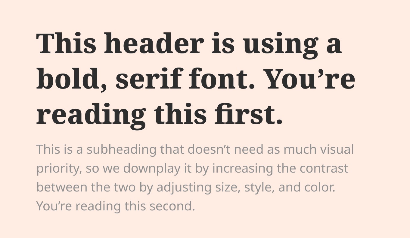
Design tip #7: Create a visual stack
Your logo, header, subhead, body text, color, dividers, footers, styled buttons, and layout are all screaming for attention. Your users have just a few seconds to find what they’re looking for, so you can’t let everything scream in the same pitch.
Make a list of all the elements on the screen and give them a number from 1 to 20 (or however many you have). Make sure to use higher contrast for items 1-5, and lower contrast for the numbers at the bottom. (See #3)
A quick test is to squint your eyes. You should easily see numbers 1-5, with the rest taking longer to find.
Creating visual priority is like hand-holding someone down your page, making sure one element leads to the next, like a walk on the beach.
Design tip #8: Use just 1-3 colors
Starbucks uses just a couple of colors in creative ways. Target sticks to its red for everything. You don’t need more color options than they do.
Find a color that represents you well, and then pick a secondary color that contrasts well with the first. The secondary should compliment the first without taking too much visual attention. If the first is high contrast, make your second a neutral or lower contrast color.
You can add a third if you really need to, but try to stick to 1-2 at first.
Design tip #9: Use 16-18px font for your website body text
Providing a good reading experience should be high on your list. If your body text is difficult to read, your brand can be directly associated with that negative feeling, unintended.
Most of us don’t think about the desktop and mobile experiences, and sticking with 16-18px font-size works well on both.
Design tip #10: Brand design should be boring
Once you have made a few decisions like what colors, elements, typography and buttons you’re using, don’t mess with it.
What makes successful brands work is their dedication to their design choices. It can be boring, but it should be.
If you do get bored with your brand choices, experiment by flipping the same colors around. There are many unique combinations that can still capture the vibe you create. I love the site Judy, because it’s a simple color palette that maximizes its design options by flipping its colors back and forth throughout its web experience.
Design tip #11: Use left alignment
Always default to left alignment for your text, headers, and containers on the screen. It’s easier for most people to skim the page this way, because it creates an invisible border (See #4) on the page.
The mistake many use is to center align large blocks of text, which tires the eye over time, making it much more difficult to read text.
This exhausted feeling will be associated with your brand experience, and encourage visitors not to come back.
Design tip #12: Repeat visual elements
By repeating elements such as type choices, colors, buttons, and dividers, you strengthen and unify your design. This creates an experience that feels polished and thoughtful, building visual interest.
Design tip #13: Use the rule of thirds for layout
This works in both photography and in design.
This rule has stood the test of time to create a well-balanced and pleasing layout. I believe it’s because it forces us to use spacing in a friendly way, making sure there is the right amount of flow around the objects within a container.
It’s basically full-proof.
Divide any container into nine equal parts, and align any important element on a line or a cross-section on the grid.
Design tip #14: Know your constraints
Design always has constraints. A business card is usually 3.5in x 2in. A social media ad for Instagram is 1080px 1080px.
Your design kit should have fixed constraints like colors, type, and textures.
Knowing these constraints ahead of time prevents you from
You can duplicate my free Figma file, Social Slates, which contains 20+ pre-built social artboards. (Make sure to sign up for a free account on Figma.com first.)
Design tip #15: Use Figma over Canva
Figma is a free design tool (for the basic plan) that many professional designers use. It’s easy enough for beginners to pick up, and provides a creative playground for you to design your own projects in.
If I ever need to build a new page, I always attempt to lay it out in Figma first to get a feel for it.
Design tip #16: Create a logo with a font
An easy way to help yourself stand out is by creating a logotype. A logotype is a logo based on your name or company name.
By picking a unique font for your logo, it’s like starting a 100-meter race with 20 meters to go. These are extremely handy for your personal websites.
I wrote an entire article on how to choose a font and to modify it here.
Design tip #17: Avoid using 100% black or white
There’s a design secret that many non-designers aren’t aware of.
Most good designers don’t explicitly use 100% black or white unless it’s part of the brand requirements.
Black and white are considered high contrast, and can often demand more attention than we want in our designs.
Try softening the ends of the spectrum by using an almost black like #111111 or almost white like #f7f7f7. You’ll notice it achieves a similar effect, but brings the intensity down a lot.
Design tip #18: Add a background tint to your website
Most templates come with a stark white background. Most people don’t change this default setting.
But, the easiest way to inject life into a page is by adding a light or dark tint to it, immediately creating a vibe to draw us in.
Design tip #19: Treat your design projects like a book
Books are the best way to think about well-designed projects.
The cover is a creative playground, attempting to stop you in your tracks when walking through a bookstore or in an Amazon feed.
Designers love the challenge of designing a book cover. But the cover is in stark contrast to the interior pages, which are designed for readability. Gone are the high-contrast fonts, colors, and fancy layouts. It’s straightforward, and most books pages are laid out in the same way.
The back of a book is compelling but reserved for marketing the author and offering a summary. It’s less designed than the front, but it still conveys the vibe.
Your websites should be designed similarly. Take creative control over your home pages and about pages, and make sure your middle content is legible and comfortable to read.
Design tip #20: Minimalism is boring
When selling a home, it’s not a secret that they sell better when someone can envision their own personality in the space. The interiors are dumbed down so you don’t offend a potential buyer.
The same is with pre-designed templates. Most templates are dumbed down so you’re not offended. The easiest templates to sell are the ones based on a minimalist feel, using black and white.
But people are not minimalists. We’re complex with a love of story, places, and experiences. But it’s not easy to make confident design choices without knowing our own aesthetic.
The best place to start is to listen to your gut, understand why you like what you like, and to go from there.
Or you can learn how to make long-lasting design decisions for yourself in just 2 days, during my next workshop.

Join 3,800+ solopreneurs & professionals who are:
Building trust with personalized branding
Increasing sales with premium packaging
Creating clear offers that convert
Get dollar-driven design tips in your inbox 2-3x a week.
More Posts