5 MIN READ
•
Design
How to design a newsletter landing page
And how design plays an important role in building trust

Not long ago, I received an inbound email from a prospect.
Old Nate would email back promptly, fielding the request swiftly, and engage in a back-and-forth email thread over needs, desires, and pain points. After a week or three, finally sending over a proposal and making the offer.
Another version of old Nate would be to ask for the budget ahead of time—and straight up turn it down if it wasn't of ideal size.
The problem with these approaches is how much time is spent going back and forth, negotiating, miscommunicating, and finally pitching the cost.
But new and improved 'Landing Page Nate' took a breath, then spent two hours spinning up a landing page to provide the value upfront, complete with pricing, irresistible offer details, bonuses, and testimonials from prior related projects.
Within 48 hours I had the sign-off and quickly signed on 8k of revenue. It wasn't a large project, but now I have a page I can use for similar offers of future projects.
Landing pages are typically the first interaction someone might have with your product or service, I want to talk about how they can help you land more deals, and why your competition is not necessarily who you think it is.
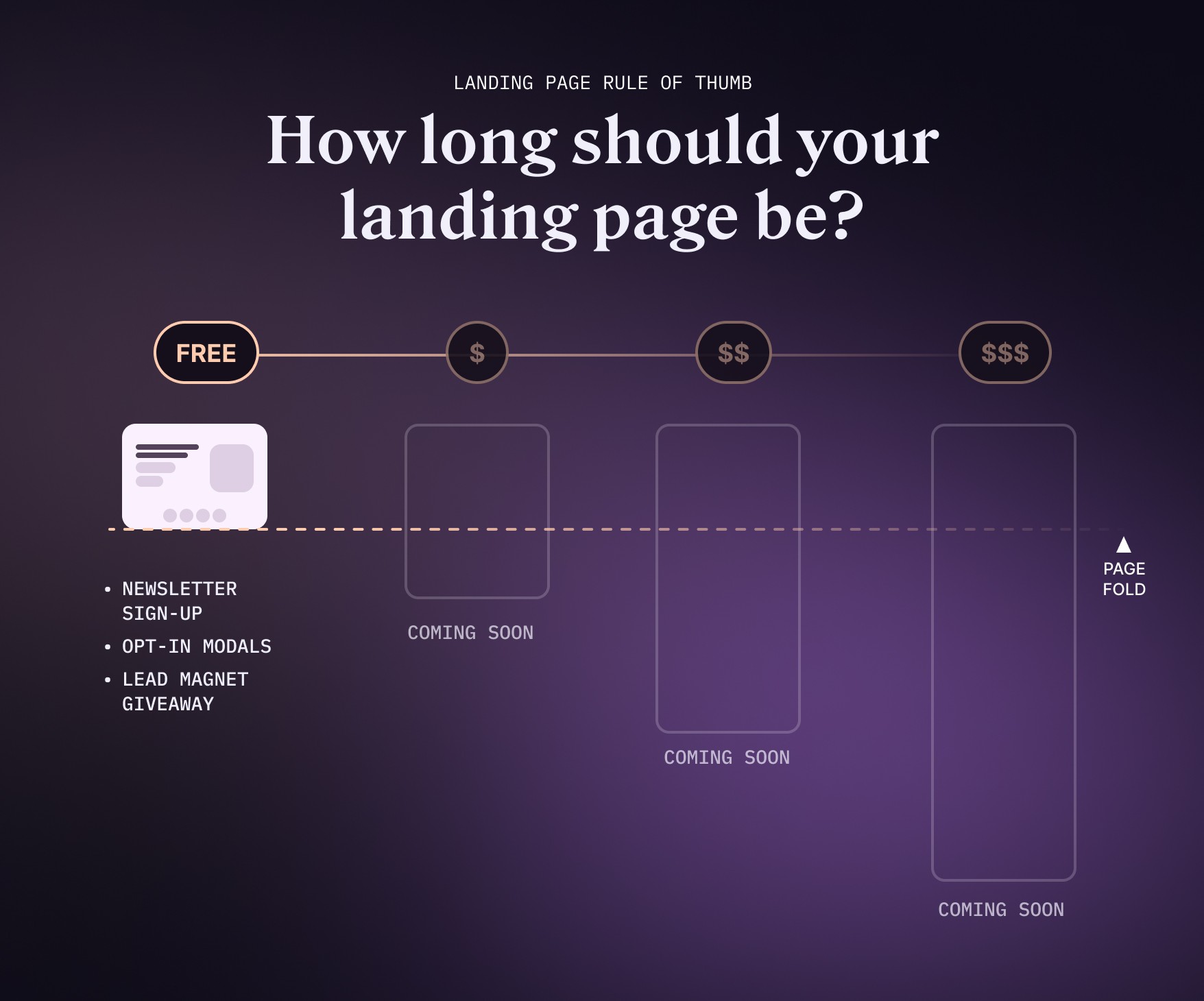
Over the next few weeks, I'll be talking about different flavors of landing pages and the different components that are needed to mitigate risk.
In case you missed it, here are the other three parts to this series:
Part 1: You're here!
Part 3: How to flip a free workshop into an evergreen product landing page
Part 4: How to design a landing page for a $1,000 product or service offering
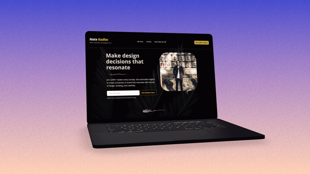
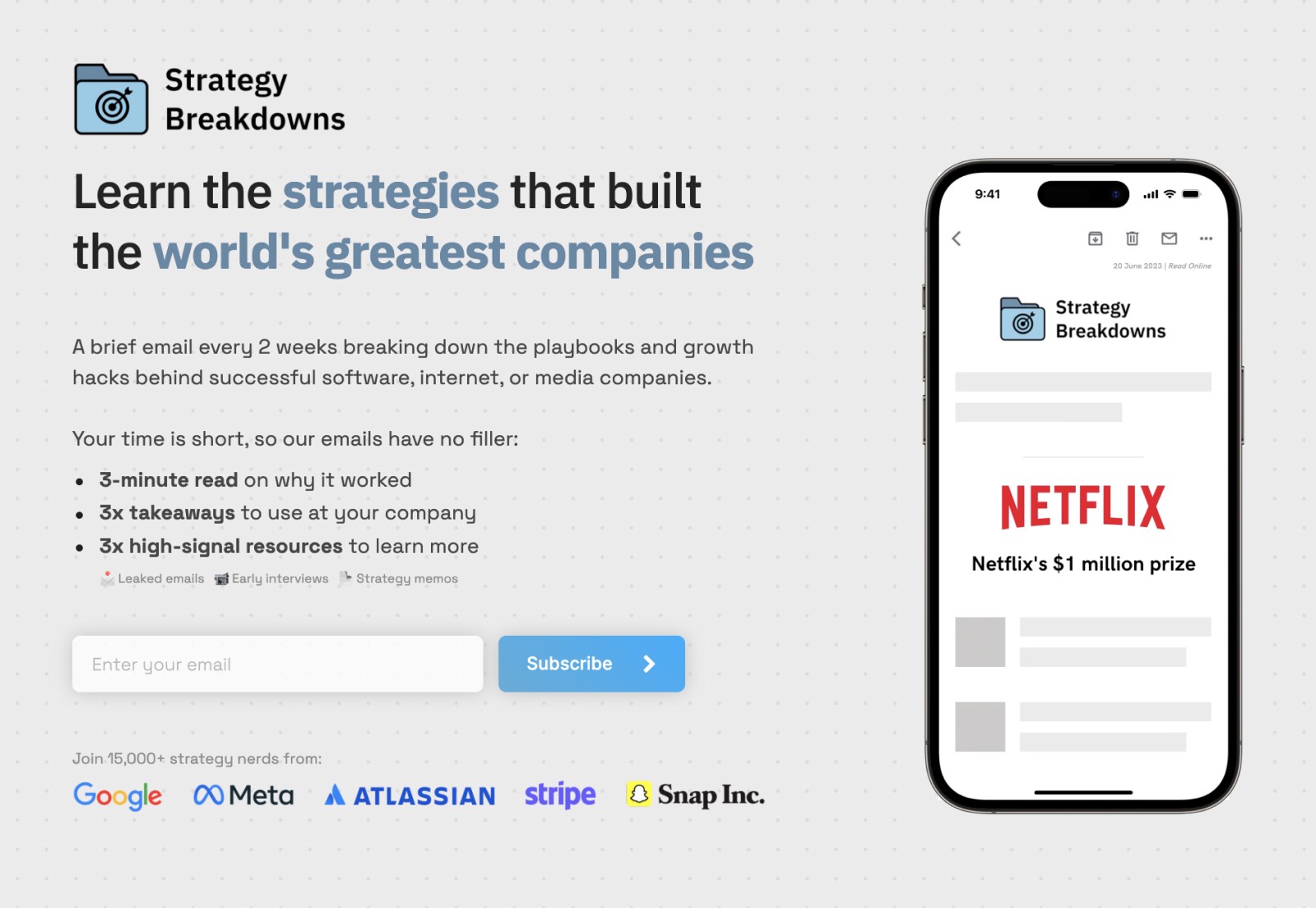
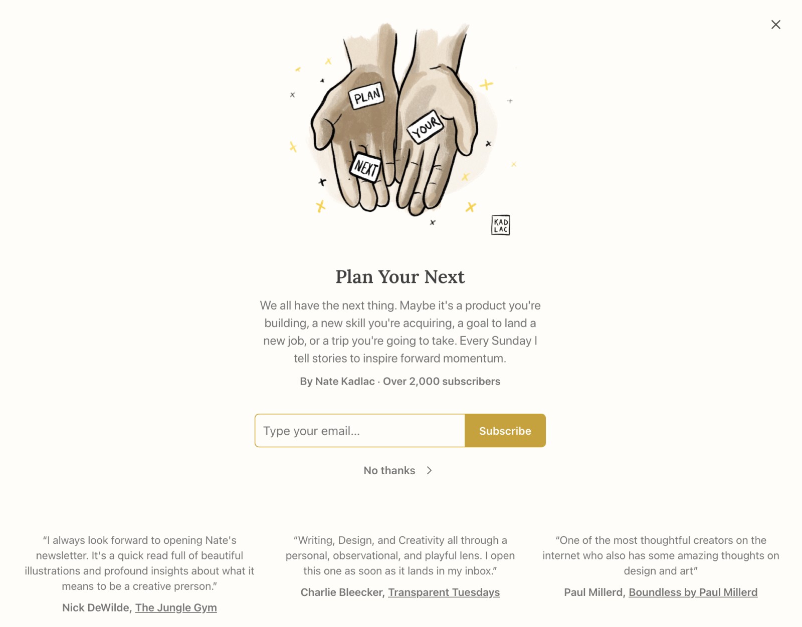
Last week I asked for landing pages from you all, and I'm excited to redesign Reginald's opt-in landing page for his business. If you have one you know should be improved, send it my way and it may make it into a future issue.
Landing Page: Grow your newsletter
Landing pages are magic. With design and persuasive copy, they can transform a skeptic into genuine curiosity within seconds.
Design plays an important role here that I don’t think is talked about enough: Design can build visual trust in milliseconds, while text takes more time to read and be persuaded.
But most people struggle with making smarter design decisions more than they do writing compelling copy.
In fact, if you google how to create landing pages, most will solely talk about how to write them. Focusing only on this aspect leaves out a lot of opportunity to grow your business.
Together, it’s an incredible superpower to be able to mitigate risk and hand hold someone down a page, ultimately proving what you’re able to provide will benefit them in some way.
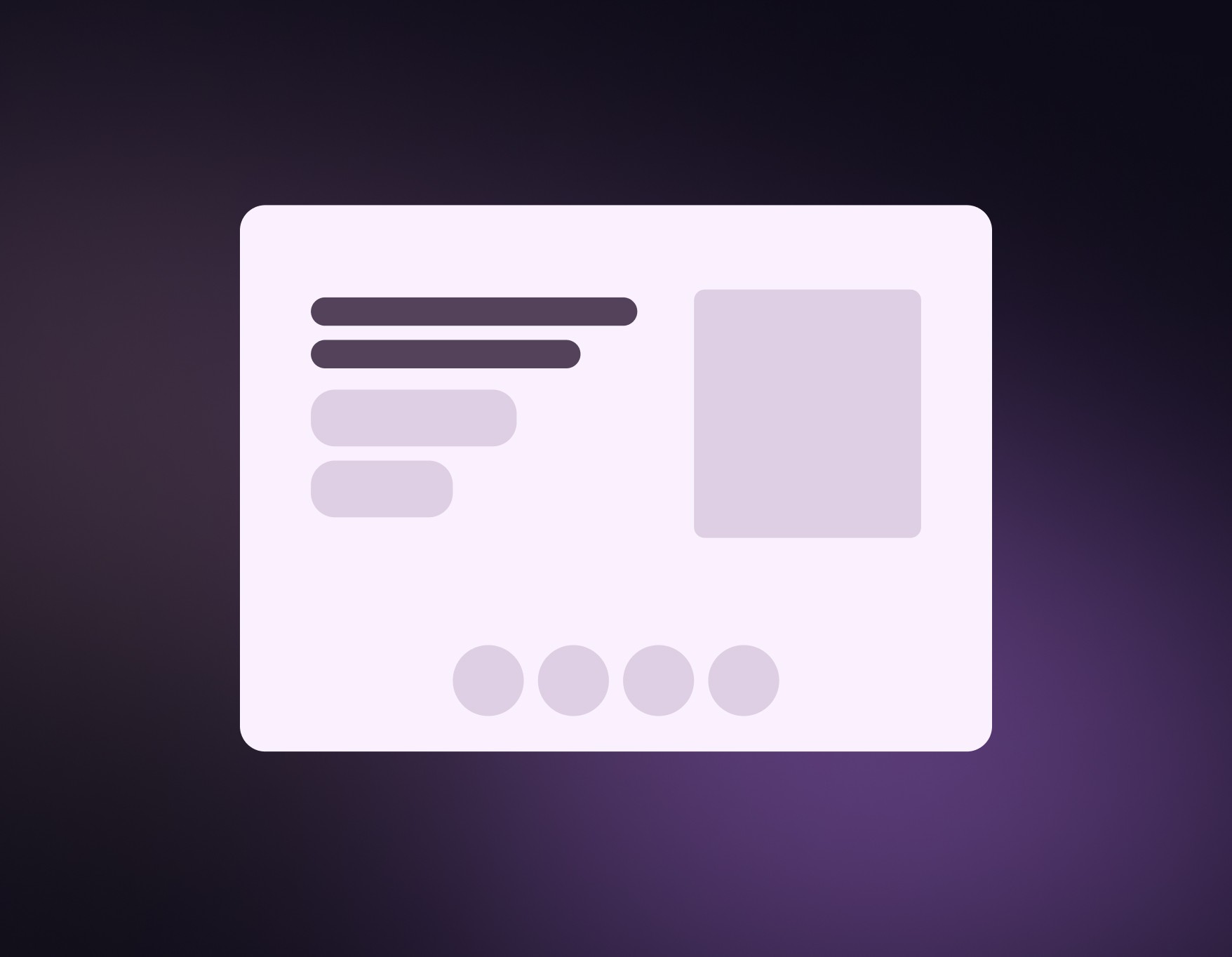
The four main components of a well designed landing page are:
Build trust with strong visuals and design
Grab their attention with a great headline and subhead
Show what’s in it for them
Give them an action to take
Support your claims with proof
A simple rule of thumb: The more you’re asking from someone—time or money—the more you’ll need to do to convince them. (aka a longer page is required to persuade)
(If you want an ever growing library of landing page inspiration, check out my Design Vault)
Let’s explore each of these within the context of a simple newsletter sign up page.

1. Build trust with strong visuals and design
“In a blink of an eye” is a cliche phrase for something that happens fast. A blink happens in a tenth of a second, which is the same amount of time it takes for us to develop a first impression.
Creating the right environment using compelling visuals, backgrounds, consistent color choices, and logical spacing are all key to building trust.
An environment that is not designed for a pleasing and trusting experience will decrease the odds your audience trusts you.
Design tips to build trust:
Use only 1-2 fonts
Use 1-2 brand colors
Showcase the product: Don’t use cheap stock photography
No more than 11-15 words in a single line
Use bullet points to clearly express benefits
Use more padding than you think you need
Don’t center align long paragraphs of text
You can also read about easy design tips more here.
Lastly, create strong visuals of the product itself that are as close to the real thing is where you want to be. Using fancy illustrations that look good, but are confusing, is an easy way to lose the trust and attention of your audience.
2. Grab their attention with a great headline and subhead
“The purpose of the first sentence is to get you to read the second sentence.” —Joseph Sugarman
The headline is the first thing your website visitors will see when they land on your newsletter page. It needs to be bold, assertive, and relevant to your audience's interests.
Your headline should be short, and clear about the value it provides. For a newsletter, you might want to highlight the value you’re delivering every issue.
Your subhead should clearly explain how you’ll create that value. How does your newsletter deliver on the promise made in the headline?
3. Show what’s in it for them
This section How do you deliver the value through the features and benefits of your newsletter? This section is done through explaining what’s in it for them, by using compelling bullet points to create fascinations.
Bullet points are easy to read, and prevent us from talking around the subject.
In design, bullet points are a quick way to drive curiosity and interest.
4. Give them an action to take
One of the most common mistakes with buttons happened when the original iPhone came out. The paradigm to push screens forward and backwards was new, and so many people just labeled the back button “Back.”
This only confuses people, especially if you’re five screens deep into an app. You don’t know what you’re going back to!
The problem behind this is that most people casually use “Learn more” or “Buy Now” without properly describing what is going to happen on the other side.
Clearly label your buttons so the visitor knows what is going to happen without confusion.
5. Support your claims with proof
To wrap up your newsletter landing page, adding some social proof goes a long way to mitigate risk. You can use logos, testimonials, or number of subscribers as a way to show you’re not the first person to sign up. It immediately validates your offer, and makes the decision to opt-in much easier.
In conclusion
The important thing about newsletter landing pages are making it clear, trusted, and simple. These also come in extremely handy on your own personal websites.
By understanding your audience, creating compelling headlines, using captivating visuals, crafting persuasive CTAs, and leveraging social proof, you can effectively capture the attention and interest of potential subscribers.

Join 3,800+ solopreneurs & professionals who are:
Building trust with personalized branding
Increasing sales with premium packaging
Creating clear offers that convert
Get dollar-driven design tips in your inbox 2-3x a week.
More Posts