6 MIN READ
•
Branding
How to create a logo from scratch using a free font


There are a lot of steps between coming up with an idea, then presenting it to the world.
For example, to build a simple website, you have to jump through a blizzard of tiny hoops.
What's the domain name?
Who is going to host my website?
Should you hire a designer and developer? If not, should you use a builder like WordPress, Webflow, Squarespace, or Wix?
Should I save money and choose a template like everyone else or spend a bit more on something from Squarespace? (btw if you don't know me, I'm not a fan of templates)
What colors should I use?
What font should I choose from the drop-down?
...and 100 other steps before you have a chance to sit down and crank out some content
Even if you make it to the end of this long and winding yellow brick road, you might land one last step before you get to enter Oz.
You're exhausted and don't have the design skills to make something from scratch, so you end up doing the easiest thing possible.
You click the dropdown filled with endless fonts, and you look for one that feels familiar. It's a sturdy choice. You've seen it in millions of dropdowns. You don't care it's a Helvetica ripoff by Microsoft who wanted to avoid paying licensing fees in the 90's so they just created their own version.
You're tired, so you type your name out in Arial and call it a day.
You're not alone. I see this happen all the time on thousands of sites. Almost zero effort goes into creating one of the most visible and most clicked-on places of your site.
Does a logo matter?
I'm not here to tell you that a logo is more important than having an interesting story to tell, or that it will help solve why people aren't visiting or buying from you.
But I am saying by putting a small amount of effort into your identity communicates a level of trust and thoughtfulness to your visitors. It signals that you took some effort to make their experience slightly better. It shows that you are someone who cares about the details.
Why spend hundreds of hours building something up you care about, then type out your name in Arial?
3 ways to create a new logo
For the purpose of this guide, we're focusing on creating a logotype. A logotype is a logo that focuses on your name or initials. It doesn't require too much effort, because we're not trying to create a graphic icon.
Examples of logotypes
Approach 1: Your signature is your snowflake
One of the easiest ways to come up with something unique is by using your own signature. Like a snowflake, everyone's natural style is different, so it's immediately going to stand out. This is incredibly easy to do on an iPad with an Apple Pencil, which you can import and size down correctly.
There are many good examples, but popular YouTuber Ali Abdaal uses his own initials for his personal website, which is one of the first things I notice when I visit it. It adds some personality to an otherwise straightforward design.

Using your full name, a nickname, or your initials is all fair game here. Choose something that you can repeat, and make it recognizable and fun. Plus, you saved yourself some cash.
One thing to be careful of is sizing. If your signature or initials aren't legible at small sizes, it might not be legible enough to use. Thankfully, it's easy to get this right.
An example of this is the signature I use for my illustrations. I use just my last name, which was just a sketch I made on the iPad and brought it over to Figma. It's now easy to just layer that on top of my sketches.

How to create a logo from your signature using Figma:
Create a digital version of your signature
iPad: Using an Apple Pencil or your finger, draw your signature on a blank canvas (I prefer Procreate).
Paper: Using a black marker or pen (.05mm or larger), sign your name on a piece of paper and take a photo of it using your phone.
Export a transparent version of your signature.
iPad: Make sure you deselect the background layer, then export the canvas as a transparent PNG file
Paper: You’ll want to remove the white paper background from the signature. Try uploading your file to Remove.bg to get rid of the background. Or, if you’re stuck on this step, send it to me and I’ll help you out.
Open Figma and create a canvas the size of the required dimensions. Drag your file into Figma from your computer, and add your transparent signature file to the artboard. Make sure the signature fills as much of the artboard as possible.
If you find your new signature not fitting the artboard space, you might want to create an alternate version of your logo using your initials, or a different sized version of your signature.
Export your artboard from Figma as a transparent PNG. Now you have your new logo to upload to your site!
Approach 2: Select a typeface not called Arial
Here's where we start to lean on the skills of real designers, even if you're not one. Hell, even designers rely on other designers a lot of the time.
Typography is an art. Designers spend hundreds of hours creating a typeface, so let's use that as a starting point
It might not look like it from afar—especially at 12pt text—but if you get on your hands and knees, you can find ways to connect with its characteristics.
An easy way to start is to decide if you want to use a serif or sans-serif typeface. Serif typefaces have those little ledges that look like you could hang a hat on.
One of the earliest typefaces was created by Nicolas Jenson in 1470. It was the first Roman typeface, which happened to be—you guessed it—a serif font. Because serif fonts have been around forever, they naturally have a historical feel to them. I usually think about the vibe I want a project to take on when making this decision.
Sans-serif typefaces were created much later and therefore take on a more modern aesthetic. Of course, there's nuance here, but choosing a feeling first, is an easy way to go.
A simple question would be, do you find yourself connecting with modern design or traditional design aesthetics? That's up to you how to interpret it, but it's a quick way to filter your search.
Here's what to do next:
Head over to fonts.google.com.
Select either serif or sans-serif from the top-left category dropdown as your starting point. Deselect everything else.
In the sentence field, type your full name.
Enlarge the font pixel size to 200px.
Start to scroll down and look at the large characters closely. Find one that stands out to you and install that onto your computer.
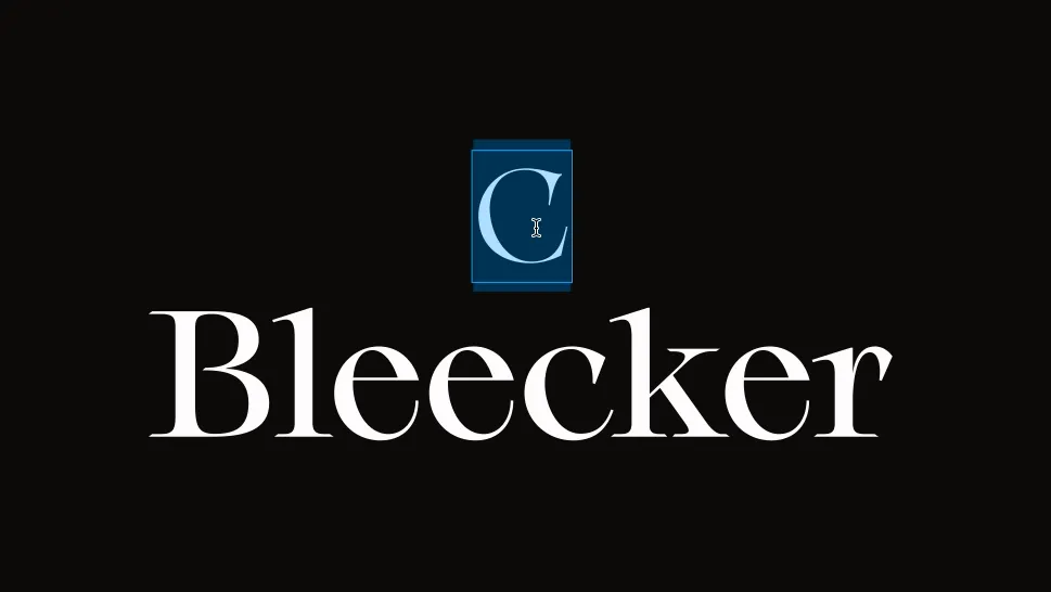
For Charlie Bleecker's site, we found a beautiful-looking serif typeface, because Charlie felt drawn towards a natural and traditional aesthetic. Plus, her love of Harry Potter was hard not to embrace.
From there, we typed it out in Figma and started playing around with some layout options. But because we picked something interesting and unique to start with, we hardly had to modify it.
Approach 3: Modify your typeface
If you found a typeface you like—and it's not Arial—you could take it a bit further than just typing it out.
In Figma, you can turn your letters into shapes. The reason why this is important is that you can modify the sides of a letter as if it's a piece of vector clay.
Figma is free to use, so first, go download the desktop app for Mac or PC.
To create a shape from the text in Figma:
Select your name.
Right-click your name, then choose 'Outline Stroke'.
Double click on your name and you'll see a number of small circles, which are points you can drag, delete, or add to.
Experiment and modify your typeface into something unique.
Outline your text and modify the logo
Try different layouts like stacking it or laying it out horizontally. You might even want a few options if you're going to use it in different places.
You could try changing the weight of your first and last name, use just your initials or even change the color.
There are an infinite number of choices here that beat out typing your name in Arial.
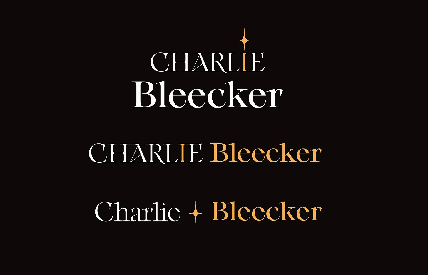
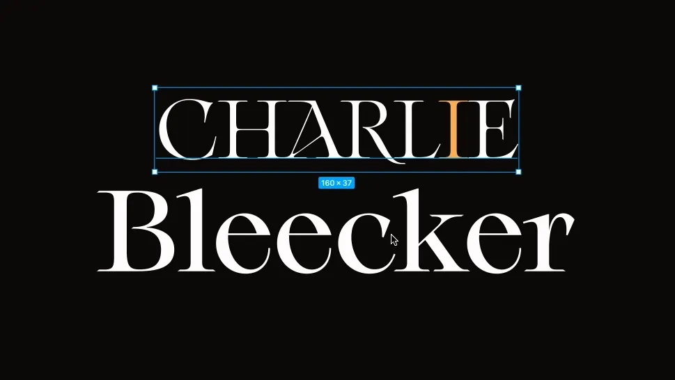
For Charlie's logo, we wanted to make sure her name was legible but included a bit of flair to it. I ended up using a capitalized first name, and a title case last name. I then added a flourish to the 'I' by using an existing shape I found in the typeface itself.
TIP: This is a hidden secret many don't know about. On a mac, you can use Apple's Font Book to view all of the fonts on your computer. By opening it up, designers sometimes add a lot of extra characters or glyphs you can use for icons or in our case, a dot for the letter I. (For your next friendly trivia game, the dot is actually called a tittle.)
We also chose some primary and secondary colors for her site and used that to fill in the tittle sparkle (I'll never get used to that word) so it stood out.
We now created a logo using only the beautiful work of an existing design, and we didn't need to create anything ourselves.
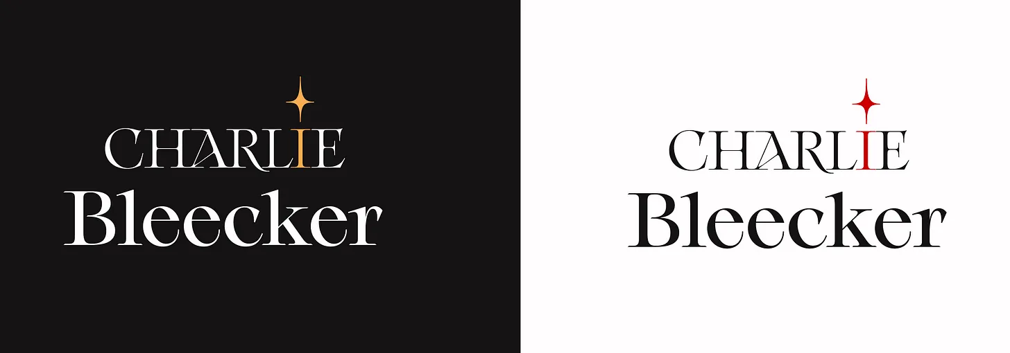
In the end, we designed two stacked variations for both light and dark backgrounds, which you can see on her site here.
We built a beautiful logo that leaned heavily on the work of the original typeface, without having to edit or spend too much time on it overall.
Next time you’re in a hurry to create a logo, please start with something more inspiring than Arial.

Join 3,800+ solopreneurs & professionals who are:
Building trust with personalized branding
Increasing sales with premium packaging
Creating clear offers that convert
Get dollar-driven design tips in your inbox 2-3x a week.
More Posts