8 MIN READ
•
Design
How to design a landing page for a $1,000 product or service
Learn the components of a $1,000 landing page offer


Creating a landing page is like working on a piece of art. You're never really done improving it. Even after designing your landing page, you'll be testing copy, creating new layouts, and finding new ways to add proof that your product or service works.
Don't be scared off by this, but understand that no one knows your business inside and out like you do.
I once spent two hours writing and designing a landing page for a monthly service offering that has generated $15,000 in the past three months.
Being able to write and design your own pages can save you and make you thousands of dollars in keeping them updated over time.
In this last part of my four-part series, I want to focus on $1,000 landing pages, and how to design them effectively.
In case you missed it, here are the other three parts:
Part 3: How to flip a free workshop into an evergreen product landing page
Part 4: You're here!
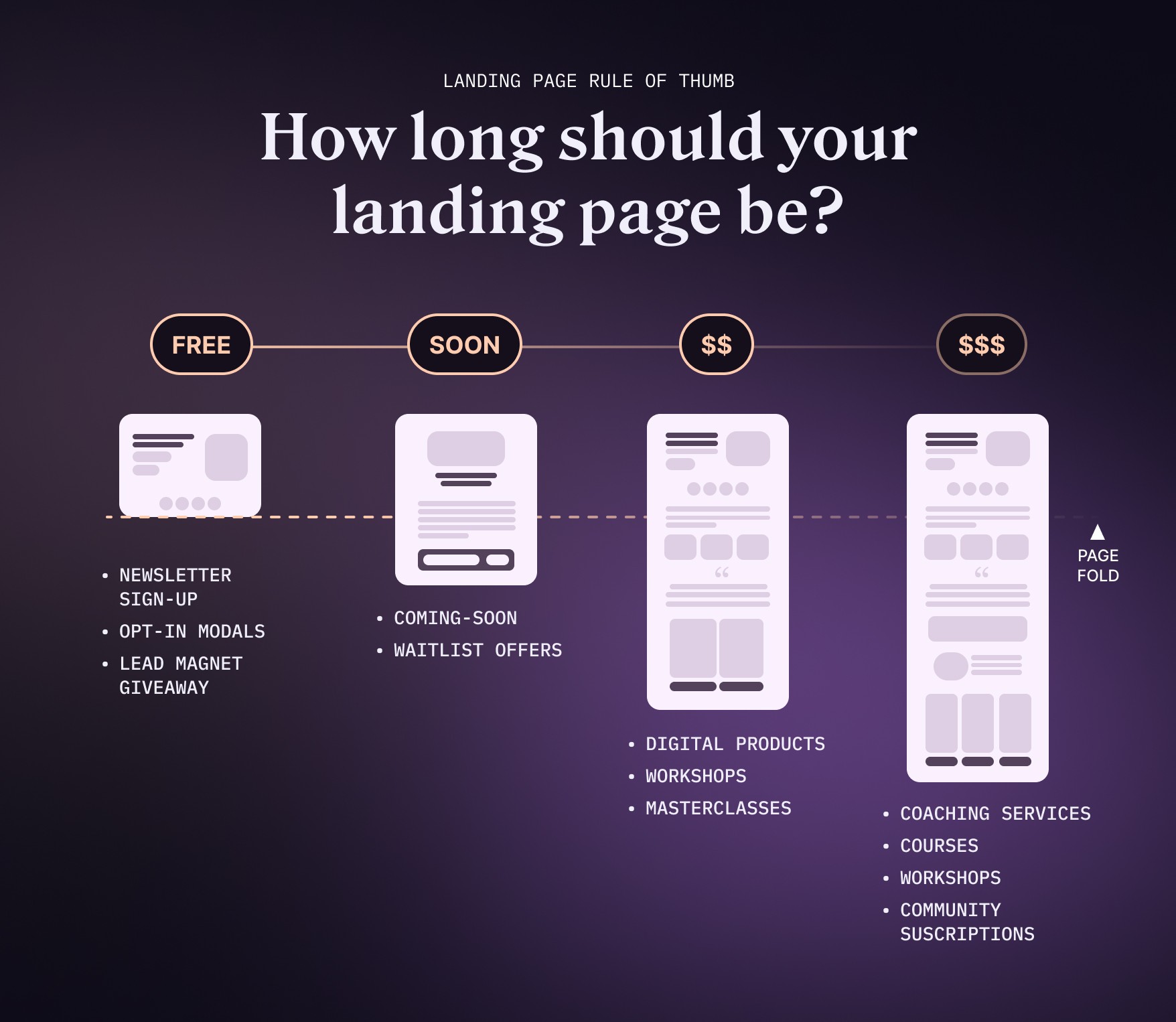
Myths about the length of landing pages
One myth when it comes to landing pages is that people won't spend time reading a lengthy landing page. But in reality, many people landing on your page have a high degree of skepticism. There's little to no trust built up at the outset, and the size of a landing page increases the more you ask of someone, either in time or money.
It takes a different level of persuasion to ask someone for two minutes or two weeks of their time.
The same goes for how much something costs. A $1,000 product requires more trust building to convince someone of the value versus a $25 product.
Be prepared to do some more work.
Quick Summary
Learn the fundamentals of landing page design to maximize conversions.
Target your audience, set clear objectives, and use compelling headlines & visuals for an effective landing page.
Optimize the user experience with responsive design, simplified navigation & strategic layout. Also consider colors, social proof, and scarcity tactics.
The Fundamentals of Landing Page Template
Let's get this straight—a great landing page is not a typical page of your website. It's not your about page, or your home page. It's a specific page targeting a specific audience with a specific problem.
If you have one product that appeals to different types of buyers, it's possible you might have multiple landing pages targeting different buyers.
By examining various landing page design examples, you’ll be able to identify the key components that make a good landing page and learn how to create a landing page that stands out from the crowd.
Understanding the Purpose of a High-Value Landing Page
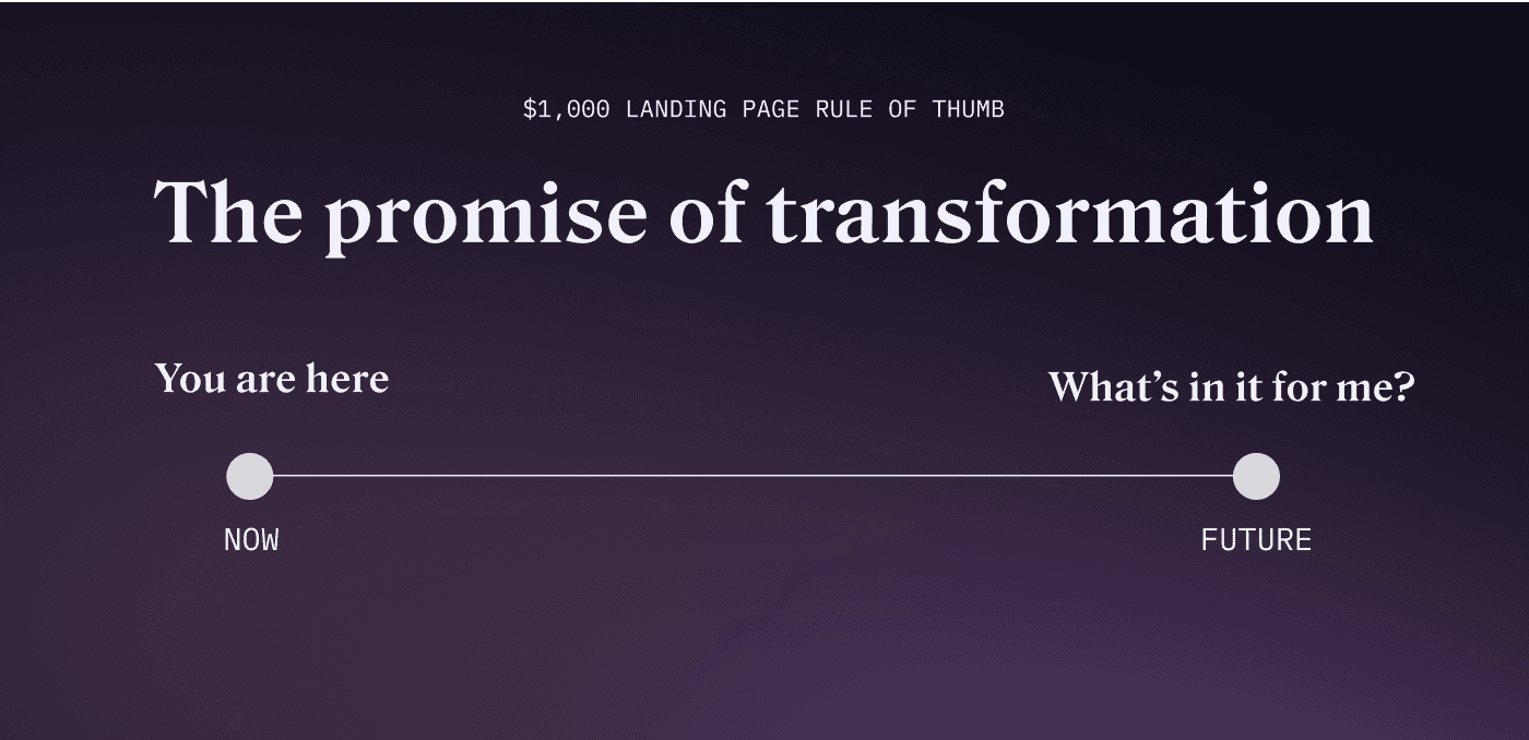
Creating a landing page for a $1,000 product or service offering is not entirely different from designing any other landing page. The principle remains the same — to convert visitors into leads or customers. However, the stakes are higher, which means every detail matters even more. You're not just asking someone to sign up for a free trial, you're persuading them to part with a significant amount of money.
From my experience, when you're dealing with a high-ticket item, there are some additional factors to consider. These include building trust, justifying the high price point, and providing exceptional user experience.
Who's your audience?
Every successful landing page is built with a specific audience in mind. Understanding who you’re targeting is essential for crafting a landing page that speaks to their needs and preferences. To create a landing page that effectively converts visitors, you must first identify your target audience and their pain points, motivations, and desires.
Once you’ve pinpointed your target audience, you can begin choosing landing page design elements that resonate with them. From selecting the perfect hero image to crafting persuasive copy, every aspect of your landing page should be tailored to appeal to your audience. By catering to their unique needs and preferences, you’ll create a strong emotional connection that encourages them to take action, ultimately boosting your conversion rates.
Setting Clear Objectives
Establishing clear objectives for your landing page is vital for guiding its design and content.
With a well-defined goal, you can ensure that each element of your landing page works together cohesively to create a seamless and straightforward user experience. Additionally, setting clear objectives allows you to measure the success of your landing page, enabling you to optimize and improve its performance over time.
A great landing page should have a clear and measurable goal, such as generating leads, increasing sales, or driving traffic to other pages on your website. By keeping your objectives at the forefront of your design process, you’ll create a focused and effective landing page that drives results and helps you achieve your marketing goals. Creating landing pages with these principles in mind will ensure a great landing experience for your visitors.
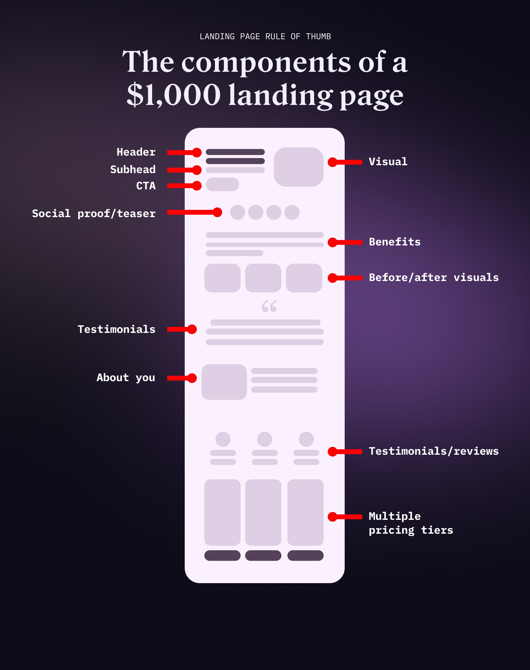
Key Components of a Landing Page
Now that we’ve covered the fundamentals, let’s explore the essential elements that make up a high-converting landing page. From compelling headlines and engaging visuals to persuasive copy and effective calls to action, each component plays a crucial role in captivating your audience and guiding them towards taking the desired action.
By mastering these key components and learning how to optimize landing pages, you’ll be well on your way to designing a landing page that consistently achieves exceptional conversion rates.
Nod Your Head-Lines
The entire goal of the headline is to get someone to nod their head. If you don't drive curiosity immediately, or speak to a specific need, you'll lose them.
To create an attention-grabbing headline, focus on addressing your audience’s pain points and highlighting the benefits of your offer.
Let them know in as few words as possible, what's in it for them. Avoid using jargon or complex language that may confuse or alienate your audience. Instead, opt for simple, straightforward language that resonates with your audience and encourages them to engage with your landing page.
Remember, you only have a few seconds to make an impression, so make every word count.
“On the average, five times as many people read the headline as read the body copy. When you have written your headline, you have spent eighty cents out of your dollar.”—David Ogilvy
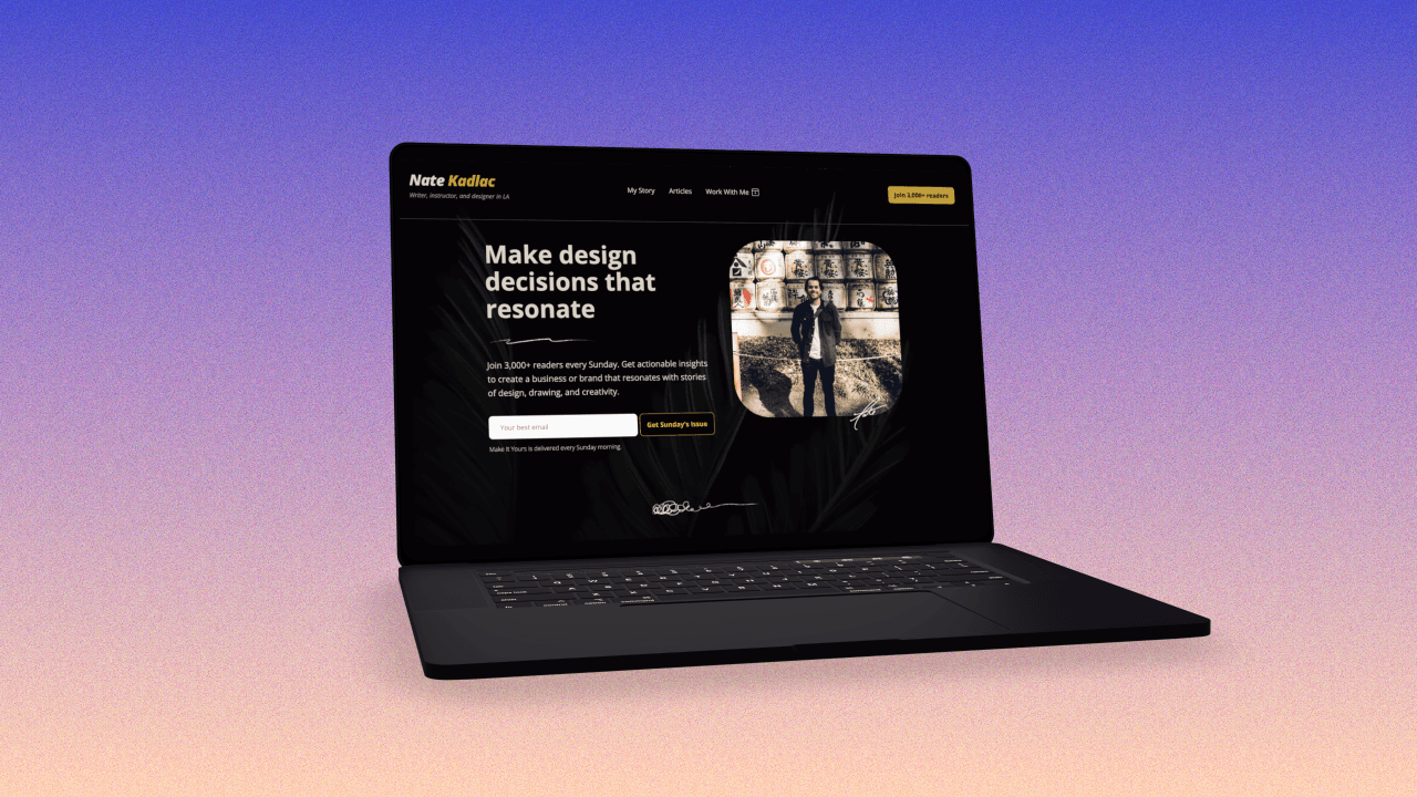
Engaging Visuals
Persuasive visuals are fundamental to setting up a buying experience. They build trust, without saying a word. They're also overlooked because many people don't consider themselves a designer. But often choosing templated diagrams or stock icons do more to hurt your brand than help it.
Stay away from using anything stock photo related for your landing page. If you're selling software, use images of the interface or actual images of the product. Even hand-drawn doodles can stand out and not look like anything out there.
If you're offering a service, show graphs of results-based outcomes, or high-fidelity photos of yourself if you're trying to establish a personal connection.
When choosing visuals for your landing pages, consider your target audience’s preferences and choose images that evoke the emotions you want them to feel.
Lastly, ensure your visuals are optimized for both desktop and mobile devices to provide a seamless experience for all users, regardless of their preferred browsing method.
Persuasive Copy
The copy on your landing page should be clear, concise, and persuasive.
It needs to highlight the benefits of your offer, address any potential objections, and guide visitors toward taking action. To create persuasive copy, focus on your target audience’s pain points and desires, and demonstrate how your product or service can provide a solution.
For example, I will take exact quotes I have heard from past clients or any incoming questions from potential leads. These questions or struggles can sometimes be used word-for-word in your landing pages, because of their plain-spoken nature. They might also be phrased in language you never would have thought of.
Here are a few tips I have come across:
Lead with a story or hook
Keep paragraphs short and easy to read
Use bullet points or numbered lists to break up large blocks of text
Use testimonials or results-based outcomes to prove value
Emphasize key points with bold or italicized text
Emphasis quotes with large font-sizes paired with images of real people
By making your copy easily digestible and engaging, you’ll encourage visitors to read through your content and ultimately take the desired action.
Effective Calls to Action
The call to action (CTA) is a crucial component of any great landing page. It’s the element that guides your visitors towards completing the desired action, whether that’s signing up for a newsletter, downloading a resource, or making a purchase. To create an effective CTA, focus on making it visually appealing and easy to spot.
Stay away from words like, "Buy Now" or "Learn More" as they are ambiguous and tend to
Choose a contrasting color for your CTA button that stands out against the background and draws the eye. Additionally, use clear, action-oriented language that tells visitors exactly what they need to do. By designing a standout CTA that catches the eye and communicates a clear message, you’ll increase the likelihood of your visitors taking the desired action, ultimately boosting your conversion rates.
Design Strategies for Optimized User Experience
An optimized user experience is critical for a successful landing page. By implementing responsive design, simplified navigation, and strategic landing page layout, you can create a seamless and enjoyable experience for your visitors, increasing the chances of them converting.
In this section, we’ll explore each of these design strategies and discuss how they can be applied to your landing page to enhance the user experience and improve conversions.
Branding and Landing Page Layout
Many non-designers start off with a blank landing page template, and slowly fill in the content and call it a day.
While there is some merit to the simplicity of how landing pages can be laid out, too many landing pages look identical. Creating something visually appealing is like saying, "I'm worth listening to because I don't look like everyone else."
Make sure you're using the exact brand colors of your company, and creating an experience that feels consistent and flawless compared to your other pages. Sometimes the design of landing pages is done in a different product, so you need to put a little extra effort into tailoring it to your look and feel.
Here are a few guidelines to remember when designing:
Use the same fonts as the rest of your online materials
Use the same primary, secondary, and CTA colors
Mix up the layout with one, two or three-column variations
For body text, use 140-150% leading to increase legibility
Responsive Design
Imagine this - you've spent countless hours perfecting your landing page only to find out it's not accessible or visually appealing on all devices. In this digital era, it's paramount to ensure your landing page is as responsive as it is captivating. Wondering what responsive design is? It's a technique that makes your landing page adjust its layout and elements to fit the screen size of any device it's being viewed on. It's like having a personal tailor for your landing page, ensuring it's always the perfect fit, whether on a desktop, tablet, or mobile device.
But why should you care about responsive design? For starters, it enhances your users' experience. No one enjoys squinting at a screen or scrolling endlessly to read content. Plus, it gives your landing page a boost in the eyes of search engines like Google. They have a soft spot for mobile-friendly websites and often prioritize them in search results. So a responsive landing page is like a double whammy - it not only improves your users' experience but also aids in search engine optimization, driving more traffic your way.
What's the endgame, you ask? By making your landing page accessible to everyone, irrespective of their device, you’re not just opening your door to a broader audience but also maximizing its potential to generate leads and convert visitors into customers.
Here are some tips for mobile responsiveness:
Minimum body text sizes should be 16px
Padding on the sides should be a minimum of 10px, but I opt for 16px
Vertical padding between elements should be 32px or more
A clear visual hierarchy between font sizes of H1, H2, H3 and body text
Simplified Navigation
I don't always recommend removing the navigation of your landing pages, but if you're testing bounce rates and looking to improve time on page, you could try removing them if the incoming traffic is paid acquisition.
But if you're linking to the page from your website, I tend to leave the navigation in place so they don't feel lost.
But, eliminating unnecessary navigation elements and focusing on the primary goal, you can minimize distractions and guide your visitors’ attention to the most important aspects of your page. This can include removing headers, footers, or navigation links to other pages.
Everything should be tested, and so I wouldn't remove key elements of a page without understanding the impact of the decision.
Strategic Layout
Organizing your landing page content strategically can have a significant impact on the user experience and your conversion rates. By applying proven techniques like F and Z-shaped patterns, you can guide your visitors’ attention to the most important elements of your page, such as headlines, visuals, and CTAs. These patterns are based on how people naturally scan web pages and can help you create a visually appealing and intuitive layout.
An F-shaped pattern directs the user’s gaze across the top of the page, then down the left side, while a Z-shaped pattern leads the eye from the top left to the top right, then diagonally to the bottom left, and finally across the bottom right. By arranging your content using these patterns, you can create a clear visual hierarchy that guides your visitors’ attention and encourages them to take the desired action, ultimately improving your conversion rates.
Psychological Factors in Landing Page Design
In addition to design strategies, understanding the psychological factors that influence visitor behavior can also help improve your landing page’s effectiveness. By leveraging social proof, and scarcity, you can influence your visitors’ emotions and decision-making processes, ultimately increasing conversions.
Let’s delve into each of these psychological factors and explore how they can be applied to your landing page design.
Social Proof
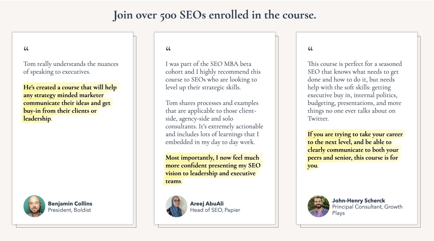
SEO MBA by Tom Critchlow
Social proof is a powerful psychological principle that can help build trust and credibility with your audience. By incorporating testimonials, reviews, and endorsements on your landing page, you can demonstrate the value of your product or service and reassure potential customers of its quality. Social proof can come in various forms, such as customer testimonials, star ratings, or even logos of well-known clients or partners.
When adding social proof to your landing page, aim to select genuine and relatable testimonials that highlight the benefits of your product or service. Place these testimonials near your call to action to bolster your messaging and provide assurance to potential customers. By leveraging social proof, you can establish trust with your visitors and increase the likelihood of them converting into customers.
Scarcity and Urgency
Creating a sense of scarcity and urgency on your landing page can encourage visitors to take action quickly, as they may perceive that time or availability is limited. You can create this sense of urgency by incorporating limited-time offers, countdown timers, or messaging that emphasizes the limited availability of your product or service.
Scarcity and urgency tactics can be powerful motivators for visitors who are on the fence about making a purchase or taking action. By prompting visitors to act fast or risk missing out, you can capitalize on their fear of missing out (FOMO) and drive higher conversions.
However, it’s essential to use these tactics ethically and accurately represent the availability of your offer to maintain your credibility and customer trust.
Pricing
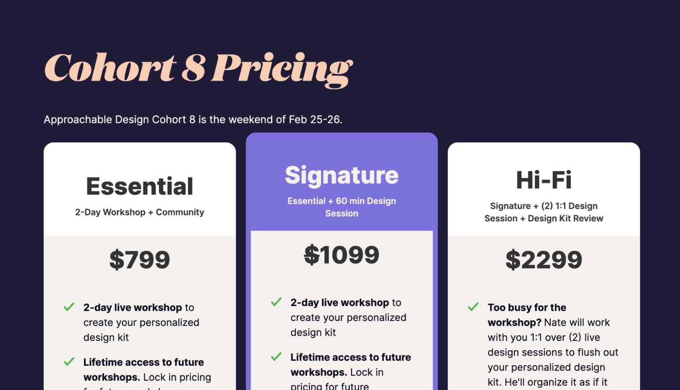
A good strategy for pricing is to always give your customers a choice. Instead of leading with just one option, offer an additional one or two tiers to help price anchor the most valuable offer.
In my own workshop, I'll provide more 1:1 support at the $2k price, and it has been purchased multiple times during several of my cohorts, because of the 80/20 rule at play.
There's a great video on the $2,700 Espresso Machine principle stating that for every customer that purchases, 20% of those customers are willing to spend 4x the smallest amount.
So if you have 1,000 customer paying $5, 200 of those are willing to pay $20. 40 of those are willing to pay $80. 8 of those are willing to spend $320. And so on. Keep this in mind when setting your own prices.
Testing and Optimizing Your Landing Page
Continuous improvement is the key to maximizing the effectiveness of your landing page. By regularly testing and optimizing your landing page through A/B testing, tracking key metrics, and following an iterative design process, you can refine your design and content to better serve your audience and achieve your desired goals.
Let’s explore each of these methods for testing and optimizing your landing page.
A/B Testing
A/B testing is a powerful method for comparing different variations of your landing page to determine which elements perform best and drive higher conversions. This can involve testing variations of headlines, visuals, copy, or calls to action to see which version resonates more with your audience and achieves better results. By conducting A/B tests, you can make data-driven decisions about your landing page design and optimize its performance.
To conduct an A/B test, you’ll need to create two versions of your landing page, each with a different variation of the element you’re testing. Then, you’ll direct equal traffic to both versions and compare their performance based on key metrics, such as conversion rate or time spent on the page. By analyzing the results of your A/B tests, you can identify which variations are most effective and make informed decisions about your landing page design.
Tracking Key Metrics
Monitoring important metrics is essential for understanding the performance of your landing page and identifying areas for improvement. Key metrics to track include page visits, bounce rate, and conversion rate. These metrics can provide valuable insights into how visitors are interacting with your landing page, and whether they’re taking the desired action.
By tracking key metrics, you can identify trends and patterns in user behavior, as well as pinpoint any areas where visitors may be dropping off or experiencing difficulty. This information can help guide your optimization efforts, enabling you to make targeted improvements to your landing page design and content.
Regular monitoring and analyzing your key metrics will ensure that your landing page remains effective and continues to drive results for your business.
Iterative Design Process
An iterative design process involves regularly updating and refining your landing page based on data-driven insights and user feedback. This approach allows you to make gradual improvements to your landing page, ensuring that it continues to meet the needs of your audience and achieve your desired goals. By following an iterative design process, you can create a landing page that evolves with your audience and remains effective over time.
To implement an iterative design process, start by gathering user feedback and analyzing your key metrics to identify areas for improvement. Then, make targeted updates to your design and content based on these insights, and continue to gather feedback and analyze your metrics. By repeating this process, you’ll be able to continuously optimize your landing page and ensure that it remains an effective marketing tool for your business.
Summary
Designing a great landing page in 2023 requires a deep understanding of your target audience, a keen eye for design, and the ability to leverage psychological factors to influence visitor behavior. By mastering the fundamentals, optimizing key components, implementing user experience strategies, and continuously testing and refining your landing page, you can create a powerful marketing tool that drives results and helps you achieve your goals. Embrace the power of cutting-edge landing page design and unlock the potential of your online marketing efforts.
Frequently Asked Questions
How should landing pages be designed?
Landing pages should be designed with a clear and focused layout, highlighting important elements such as the headline, copy, and call-to-action. Structuring the page in an organized manner will help guide the users’ attention and create value and a sense of urgency.
I also tend to design my landing pages in Figma first, so I can get a feel for how the design of a page interacts with the copy. it's a quick way to get feedback before spending dozens of hours developing the page.
How to create a landing page?
Creating a landing page doesn’t have to be difficult or complicated; just follow these 9 steps:
What is your campaign goal?
Define your audience and their goals
Write clear headlines that speak to the outcome
Write subheads and supporting bullet points
Create an irresistible offer
Use visuals like before and after imagery, or product shots
Gather social proof and testimonials that speak to the transformation
Add multiple pricing tiers
Add branding elements
Add tracking
What are the essential components of a great landing page?
Compelling headlines, engaging visuals, persuasive copy, and effective calls to action are essential components of a high-converting landing page.
These elements must work together to create an experience that encourages visitors to take the desired action.
When crafting a landing page, it’s important to consider the user’s journey and how each element can help guide them.
How can I create a sense of urgency on my landing page?
Create a sense of urgency by incorporating limited-time offers, countdown timers, or messaging that emphasize limited availability.
This can help to encourage customers to take action quickly and make a purchase.
What is the benefit of using color psychology in landing page design?
Personally, I ignore color psychology for landing pages.
Does it exist? Yes. But unless you're immersed in a store or at a restaurant, I don't believe you need to spend time thinking about color psychology. Instead, invest that time into creating an experience that uses consistent colors from the rest of your brand.
Instead, focus on using high-contrast colors that are clear, readable, and legible. Don't create a design that looks tacky. Color doesn't persuade, on a web page, well-written copy will.

Join 3,800+ solopreneurs & professionals who are:
Building trust with personalized branding
Increasing sales with premium packaging
Creating clear offers that convert
Get dollar-driven design tips in your inbox 2-3x a week.
More Posts