7 MIN READ
•
Design
How to improve your Google Docs writing experience
Take your Google Docs from, "OMG, I'm going blind!" to a Zen like experience


A simple book is the perfect example of great design.
Books have existed for thousands of years—and while there are jerks like me who like the convenience of a Kindle—nothing beats the design details of a book.
What makes it so resilient is the intentional typesetting, the space of the side margins for your precious fingers, the evenly spaced leading between lines, the left-aligned text, the color and texture of the printed paper, and a glass of cabernet just within arms reach.
That last part might be just me.
Do you know what’s not enjoyable? Reading a Google Doc on a bright laptop screen using its default settings while it pokes its googly fingers into your eyes.
Printed books have been doing something right for over a thousand years. So today, we’re going to make the internet a little bit cozier by making our Google Docs less traumatic.
These next few minutes could change your life. (And mine if you ever share a doc with me!)
Here’s a quick breakdown:
Remove page breaks
Change the background color to anything except pure white
Choose different fonts (optional if you hate nice things)
Update your font colors
Set defaults so you never need to do this twice (unless you’re a masochist)
Skip the article and grab my Google Docs template here
1. Remove page breaks
Page breaks are for those who either need to use a fax machine or if you’re trying to make an office memo look a little longer than it is.
It’s like a fifth grader bumping up the font size to turn a two-page homework assignment into a four-banger, but for an insecure middle manager who wants to look smart.
Now imagine what might happen when you let things breathe a bit. Heaven’s gates are pushed open, angels rejoice in unison, and all the ice cream pint lids at Jeni’s suddenly pop off. (It’s a California thing)
But seriously, spacing is everything when it comes to being a good steward of design. Open things up a bit, take a sip of your Cabernet, and prance blissfully while using infinite scroll.
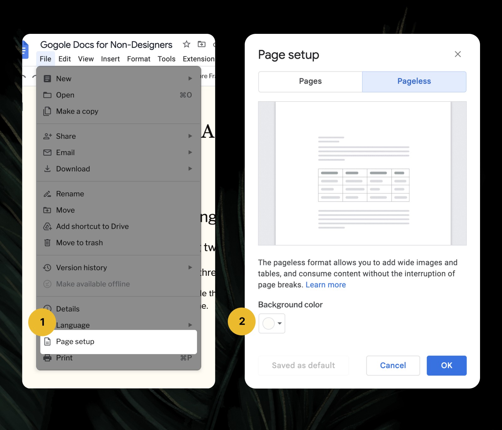
To turn on pageless viewing, navigate here:
→ File > Page Setup > Select the tab labeled Pageless
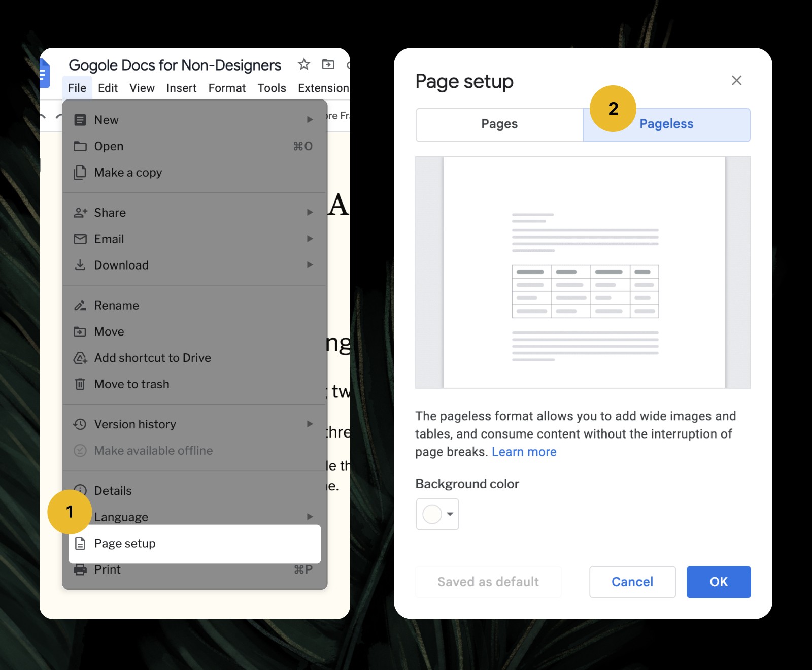
File > Page Setup > Pageless View
2. Change the background color to anything except bright white
Now, if we just stopped after step one, the entire internet might let out a big sigh. But we’re not done.
There’s one thing you need to know about pure black and white: they’re the most intense colors you can use together. They’re also used out of pure laziness because they’re default settings no one wants to change. They’re also used explicitly by luxury brands like Prada or Gucci when they need your immediate attention to spend thousands of dollars on a handbag.
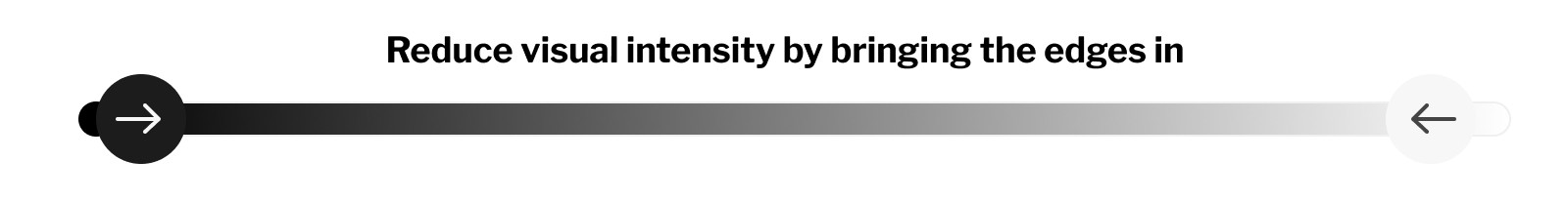
But we’re just trying to give your colleagues and readers a more pleasant reading experience—not sell thousand-dollar heels—so let’s soften it up a bit.
I’m going to give you a nice off-white sandy beachy color to use, which takes the edge off a bit. It’s going to feel like a soft piece of paper lit by an old gold-plated 40w desk lamp. You can always change this up later.
Head to the same place as the last step.
→ File > Page Setup > Background color
File > Page Setup > Background Color
Background Color > Custom HEX Value
Now that you’re here, click on the color swatch labeled "Background color.”
Next, under “Custom,” click on the “+” sign and then paste this hex value into the field. Don’t worry about adding in the # symbol.
→ Add this color value in the field: FFFCF2
You can change this to anything you want, but let’s just start with this sandy beach vibe background for now.
It may take a second for the shock to wear off, but give it a moment. Your eyes will adjust and you’ll never want to go back the next time you’ve shared a default Google-themed document.
3. Choose different fonts (optional if you hate nice things)
Now we’re getting our hands dirty.
You might be thinking to yourself, changing the font is a waste of time. But I’d love for you to experiment and pick one that you love to see.
It’s easier to tell you what not to do, instead of the many things you can do. So follow a few tips below for picking fonts quickly.
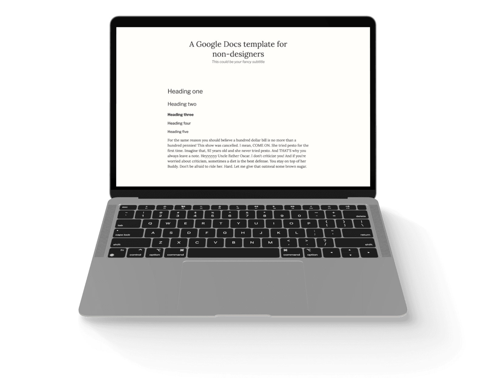
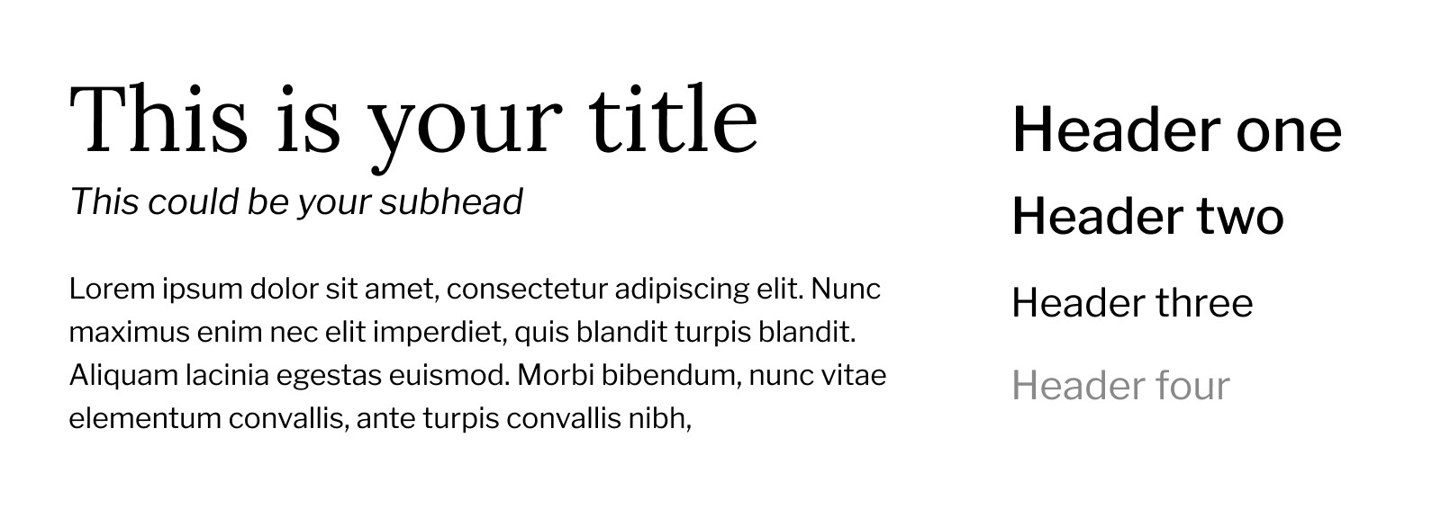
But first, just set up your Google Doc with a title, headers (1-4), subtitle, and normal text. You’ll want to see these side by side when making your text decisions. Here’s a starting template for you to use. (File > Make a Copy before editing please!)
Don’t make these mistakes:
Never use more than two typefaces unless you want to make things difficult for yourself. And really, most of you can stick with one font that has multiple styles.
Don’t use two different sans-serif fonts, like Helvetica and Arial. Just pick one and use different sizes or weights to differentiate between them.
Similarly, don’t use two different serif fonts like Georgia and Source Serif Pro. Just pick one and use different weights and font sizes for your normal or header text.
If you want to get fancy, do this:
Choose a serif font and a sans-serif font. Choose one to use for your headers and one to use for your normal text. (Like Montserrat for your headers and Lora for your normal text) The natural contrast between them will increase the visual intrigue, making for a more interesting vibe.
You can flip these around to your liking, but just use one for your normal text, and one for all of your titles and headers.
Use different weights like regular, semi-bold, bold to increase the visual interest in your text without using different fonts.
Apply your new font selections
First, I’ll add a few pieces of text to a document to cover my immediate bases. (Use this document as a starting point.)
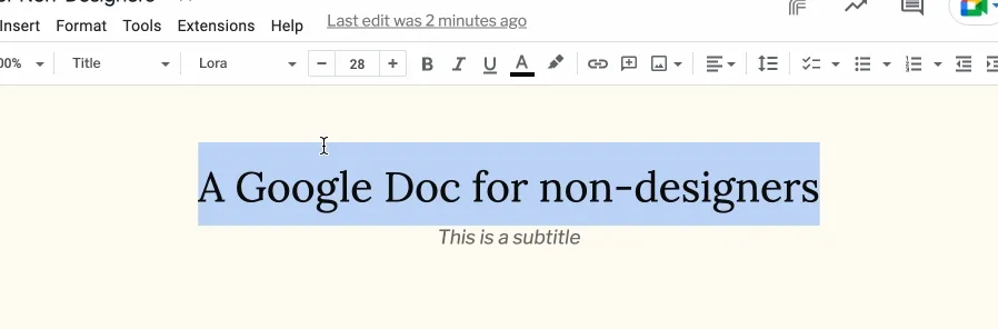
Select the modified text. In this example, I’ve highlighted the text for the title of the document.
Then select the Style dropdown and select “Update Title to match”
Now do the same for the title, headers (1-5), subtitle, and normal text options.
Update your font styles to match
4. Update your font colors
This might be going overkill, but similar to adjusting the pure white background, we’re going to adjust the color of our pure black text.
Head to your text color icon and click the + icon under “custom.”
→ Type in this HEX value: 0D0C0A
This softens the text just slightly so it’s not stark black, and will give us a more pleasant reading experience.
5. Set defaults so you never need to do this twice (unless you’re a masochist)
Ok, that was a bit of work. But thankfully, you’ll never need to make these changes again. How?
Google built in a feature that lets us save our page and text settings for next time. Here are two things you need to do:
→ Save your page settings:
File > Page Setup > Set as Default
→ Save your text styles:
Format > Paragraph Styles > Options > Save as my default styles
Stand out with your own visual style
I hope that was painless, but if you found yourself giving up in the end, you can download the Google Docs template for yourself. Just be sure to save the styles as your default from Step five.
Making a few design decisions in your everyday life goes a long way to improving how you show up in the world.
If you’re curious about how to make better design decisions for you or your business, my 2-day Approachable Design workshop is coming up in a month, and you can get on the waitlist here.

Join 3,800+ solopreneurs & professionals who are:
Building trust with personalized branding
Increasing sales with premium packaging
Creating clear offers that convert
Get dollar-driven design tips in your inbox 2-3x a week.
More Posts