5 MIN READ
•
Design
Fresh Sheets for your spreadsheets
A non-designers guide to upgrading your Google Sheets spreadsheets


It’s a Friday night with a glass of boxed cabernet in hand—and like most people—I’m searching “How to make your Google sheets look better.”
The first two results are YouTube videos and this is what passes as being acceptable examples of well-designed Google Sheets:
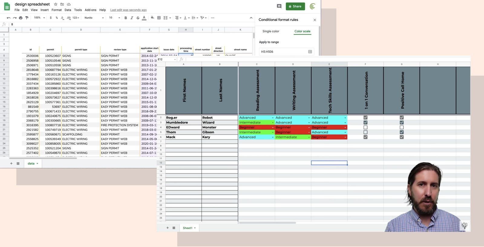
In case I’m being too subtle, these are not well-designed!
Nothing against what these people view as acceptable, but if you decide that vertically aligned text, low-contrast backgrounds, and brightly colored cells with unreadable text are what people enjoy looking at; many thoughts and prayers.
But, don’t lose hope.
The one common mistake non-designers make when trying to design, is to overdesign. One bad decision leads to a worse one to make up for it. Ultimately you’re left with a color palette the Joker might find provoking.
So here are a few ways you can help bring a bit of subtle personality and organization to your Google Sheets without relying on abysmal color decisions and type choices.
1. Future proofing your fresh sheets
It’s much easier to start from a new spreadsheet than to alter an existing one. While this isn’t as helpful for you to if you want to modify the one you’re currently using, reversing design decisions is always a bit more tricky because I’m lacking the context in which it was built.
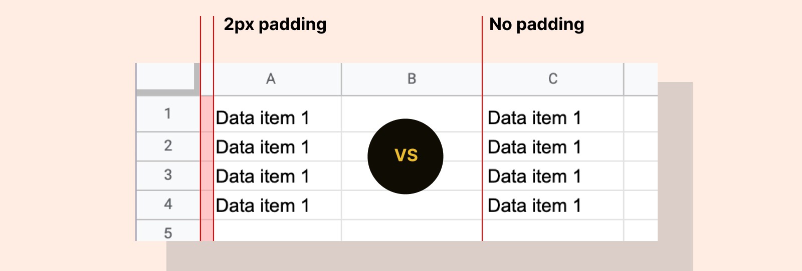
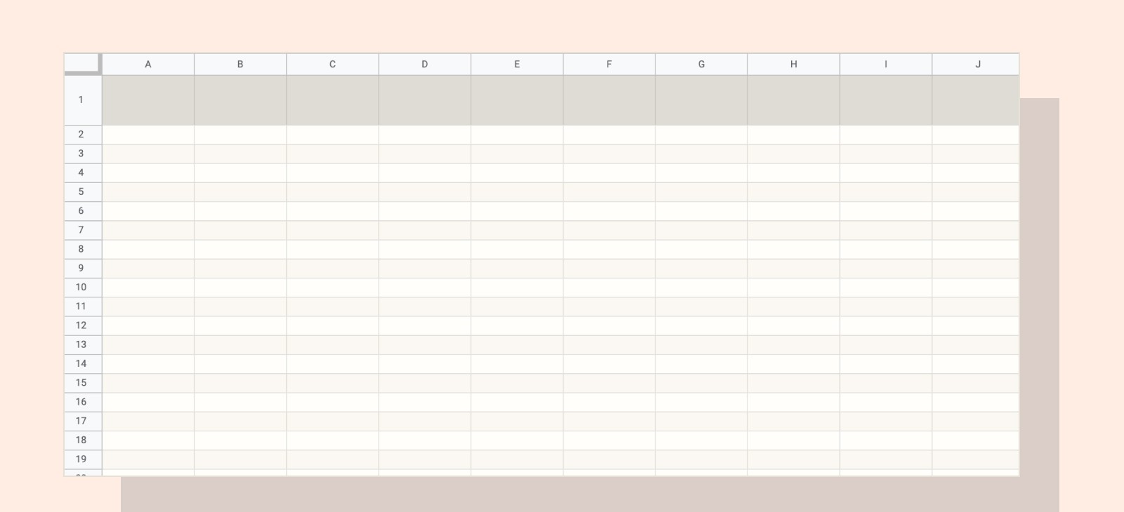
With that, the main thing almost every non-designer gets wrong is not adding enough spacing. (Or padding, in this case).
Most likely if something is tough to read, or an online form looks too squished, it’s because there’s not enough spacing around the letters, between the sentences, around the form fields, and almost every other element.
Even bad restaurant menus lack good spacing. (Badly formatted menus when I’m hangry is not a great combo for a designer.)
How do you add spacing in Google Sheets?
I will usually add two spaces of padding to the left of each cell. This helps to give the text some breathing room around the text, especially if you end up using background colors later on. (Which we will)
To do this, open up the Custom Number Format menu:
→ Select all cells > Format > Number > Custom Number Format
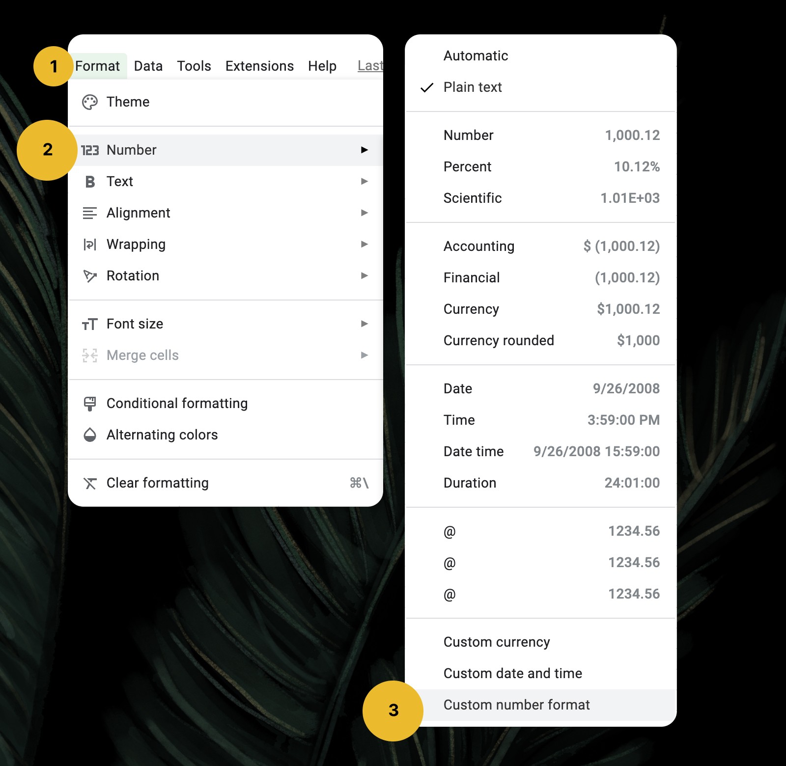

Once you have this menu open, you’ll want to type, [space][space]@, then click Apply.
It feels a bit hacky, but what you’re doing is adding two spaces to the left of each cell that is selected. The “@” symbol represents the cell itself.
If you want to add padding to both the left and right sides, you would type, [space][space]@[space][space]. I don’t do this myself though because we’re usually dealing with fixed-width columns.
2. Setting up our color scheme
Almost no one takes the time to set up their Google Docs or Sheets files, so it’s easy to make a good first impression.
By setting up a few subtle color choices for each document, how we show up in the world is immediately projected.
I remember the moment when Tom Critchlow shared his Google Doc with me to collaborate on, and I just thought, "he gets it."
Imagine what spreadsheets might look like from some major brands. These are not complicated or overly designed choices.
Now, what might your own fresh sheets look like?
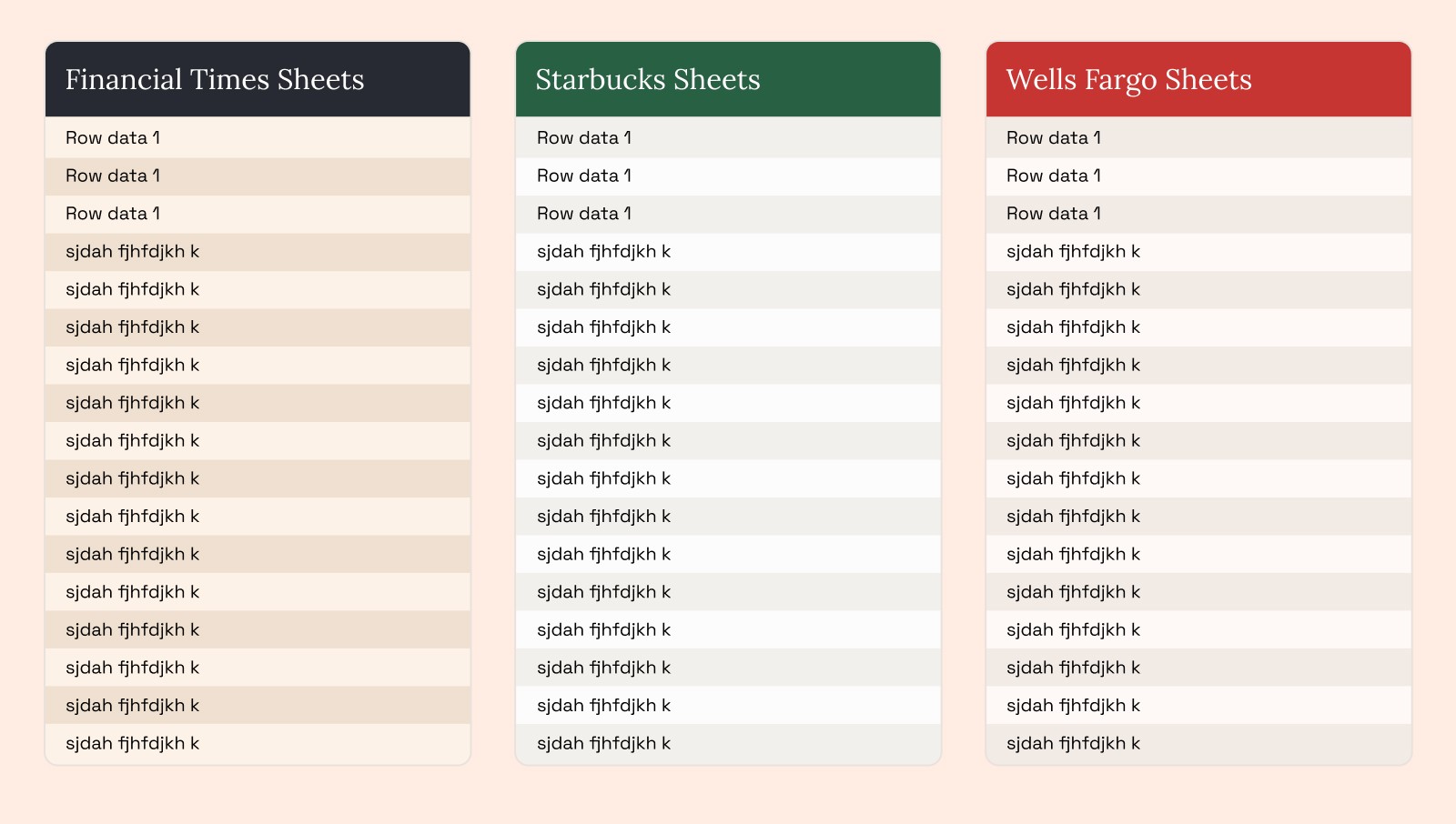
Here’s how I think about picking color schemes for spreadsheets:
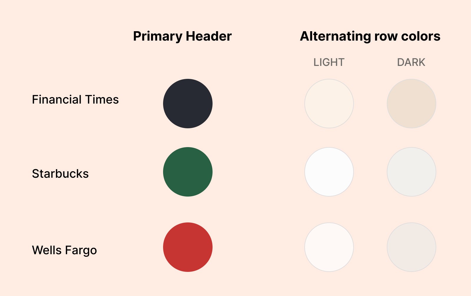
You’ll want to choose a primary color—used for headers—then pick two alternating row colors that pull from the same color (or hue), with slight differentiation in tint and shade.
Even though we’re using dark headers above, I prefer to keep mine on the lighter side so I don’t need to also change text colors based on the background.
How to set your custom sheets styles
→ Format > Alternating Colors
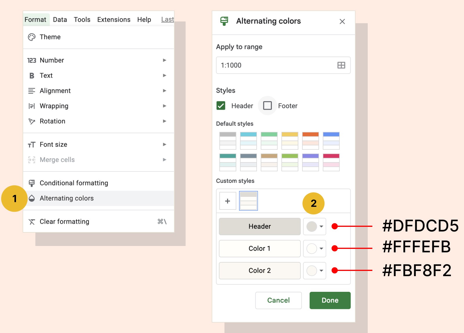
By clicking on each swatch, you’ll open up a menu where you can change the HEX values of the header and alternating rows. This will give your spreadsheet an entirely new canvas to work from.
I included my default settings here, but you can add any color you want.
Header: #DFDCD5
Color 1: #FFFEFB
Color 2: #FBF8F2
3. The best spreadsheet fonts to use that are not Arial
First, let’s all agree Arial can go sit on itself. It was commissioned by Microsoft to rip off Helvetica because they didn’t want to pay the licensing fees.
Thankfully we have thousands of others to choose from.
I recommend picking a sans-serif font which is more easily readable at smaller sizes, especially when you’re working with spreadsheets. Think Source Sans Pro, Roboto, Open Sans, and many more.
If you happen to be using a lot of numbers in your sheets, I’d recommend choosing a monospaced font. These are useful because each character takes up the same amount of space, so numbers line up exactly.
I’m somewhat biased and love the personality of Space Mono. If you don’t see this in the dropdown, click on “More Fonts” in Google Sheets and you can add a new font from Google Fonts.
You’ll need to select every cell before changing your font. Select all the cells of your empty spreadsheet by hitting Command + A, or selecting the top left corner square.
So here I am, wondering what a really great spreadsheet looks like. I land on a video like this
Honestly, I don’t even want to write this. Right now I’m sandwiched between two Google Sheets views, to see if I can make this look a bit better.
It’s a challenge I don’t particularly like, but it’s a challenge I should attempt.
Spreadsheet readability type tips
Here’s my Google Sheet doc if you’d like a starting point. Please make a copy.
Freeze the top header if dealing with large columns of data. Left-click the row number to freeze, then go to View > Freeze > 1 Row
Use all caps for the header row titles, and make them 1pt smaller than the rest of the data in your spreadsheet.
Never center-align spreadsheet data. Left align titles and row data for everything except numbers.
Right-align columns with numbers, using an evenly spaced monospaced font so the decimals line up.
5. Creating a template to save your styles
Unlike Google Sheets, there’s no easy way to make a default font in Spreadsheets without using a Template, and your font choices are limited using Google Sheets Templates.
Instead, I have created a template file that I use as a starting point for all future spreadsheets.
Stand out with your own visual style
I hope that was painless, but if you found yourself giving up in the end, you can duplicate my own document here.
Most of us make small design decisions every day, like selecting which font to use in your spreadsheet. The tiny amount of time you spend thinking about them adds up, when you should be making them once.

Join 3,800+ solopreneurs & professionals who are:
Building trust with personalized branding
Increasing sales with premium packaging
Creating clear offers that convert
Get dollar-driven design tips in your inbox 2-3x a week.
More Posts