7 MIN READ
•
YOUTUBE DESIGN
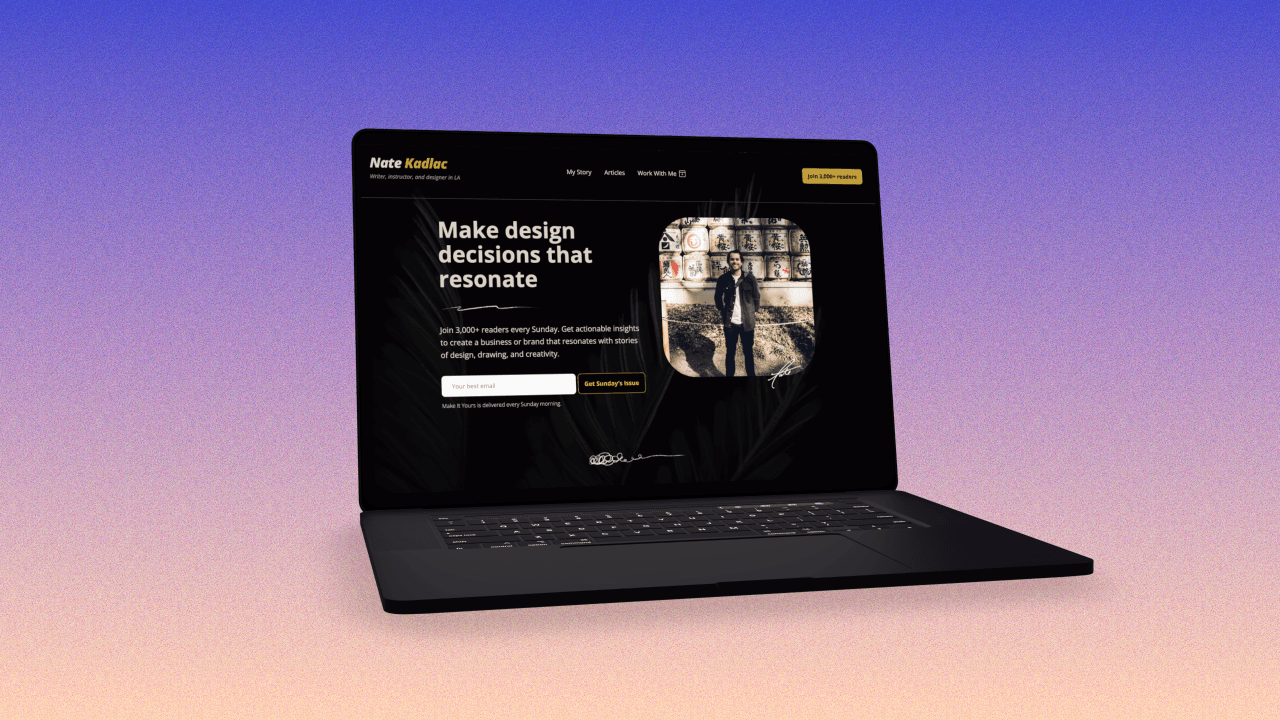
YouTube Thumbnails: How to design click-worthy images
Learn to design YouTube thumbnails that stand out with these eight questions


A well-designed thumbnail can increase your video views, boost engagement, and improve your YouTube channel's overall performance. But how do you create thumbnails that are both appealing and effective?
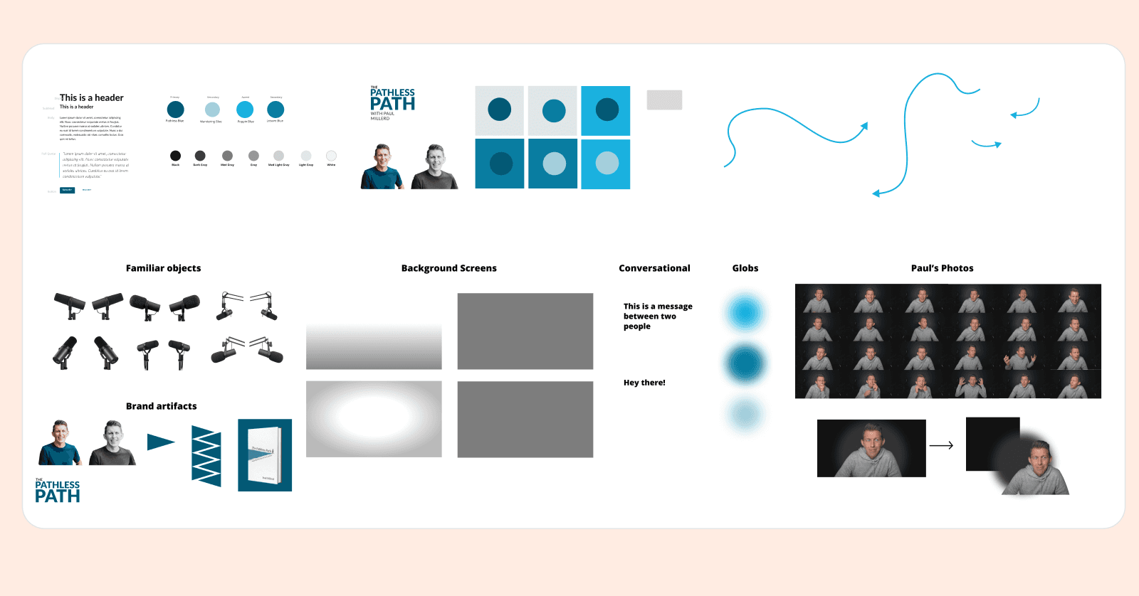
I’ve been fortunate to help advise and design YouTube thumbnails for several creators—people like Lenny Rachitsky, Paul Millerd, Khe Hy, Nat Eliason, and Josh Spector.
A common theme I’ve found is that if you don’t have high-quality assets to work with, or that you’re trying to include too many elements into a small space, your YouTube thumbnails will suffer.
The importance of YouTube thumbnails
A thumbnail’s job is the same as a great subject line, hook, or Facebook ad:
To drive curiosity and get someone to click in a way that builds trust.
Trust that they won’t be misled into clicking something they will regret.
Trust that you deliver on the promise of your YouTube thumbnail.
And trust that you don’t waste their time with clickbait.
And so there’s the dilemma. How do you show up on brand, drive curiosity, and still optimize for video thumbnail click-through rates? (While still making your thumbnails look delicious?)
The secret is to focus on four main areas: Spacing, imagery, contrast, and text.
That’s all you need.
If you try to say or show too much, you’ll end up confusing the message and focal point. And with the limited space you have, your design will suffer in quality, because it will lack visual hierarchy and clarity.
1. What can be removed from your video thumbnails?
This is the very first question I ask myself. Are there too many people in the shot? Are you using more than 4 words? Do things look cluttered? If you squint your eyes, what is the visual priority?
Start with a single image, a few words, a single color, and the rule of thirds. Play with the spacing and get an idea for where you want to go. Play with these ideas on an open canvas like Figma, which lets you iterate and compare designs side by side.
If you have ever wanted the superpower to design, check out my 80/20 design course which will get you up to speed even if you haven’t tried it before.
Images
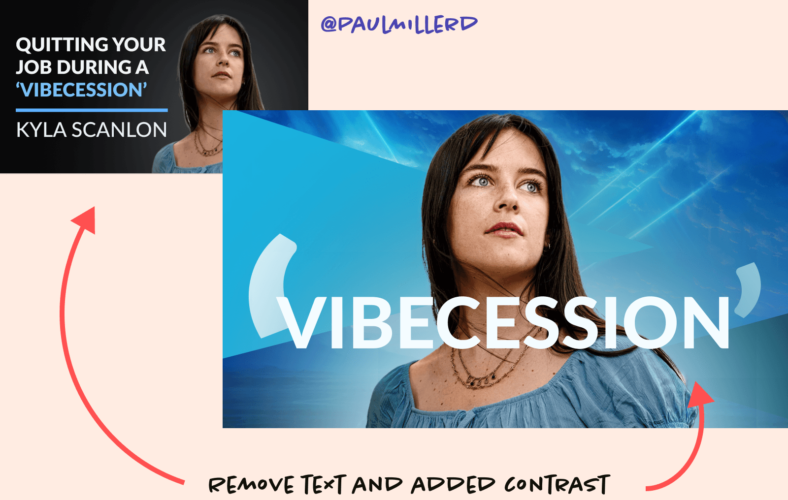
It's a pretty common practice to include images of yourself, a familiar object, and even a background. But I would recommend simplifying the amount of images you use to tell a single story.
In your YouTube thumbnails, try limiting your images to just one, which will help give you space to work text and color into it.
Also, try resisting the urge to use stock images. It comes off as generic—and if implemented poorly—it can reek of amateurism. I would urge you to try and become more familiar with Midjourney or some of the other AI tools that can create much better options than many of the stock photo websites.
Color contrast
Simply, if you have a dark photo, try using a lighter background. One of the first design changes I improved here was to help lift the image off the background by moving in the opposite direction of the focal point. Many times this means choosing a darker background to offset the lighter image.
Backgrounds
A busy background image creates chaos in your YouTube thumbnail images. One of the easiest tricks to downplay a busy image is to desaturate it, then apply a simple color screen over the top at about an 80% opacity.
This gives the background a monotone look, leveling up the quality and giving you a professional YouTube thumbnail image to work with.
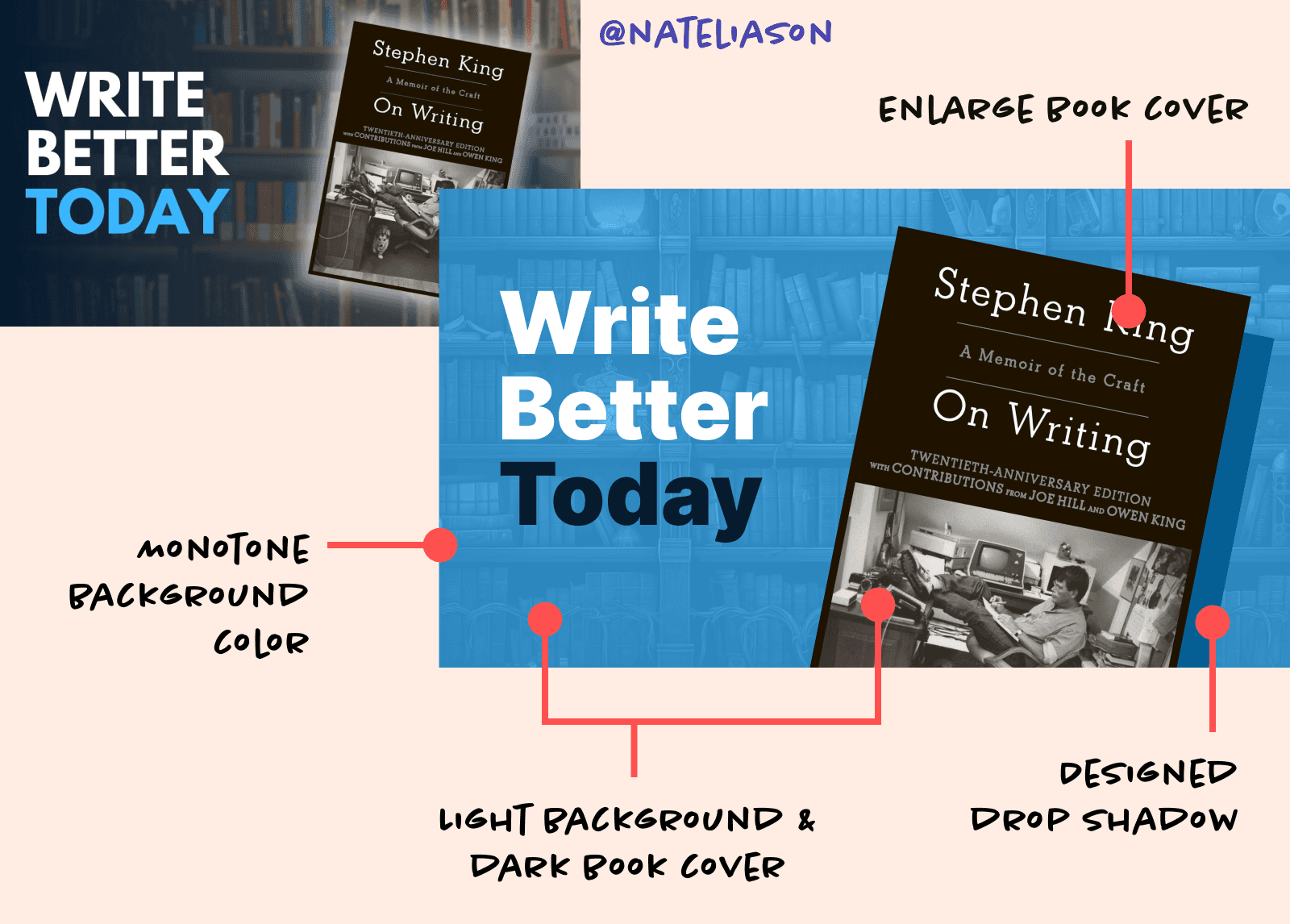
2. Are you always making everything smaller to fit your YouTube thumbnail?
If you find yourself often making things small (text, images, etc), you’re likely creating more noise and clutter. Smaller text and images mean that your eye needs to work harder to fixate on a focal point.
And if that takes more than a second, you’ve lost their attention.
What you want to do is scale up your images or text and remove what’s unnecessary.
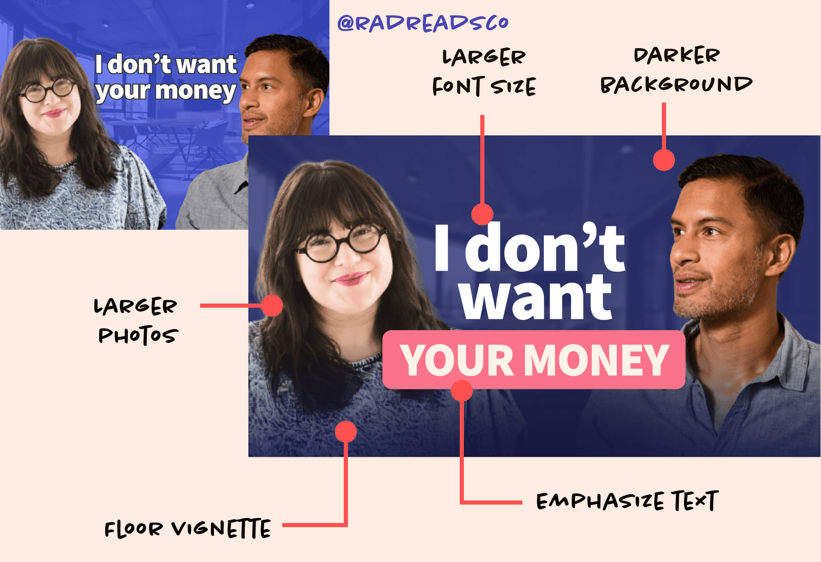
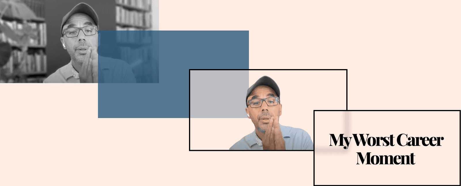
For instance, Khe started with two people in this shot with some text in the center. But the text was shrunk to fit between them. This is pretty common, but try overlapping the text over the bodies and using a color background to highlight a keyword or two.
This simple trick adds contrast, pulls attention into one word, and lets you scale up instead of down. Your YouTube thumbnail will now feel more balanced when the text isn't trying to squeeze into a small space.
3. Do you have high-quality assets?
A common approach is to shoot and edit your video and then screenshot your video for graphics. If you’re doing this, you’re working from behind, and it’s difficult to create something notable.
Fonts:
I usually opt for sans-serif fonts for thumbnails. It’s easier to read at smaller sizes, and to work with. Here's an article on my favorite YouTube fonts to use.
Images:
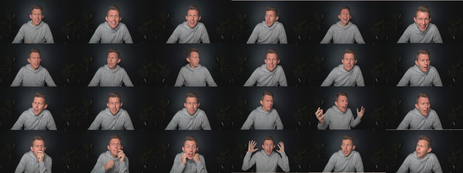
Follow Thomas Frank and Paul Millerd’s approach by shooting a series of shots portraits for your channel. Photograph yourself in a dozen or more different expressions to give yourself enough to work with regularly.
Backgrounds:
Use high-quality images, or try using AI tools like Midjourney for creating original assets.
Icons:
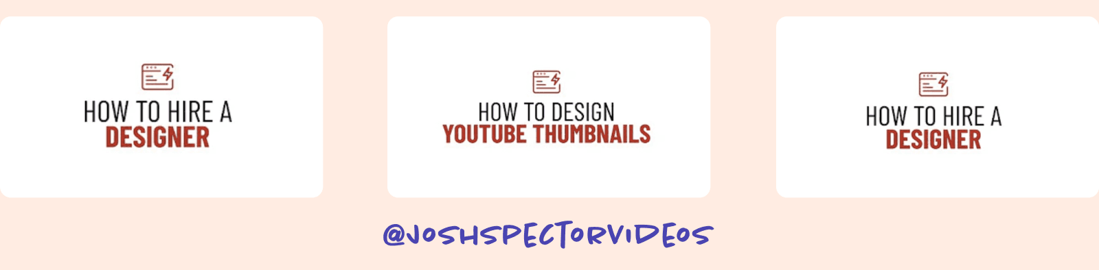
I don’t always recommend icons, but Josh Spector uses them in his minimal approach. It works because he doesn't rely on other images or effects.
In my YouTube Masterclass, I provide you several high-quality assets to work with in all of your thumbnails.
4. Are you using less than five words?
The best YouTube thumbnails convey a story without any text. Unfortunately, this is an extremely difficult and expensive process because you need to craft a story with pre-planned photography. This requires custom design work.
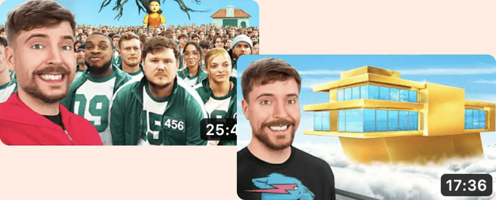
You’ll notice big channels like Mr. Beast rarely use text because the images are so strong. But they pay thumbnail designers in the low five figures to create and a/b test these.
When you make a YouTube thumbnail, the text should be simple, and compelling, and does not repeat your video title. Use these few words to drive curiosity and intrigue, like a hook to your title.
Let the video title do the heavy lifting, and the thumbnail text provokes the viewer.
5. Are you creating depth by stacking layers?
Beautiful and compelling thumbnails use layer stacking to create a sense of depth. This gives your design a sense of natural flow, because in the real world, things overlap all the time and it’s natural to allow for a bit of imperfect qualities.
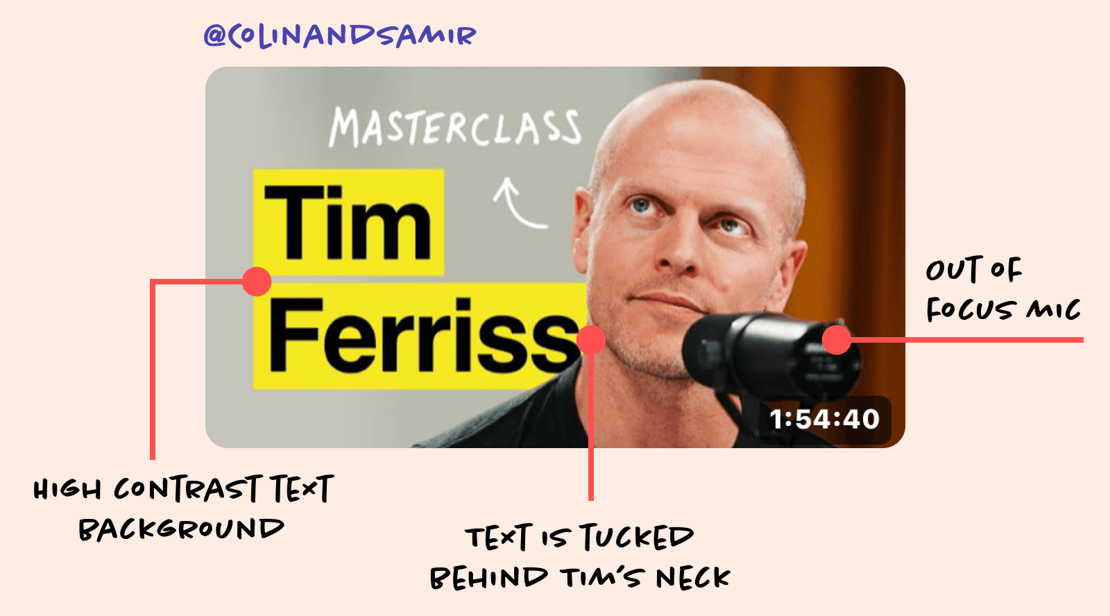
Think of layers like a deck of cards. The topmost card covers the cards below it. The bottom card is covered up by all the cards above it. Layers in design work the same way, and you can use this to your advantage when tucking letters behind people, or overlapping your own images with other layers.
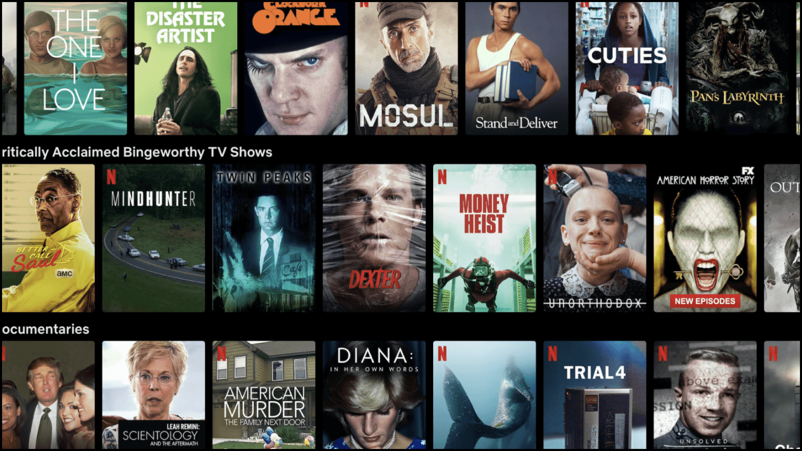
Take a look at any streaming service and study their thumbnail art. You’ll see text running behind people, overlapping in front of people, and it just looks great. This same technique can help your YouTube thumbnail design stand out.
6. Are you designing using the right YouTube thumbnail size?
More than once I've seen YouTube video thumbnails designed in the wrong image formats or size.
1280 x 720 pixels
Make sure your YouTube thumbnail templates are using this exact dimension, otherwise, your thumbnails will get accidentally cropped. I noticed this on Key Hy's channel, and it was clipping the text in the top of the image.
If you're using Canva to design your custom YouTube thumbnails, make sure you're using the right template. In Figma, you'll need to manually size your artboard to 1280x 720 pixels. Even a couple of pixels off will throw everything off.
There are plenty of free thumbnail templates on the web, but the best YouTube thumbnail maker I find is Figma. If you want to learn Figma and design anything from YouTube thumbnails to websites, check out my course here.
File format
I tend to save my images as PNGs, but you can also use JPEGs for your videos. It has no effect on your images, and they both upload the same way.
7. Do your YouTube thumbnails look cluttered?
My favorite trick to create eye-catching YouTube thumbnail is to space things using the rule of thirds in my YouTube video thumbnails.
When you have a lot of design elements to work with, it's difficult to know where to place everything.
The Rule of Thirds
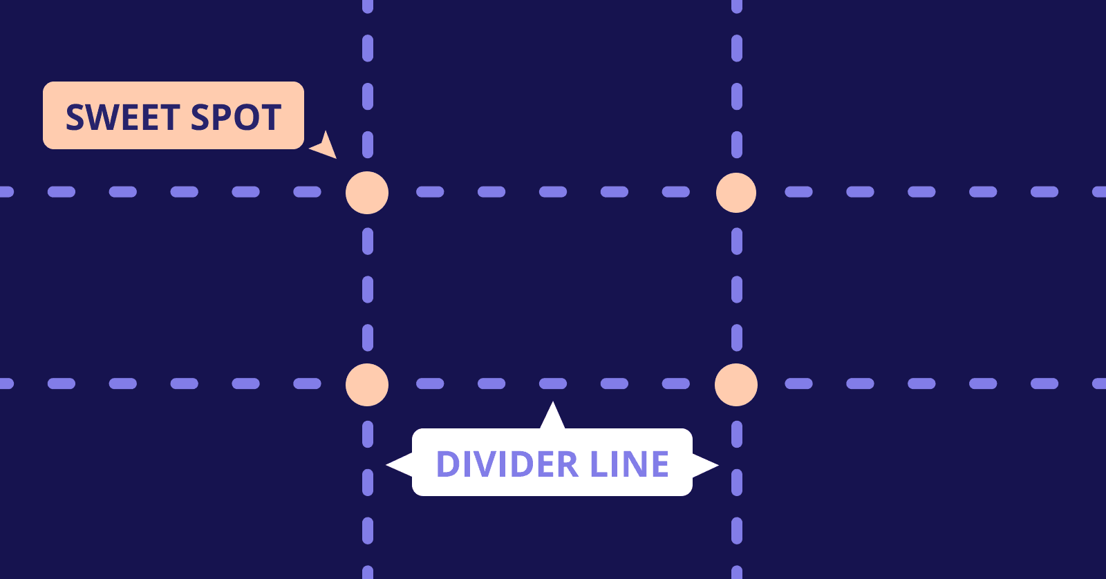
While it's popular in photography, using the rule of thirds in your YouTube thumbnails can help create a better visual hierarchy overall.
Try finding the four sweet spots in your design, and aligning the main focal point along the intersection. Our eyes are naturally drawn to these areas, and it will help give you a grid to work with when placing your text and imagery.
8. What design tool are you using to create your YouTube video thumbnail templates?
I don't love using thumbnail templates, but I understand the convenience. Creating a custom thumbnail ensures you create something unique to your brand kit, and is instantly recognizable.
Canva
Canva has the most YouTube thumbnail templates for you to get started. I don't love this online YouTube thumbnail maker because of its limited canvas space to play around, but the video thumbnail templates are decent and easy to use.
Figma
Figma is powerful, even if you're a beginner. Using Figma for your YouTube thumbnail design allows you to create custom thumbnail image templates that will help you build a repeatable process to maintain brand consistency and flexibility. Learn how to design in Figma in my email-based course, especially if you have never used it before.
Once you have a finalized look, you can build out your YouTube thumbnail templates to reuse in Figma quite easily.
Photoshop
I don't recommend using Adobe Photoshop for your thumbnails unless you're using professional designers. But, if you're spending a lot of money on video editing and have a team, you likely will want professional YouTube thumbnail templates created for your channel.
Conclusion
Creating an effective YouTube thumbnail template is both an art and a science. It requires a combination of design skills, understanding of your audience, and restraint in doing too much.
But with practice and experimentation, you can create YouTube thumbnails that boost your video views, increase engagement, and help your YouTube channel thrive.
So, start experimenting with your thumbnails today. With the right design decisions, you can create thumbnails that not only look great but also drive results for your YouTube channel.

Join 3,800+ solopreneurs & professionals who are:
Building trust with personalized branding
Increasing sales with premium packaging
Creating clear offers that convert
Get dollar-driven design tips in your inbox 2-3x a week.
More Posts