16 MIN
•
DESIGN
The modern guide to creating a personal website that drives career and personal growth
How to create a personal website to improve serendipity in your professional and personal life

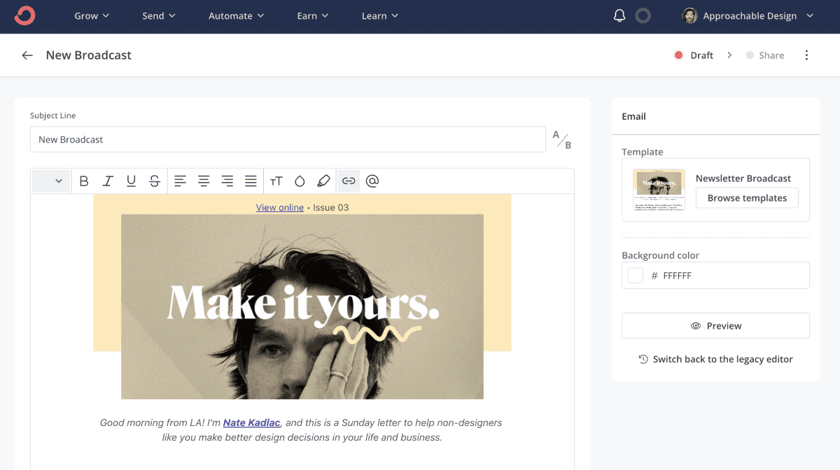
My personal website has single-handedly played a specific role in accelerating my career growth and income for the past 18 years.
It's also served as a way to build relationships with people outside of my immediate universe, stand out compared to others like me, and act as a permanent digital home when all I love to do is rent.
I first purchased kadlac.com in 2003 to have an online design portfolio when applying for my first temporary in-house design role. It was simply a portfolio, an about page, and a contact page.
I got the temp job, and within two weeks I was offered a full-time position. My boss later told me that having my own website was something he rarely saw, and he loved it. And this was 20 years ago!
As a self-taught designer lying to my landlord about rent checks being lost in the mail, I went from $11,000 in income to $45,000 with benefits, and it changed my life.
Since then, my website has mimicked a ball of squishy playdoh, morphing from shape to shape. It's been a personal portfolio website, a personal blog detailing my dating life, hosting video essays, a way to land jobs, showcase freelance work, and now it supports myself and my family independently.
And today, I wouldn't sell it for $1,000,000.
Why a personal website is important and how this post is structured
Listen, a one-page website is better than a none-page website. But you want to let the internet work for you by giving it more to work with.
Imagine having a notecard to write one sentence on who you are versus having an entire notebook to let people see different sides of your personality.
The more interests you combine, the more chances you give yourself to connect with someone new. If you're in finance and love basketball, you're adding another spoke in a large wheel for people to connect with you.
Multiple pages act like multiple chapters of a book. People can bookmark individual pages, share them on other sites, and show up in different contexts. They can take on a different design, use different copy, and even change positioning based on who is viewing your page.
One-page websites are great for selling one product or service, but I believe multiple pages will 10x the serendipity effect just by including more of yourself.
Here's how the post is structured:
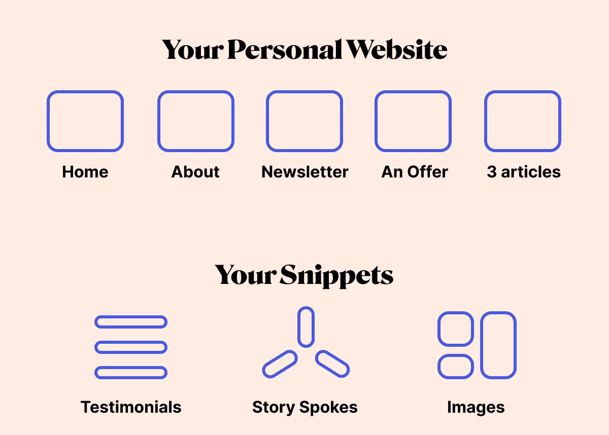
How to start your personal website
The five essential pages your personal website should have
World-building and distribution
Personalize and design from the inside out
Inviting people in
Asking for help
Additional personal website examples and resources
1. How to start your personal website and why it's a Google Doc and a custom domain
“Content precedes design. Design in the absence of content is not design, it's decoration.”
- Jeffrey Zeldman
I suggest starting with a brand-new Google Doc. (preferably one that doesn't burn your eyes).
As you go through this guide, you'll want to write a small amount of copy for each page. Give each page a headline, a subheadline, and a main paragraph at the minimum.
I've whipped up a handy content template for each page, just to take a little weight off your shoulders during this process.
Keep in mind, that while this website is for you, it's actually for the people reading it. Write as if you're writing for one person who doesn't know you. How can you improve their experience by visiting your piece of online real estate?
Tip: If you're inclined to use an AI writing tool, I wrote some of this in Reword, which has a fantastic UI and great creative suggestions to write about.
Create your Story Spokes
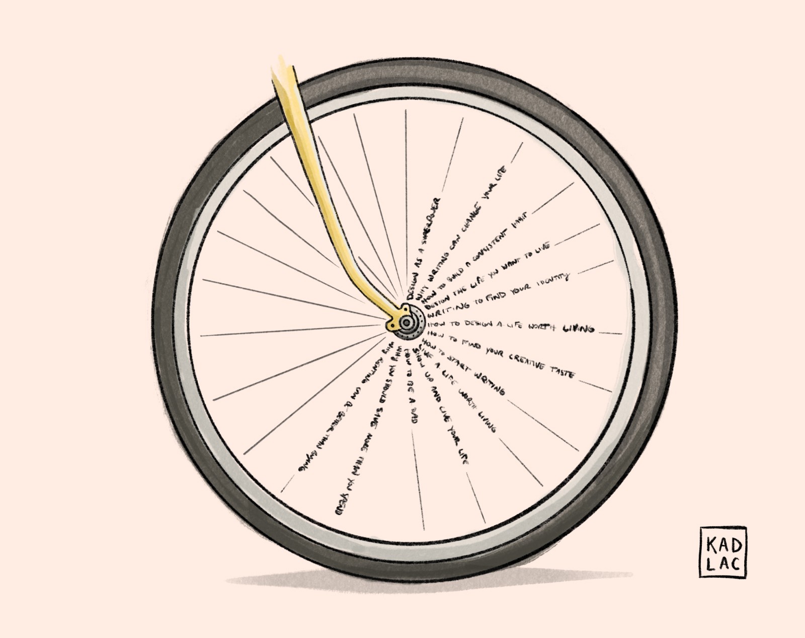
Our lives are like a bicycle wheel that continues to roll forward. The individual spokes are the stories that make up our lives, propelling us in a direction of our choosing.
And just like a bicycle wheel, our websites are made up of not just one spoke, but a combination of many.
Instead of thinking about page content just yet, think about the individual stories that make up your wheel. By spending 5 minutes on each question, you'll end up with enough Story Spokes you can use to color in the pages of your website.
They range from professional to personal, giving anyone who doesn't know you an idea of who you are, and what you care about.
A good rule of thumb for page length is around 200-500 words.
This helps on two fronts: It's enough content to let someone learn a little more about you, and it's enough juice for Google to consider the page relevant. You might even start to get random traffic to your site without putting in any extra SEO work. My current site as of today gets about 5,000 organic visitors a month just from SEO.
Get personal, and share your perspective of the world.
Some ideas and questions to answer across your site:
What questions keep you up at night?
What projects are you currently working on?
What have you learned in your last job role?
What are your favorite articles and books to read?
Get more Story Spoke prompts in my free Personal Website Content Template
Tip: If you're struggling to write and want to become a better online writer, check out David Perell's Ultimate Guide to Writing Online.
The content structure of your pages
If you happen to download a website template, most likely they are prefilled with single lifeless words like Blog, About Me, and Contact.
Ignore these juvenile attempts at coming across as personal. A good rule of thumb is whenever there's an opportunity to break the template mold, there's an opportunity to stand out.
Most people don't take advantage of personalization.
Instead, use a more descriptive—and interesting—headline. Then add a subheadline and prepare for a couple of sentences to a couple of paragraphs of copy. Get creative, but be clear.
At a minimum, each page should have:
Title (H1) of 3-6 words
Subheadline of 8-20 words
Body copy totaling 250-500 words (More is great!)
Here are a few example headlines for an About Me page:
About [Your full name]
A true story about a woman named [your name]
It's about time we met! (I use this)
Buy a custom domain
This is more of a formality, but spend $10-20 on buying a custom domain. This is an annual cost, but it can be a write-off if you ever use it to earn money from it. (Freelance or otherwise)
You can buy a domain from anywhere. I use Name.com, but having a custom domain instantly sets you apart from the crowd. Finding the domain you want might not be available, but don't let this stop you in your tracks. You can always find a new one later and use redirects if your site has traffic.
Hell, Tesla even had to settle for teslamotors.com at first.
Here are a few tips to consider:
Try to find a dot com domain first (This is becoming less important every year, but it's still the default when people start to type in a domain.)
Use your last name or your full name. Make it as easy as possible. (Mine is kadlac.com)
Combine your first or last name with another word
Try searching for a nickname or something silly. (Not too silly though)
2. The five essential pages a personal website should have
Listen, a one-page website is better than a none-page website. But you want to let the internet work for you by giving it more to work with.
I fully believe to give yourself an advantage in almost any career decision, having a fully baked five-page website gives you a 10x advantage over a one-page website.
Imagine having a notecard to write one sentence on who you are versus having an entire notebook to let people see different sides of your personality.
The more interests you combine, the more chances you give yourself to connect with someone new. If you're in finance and love basketball, you're adding another spoke in a large wheel for people to connect with you.
Multiple pages are like multiple chapters of a book. They can take on a different design, use different copy, and even change positioning based on who is viewing your page.
Each page of your site should have a standalone goal. We'll see how that plays out below.
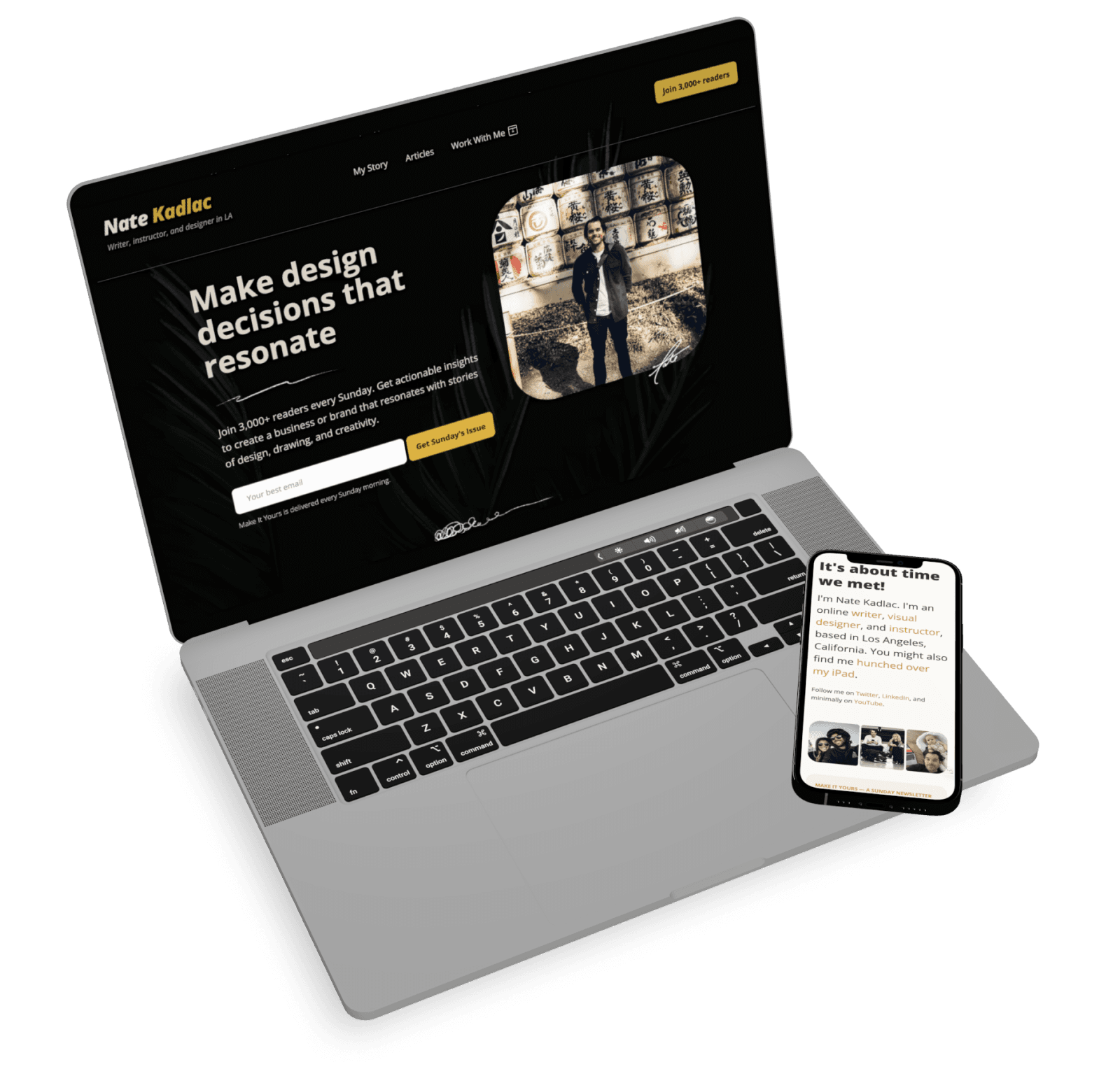
Your Homepage
There's not a more important page than your home page. But if you stopped here with just one page, you would be missing out.
Most people land here and don't know what to do next. Most people fail to introduce themselves and give visitors a clear next step.
You won't because you're reading this guide.
The worst thing you can do is to remove all personality and list your job title. “Hi, I'm Nate and I'm a web designer" holds no value and just pitches you against every other web designer.
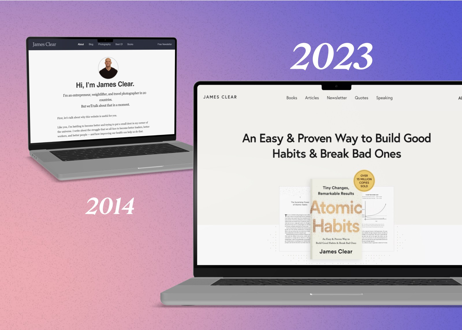
Even best selling author James Clear has updated his personal website from the generic heading to something more benefit driven.
Here are the components of a solid homepage:
Headline
Subheadline
Strong visual
CTA
Featured posts, social proof, and testimonials
Optional: Visual Venn Mode
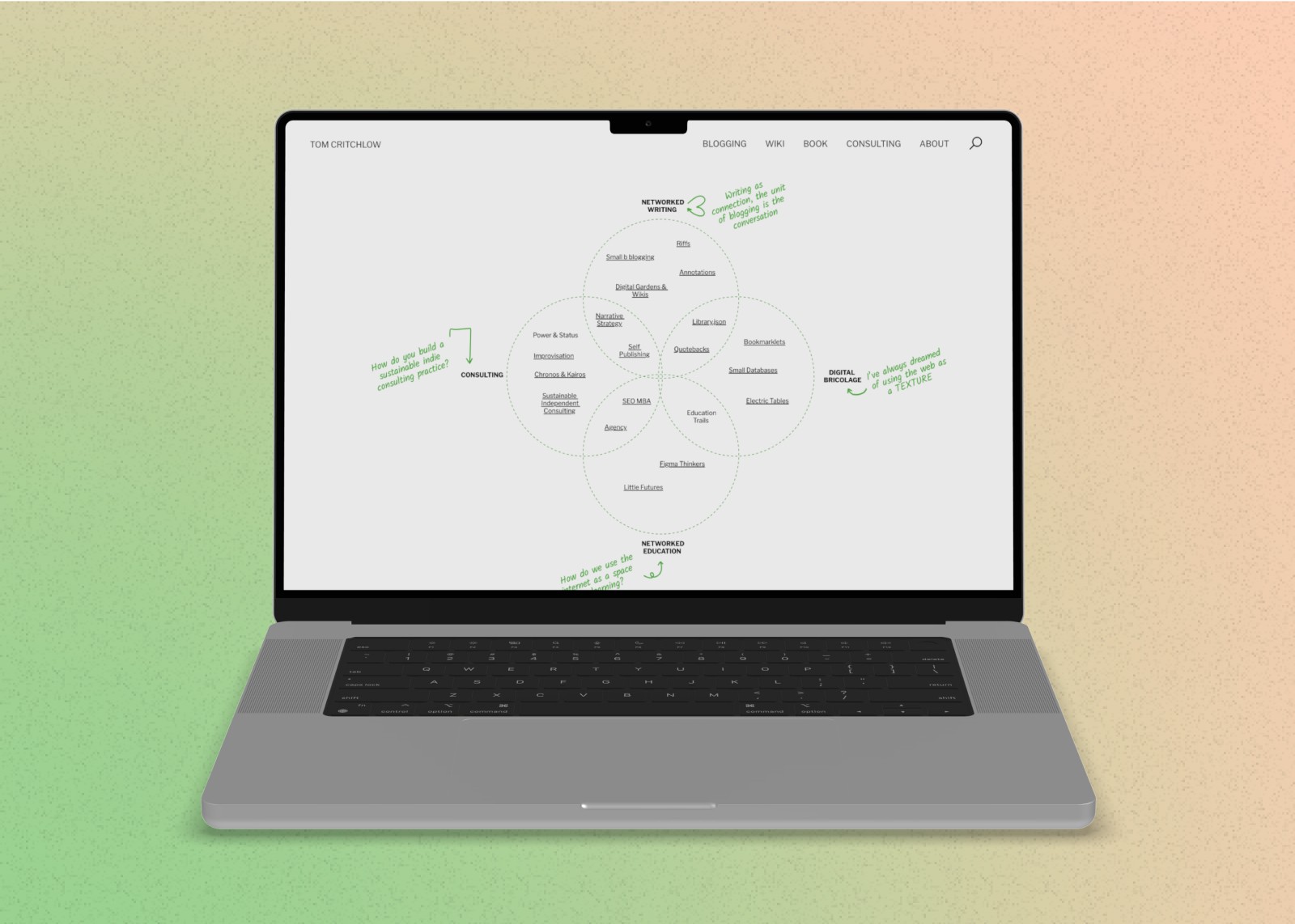
Before I go too far, I'd like to address another type of format: The visual Venn Diagram my friend Tom Critchlow likes to use. It's less text-heavy, but it quickly indicates what his interests are, and what he loves to write about. It also acts as a Wiki so you can springboard into any piece of content he wants to feature. Check it out!
So what do you do?
In this case, being a web designer in itself doesn't help anyone. It's mainly making you feel good about yourself by saying it out loud.
But what's your goal?
Is it to get more potential clients? To get a job? To share your insights and get people to read your newsletter so you can build an audience?
There's no right answer, but picking a goal helps you define what you should say so you can make a clear statement. It probably feels difficult to reframe your intro but stick with me here.
Clay Hebert has a great TEDx talk on a simple framework to create the perfect intro. He states:
I Help + [people] + [achieve result]
So instead of telling people your title is “Web Designer," you might instead say:
“I help SaaS founders attract and retain more customers."
Author Simon Sinek might say, “I help leaders find their why."
Magician David Blaine might say, “I help prove magic is real."
Don't tell people what you do, tell people how you'll help them transform.
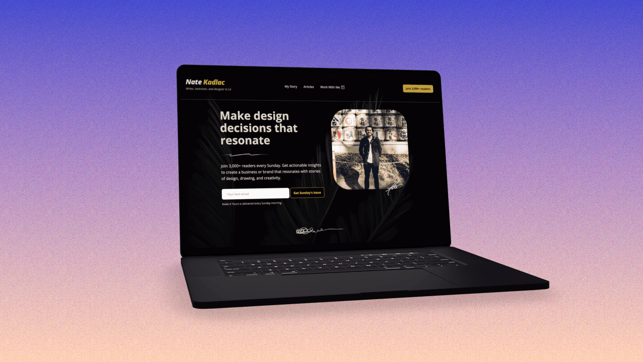
Your subheadline
Your subhead could be a more explicit and clear description of your ability and goal for what you're pursuing. Think of it like supporting of your headline, but in the direction of your goal.
The goal of my subheadline is to drive everyone to my newsletter, no matter where they are on my site.
My subheadline is, “Join 3,000+ readers every Sunday. Get actionable insights to create a business or brand that resonates with stories of design, drawing, and creativity."
It's not perfect but it clearly makes an ask, and drives toward my own goal.
Below the headline
The rest of your home page should be geared toward helping the visitor take one action. If you want to build an audience, have a form to your newsletter. If you want to highlight a case study to land more clients, bring that into the area just below the hero area.
The rest of the content should drive curiosity and intrigue, helping hold the hand of your new visitor.
Make it personal, but don't try to ask people to do two or three different things.
Homepage resources:
Your About Page
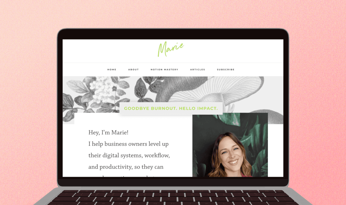
Marie Poulin's Personal Website
Your About Page is likely the second most trafficked page on your site. Its purpose is to get to know the person behind the door, and to share a bit of backstory.
This page lets you display a bit of vulnerability, and personality, as well as a chance to brag.
Too many people try to lift themselves up on the homepage, but this is where you should actually put your ego to work.
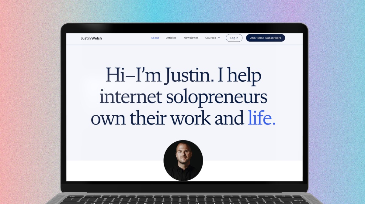
Justin Welsh's Personal Website
Tip: If you're early in your career and you don't have recognized credibility to share, include other articles, videos, or books that you're interested in. This gives your About Page a personal touch and tells me a little more about you through curation.
A few main components to include:
Introduce yourself (it may seem obvious, but share your full name)
A high-quality image of yourself
A brief history of who you are and what you do (Some like to use a “10-second Bio" to quickly summarize)
What are you working on now?
What do you find interesting?
Share credibility: Awards, testimonials, podcasts, videos, etc.
Make it yours: Easier said than done, but what makes you unique?
A way to contact you: I don't love contact pages unless you're a business. Just include an email address or another way to contact you that feels comfortable.
Bonus!: Add a Hello Video introducing yourself
Your service or product offer landing page
One of the most overlooked opportunities and potential revenue-driving pages is a dedicated landing page for a service or offer.
At a minimum, it signals you're someone who has something to offer, even if it's small. At a higher level, it could change your life.
The great thing about this page is it doesn't matter if you're just starting your career, building a personal brand, or 20 years into your career, this page reeks of opportunity.
4 ways this page will help you:
Signal you have value
Make it easy to work with you
Build copywriting, sales, and storytelling skills
Expand your mind to new ways of working
What this page looks like
In its most basic form, this page will look and feel slightly different from your other pages. Its intent is to get someone to take action. That action could be a number of things. Book a call with you, buy a digital product you're selling, sign up for a service you offer, or anything you can come up with.
This page puts your copywriting skills to work, and its aim is to help you create an offer to sell. An offer is simple a creative package (product or service) that contains enough value, that someone would pay you money for it.
Here's an example of one of my offers. I built this page within a couple of hours, and it's sold over $20,000. Without this page, I would be negotiating over email, and phone calls, trying to explain its value.
But simply, it's all right there, and it contains everything I could include to provide clear value. It likely doesn't look like any other coaching program, because of my own expertise, and how I package it with different courses I have created.
Your offer page should be unique to you, and what you're able to bring to the table. Try creating a prominent link on your personal website in the navigation or the home page, if you want additional focus on it.
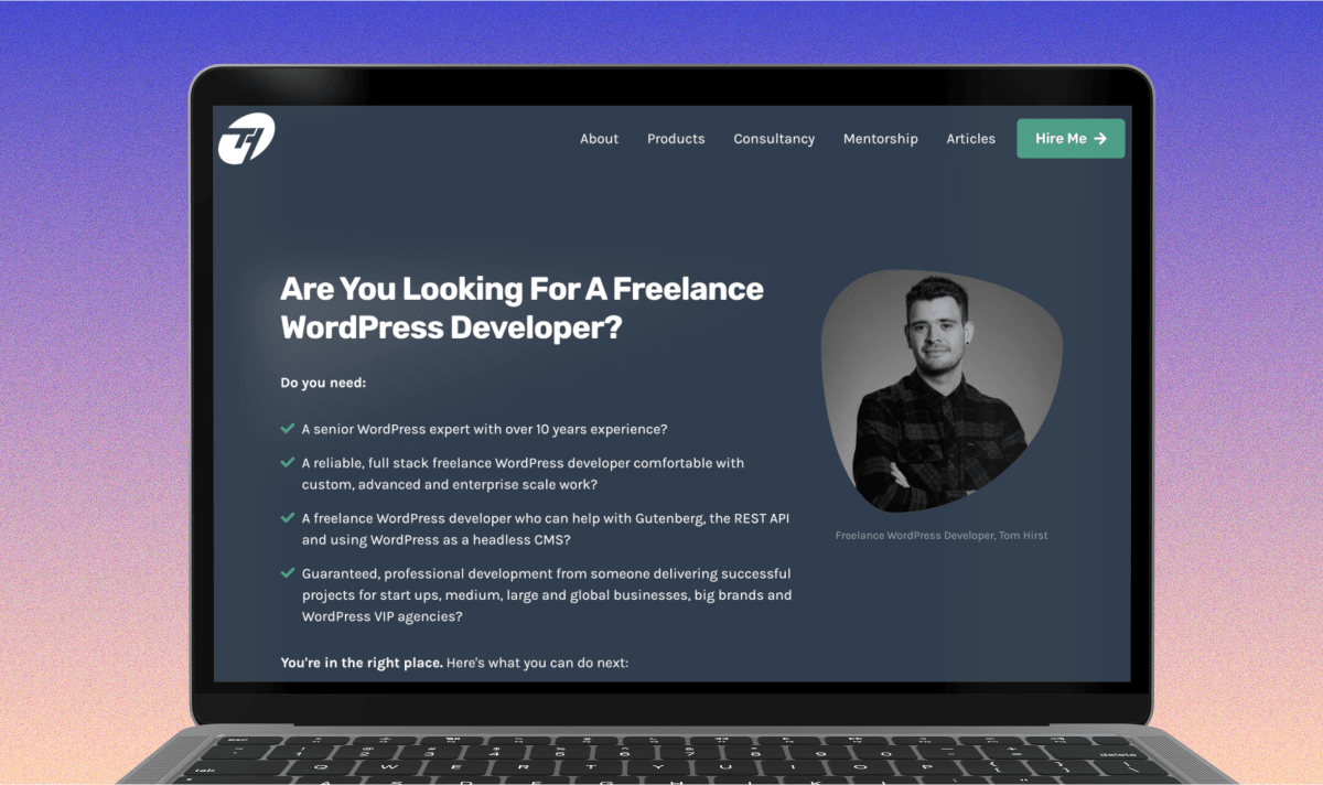
Tom Hirst does a good job of highlighting his offer from his professional website.
Components of an offer page:
Headline that speaks to the offer and who it's for
A subheadline that clarifies what your offer is
Supporting before/after visuals
Bullet points that describe the features and objections
A small section about you (Take some of this from your About Page)
Social proof or testimonials
A clear CTA to purchase or book a call
Optional: Lead Magnets
I've come around to having lead magnets on my sites because it's another method to offer valuable help. But, I think they're optional until you're up and running. Check out Nathan Barry's article below to get more insight, but it can be a helpful way to grow an audience, or drive revenue.
Resources for copywriting and creating offers:
How to design a landing page for a $1k product by Nate Kadlac
Creator Flywheels – The Operating System for Your Business by Nathan Barry
ConvertBox to create popups and modals for your lead magnets
Your three unique ideas
I can't begin to count how many blogs I have created over the years. The first one was hand-built by my neighbor using PHP before WordPress took over.
The words, “I'm going to start a personal blog!" are like hearing five long nails screeching across a blackboard.
The problem is that the word blog feels infinite. Like if you ever stop blogging, you're a failure.
I'm not here to convince you that you shouldn't write a blog. But, I do want to offer a lighter way to add some writing—which is important!—inside a small enough container that anyone can do it.
How to create 3 unique pieces of content
Writing Tip #1: Use Story Spokes to generate article ideas
First, use your Story Spoke answers above—and included in my free content template—to brainstorm both personal and professional ideas to write about.
Reflect on what is most interesting to you, and pick three that stand out. These really could be about anything, but use your taste to filter what excites you most, what doesn't sound cliche, and what might feel aspirational.
The three ideas I wrote about early on were:
Note that these pieces are all over the place, but Minimalism is Boring became one of my most popular, because it was an unconventional take. It also was the nugget that launched this business, Approachable Design.
Another way to generate ideas to write about is to use a technique Richard Feynman used. He would keep a running list of a dozen favorite problems.
“You have to keep a dozen of your favorite problems constantly present in your mind, although by and large they will lay in a dormant state. Every time you hear or read a new trick or a new result, test it against each of your twelve problems to see whether it helps. Every once in a while there will be a hit, and people will say, “How did he do it? He must be a genius!”
Writing Tip #2: Write three small posts
The truth is, you can write 500 words about anything. Start by writing three 500-word posts about your three ideas, and create separate pages for each of these.
These pages don't need to be fancy, or even live inside a CMS. Any website editor will let you create a new page and you could give it a header, subhead, and 500 words.
Writing Tip #3: Publish
Having these three ideas published on your personal website will serve as foundational content to help build relationships with new friends, connections, future employers, and clients.
Having three posts is helpful to give people another way inside your site, rather than the traditional front door. You can link to them from your signature, share a relevant article with friends, or highlight them on your home page, giving more life and color to your personal website.
My advice is to publish these posts without giving it too much thought. Just having these posts out in the wild indicates you're someone who finishes things and can push against the anxiety many people struggle to get past.
Another book that has helped me overcome this fear of caring what other people think, is The Courage to Be Disliked.
Ignore the haters, and publish.
A few resources that have helped me become a better writer:
3. World-building and distribution
What we're really doing with our personal websites is creating personal leverage. And to create personal leverage with a personal website, we have to world-build with our ideas and stories.
Alex Danco quickly states what world-building means:
The world will include many things, but it needs one in particular: purpose. Inside the world, it needs to be really obvious what our goals are, and why we want our push our system into a new state. You fill your world with familiar storylines and tension and characters, highlighted or re-framed compared to the real world, that give everyone a really clear purpose.
In this context, Alex applies world-building to sales and startups, but at an individual level, we're doing the same thing.
Your goal with creating a personal website is to create purpose. You're letting serendipity happen because you're insisting people be aware of your values and purpose through your ideas, then packaging those pieces up inside our own personal websites.
But world-building needs to grow. You're planting seeds with your personal website, but you should connect more dots to it, branching out into different areas.
Thankfully, that doesn't mean we need to continue to create more pages on our personal websites. (Although I recommend you do, but only if it brings you joy.)
Start a newsletter (and own your most valuable personal asset)
Many people will let their personal website sit there without being updated, or without sharing it with the world. Sometimes it can feel heavy to update your personal website because you might be creating new pages, or updating old ones.
Instead of feeling like you need to constantly be updating your personal website, I want to suggest you start a newsletter instead.
Newsletters—or personal emails—allow you to continue to world-build using a different type of extended lever. It removes you from constantly updating a website, and instead lets you share personal stories, links, articles, movies, and books, all from the comfort of your inbox.
Seven reasons to start a newsletter:
Keeps you top of mind with your friends, families, and clients
Helps build relationships outside your immediate network
Opens up new revenue opportunities (products, sponsorships, etc)
You're regarded as a resourceful person
Increases your surface area of luck
Generates feedback loops for new ideas to chase
Platform independence and algorithmic freedom
Why you should use an Email Service Provider (ESP)
The most informal way to send a newsletter is just by adding in a bunch of BCC contacts to an email and treating it like a personal email to a bunch of friends.
The downside is that it's tough for people to get added to your list, and so you might not let the flywheel of serendipity happen automatically.
Instead, sign up for one of the free services out there, and start to build a list of email subscribers.
If you decide to switch services later, you can always export your list and move it to a different platform, making this one of the most valuable assets you'll ever own.
Below are a few popular services that are free to start, with paid premium features.
Newsletter resources and platforms:
ConvertKit (I personally use this)
SEO and how to let the Internet work for you
One of the low-hanging fruits out there is Search Engine Optimization (SEO). Even if you don't know anything about it, just having a personal website and five pages with a decent amount of writing on it, will let me be searched and trusted by Google.
Without doing anything, you'll be writing about keywords and topics that inevitably are searched by other people, potentially bringing in new people into your world of ideas.
SEO is a rabbit hole I won't get into here, and it's not something I advise to optimize for on your personal website without taking it more seriously, but here are a few resources if you choose to dig into it more.
SEO resources for personal websites:
4. Personalize and design from the inside out
I couldn't let you escape without talking a bit about design, especially on a design site, could I?!
Design is a key component to standing out against the sea of minimalism. Most people adopt the same template because it's the easiest thing to do.
Again, a personal website is better than no website, but now you're trying to world-build and express yourself.
You do this with writing, but also with your font choices, color schemes, images, textures, and motifs.
What is Inside-Out design?
I see too many people get bored with their websites, and looking to redesign 3-6 months out. It's common, but not surprising.
Many of us sign up with a new website service like Squarespace, pick a template, and then fill it in. I actually had a client tell me they never even thought of designing a site from scratch. "Don't you just fill in a template?" they asked.
On the other side, you might pick a black-and-white template because you're exhausted of flipping through templates that don't appeal to you, only to land on a boring minimalist website.
Inside-out design is about building a foundation from your own stories and experiences. To pick colors and fonts that connect to your interests, increasing the timeline of your design choices. Creating a personal website with these decisions is something that will leave you feeling proud of your choices.
Colors
One of the most popular design questions I get is on how to choose colors, or how to combine colors.
First, color psychology does exist. But you should not pay attention to it for your personal website.
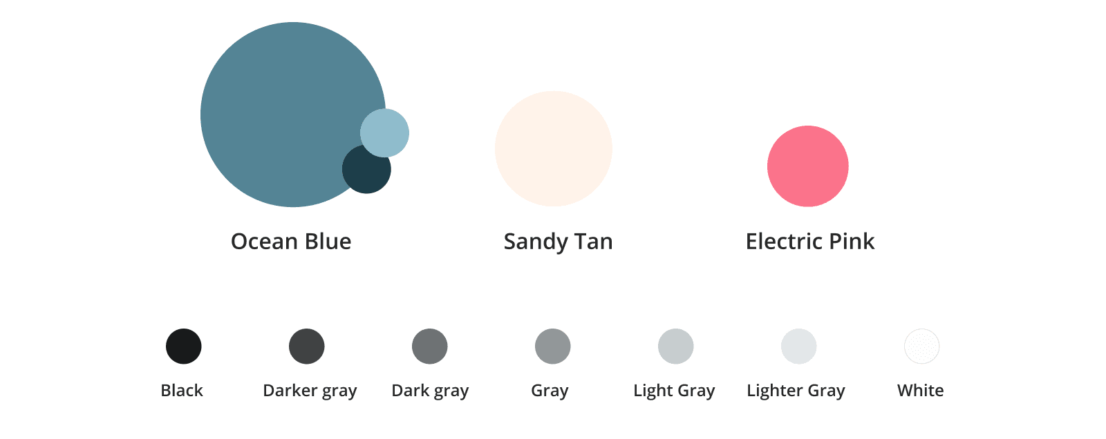
You should choose colors that you love, from your own stories and experiences, so they become timeless decisions where you don't feel the need to redesign your personal website every six months.
Simply, here's my quick process for choosing one primary color:
Just pick your favorite color. If you have one, you're good. If you can't, go to the next step.
If you can't think of a color, think of a photo that you can't forget. Go find it in your photo library. Might be a moment from your childhood or a vacation you took.
Squint your eyes and choose a color that stands out to you. Use that. (Choosing colors that stem from your own life has a higher likelihood of being timeless.)
Once you have a color, create a light and dark variation of it. Then add a secondary and an accent color if you wish. It's not necessary though.
Lastly, choose a neutral palette consisting of seven colors, from white to black. Want to learn more about picking colors? Here's my 80/20 course on design which will help you create your own palette.
Fonts
The next culprit that everyone seems to have difficulty with.
Choosing fonts can feel like you're banging your head against a wall because we tend to compare them at small sizes.
But let's step back and I'll show you a quick process to choosing a font.
How to choose a font: First, look at this picture.

Choose one of the six categories that you vibe with. Don't think too hard about it.
Head to Google Fonts and filter by the category you chose. (Pick the closest one).
Now type in your name into the "Type something" field.
Click the "Number of Styles" dropdown and slide the checked box to 6+.
Increase the font size from 40 to 200px.
Look at the letters closely and pick a font based on an interesting character you love.
Download the entire font family to your computer so you can use it to design.
The point of this exercise is three-fold. To simplify the category from which you choose a font, and to pick a font that is ultra flexible. (6+ styles). Lastly, you're picking a font that you're drawn to based on its uniqueness.
If this last part feels too ambiguous, try typing in an "&" or a couple of numbers. You're trying to find letters that look interesting to you. Designers have built in all these weird characteristics that are difficult to spot when looking at 12px. Zoom in!
Now you have a Google font you can download and install it to your computer and use it in your designs, offline.
Images
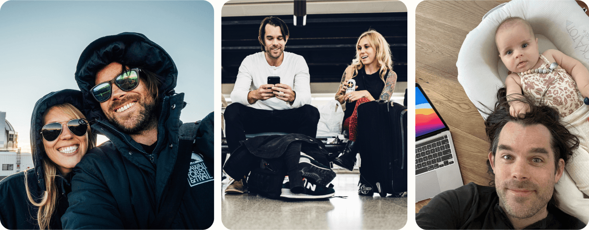
If you know how to work a camera, then you should have a slew of decent and professional-looking photos.
If you're using a more recent iPhone, you can set it to Portrait mode and have someone take a few headshots or casual shots for your site.
Try instructing them to use the Rule of Thirds to create a composition that looks and feels interesting and unique.
Or if you're looking for something a bit more "done-for-you", use a service like Snappr to find a local photographer. Or, upload a photo using AI and have something usable almost instantly.
Here's my compilation from my personal website to show different facets of my life. Note I opted for being vulnerable instead of presenting anything too professional. You do you!
Custom logo

Even as a designer, I urge you not to spend any time on a logo before launching your website. Just use a basic text font to type out your name and run with that.
But after you're up and running, there are ways to show people that you have taste and care about the details.
Thankfully, there are some incredibly easy ways to create a logo with a great font, and I wrote an article explaining how to do just that.
Personally, I use Figma to design my logos and if you want to go from 0 to 100 in just a few weeks, I created a simple course to do just that.
And honestly, I still don't have a proper logo, I use tint the color of my name. It works!
Site navigation
Your site navigation should be simple and straightforward. You don't need to include "Home" because your logo should link to your home page. Don't try to get cute with the page names—leave that for the pages themselves.
About, [Your offer], Newsletter, Writing. That's it.
In this case, Charlie doesn't have an offer, but she does use her podcast to fill that spot.

Then, make one of those stand out from the rest, so you give people a place to go. I put "Newsletter" in a button to call attention to that, but you could do the same for your offer, or an article.
My site navigation is slightly different because I've been writing on my personal website for a long time. But I still keep the navigation straightforward, and clear. I also tuck in a number of items within Work With Me to keep it clean.

How to get testimonials and social proof
One of the easiest ways to add a bit of credibility to your site is by getting reviews or testimonials from your network. Aim to get three testimonials.
Once you have three, you can sprinkle them throughout your pages in the most relevant areas. At the end of your Hire Me page, on your About page, at the bottom of your articles, or on your home page.
Having these goes a long way to convincing new site visitors that you're someone worth listening to.
How to get testimonials:
Your own network: Reach out to past clients or ask friends to give you a positive review.
Out of network: Offer a free 30-minute 1:1 call in your area of expertise. Ask for testimonials if they thought it was helpful. Book five calls in a week and go above and beyond. You'll get at least three this way if you come through.
5. Invite people to reach out
For a simple five-page personal website, I rarely recommend having a Contact Page. These pages are lifeless, and no one wants to fill out a form. Instead, sprinkle different ways to connect with you from various pages.
For example, on your Hire Me page, this is a natural spot to include a free 15-minute 1:1 call, where someone can book time on your calendar using Calendly or SavvyCal.
On your About Page, add your email link near the bottom.
However, if you're like me, I prefer to get people to sign up for my newsletter and direct everyone there. Then they get to know me and can respond to any of my weekly emails.
Or you could go the route like Nick Gray and post your phone number to make it incredibly easy. Nick does use a Contact page for his personal website but his goal is to meet as many friendly people as possible and to promote his book.
Know your own goals before copying what other people do.
6. Asking for help
Wow, that was a lot. Who knew you could write 5,000+ words on creating the best personal websites? The problem for many is actually going ahead and doing it. If you're looking for inspiration, you can find my Design Vault with a growing collection of personal website examples.
If having a professional website is something you need for your own personal brand but you're never going to do it, please reach out for help.
I always recommend people subscribe to my newsletter and just respond to my emails, or to DM me on Twitter/X. It's a guaranteed way to reach me. But you can always reach me directly at nate at kadlac dot com.
My goal is to help you promote yourself in the best way possible. Having your own personal site you can not only be proud of, but to reach the right audience and generate new opportunities you couldn't have imagined.
7. Additional Personal website examples and resources
Get inspired with real examples
I've collected dozens of the best personal website examples and more. You can sort by landing pages, personal sites, agencies, e-commerce, and more. You can find it all in my Design Vault.
Learn to design (for creators and non-designers)
If you want to learn how to design and use Figma (a free design tool used by professionals) I have an 80/20 Design Course that is taken by email. You'll go from zero to one within four weeks of daily tips and live video examples. It starts on Monday!
My content creation template
Don't forget to snag my free content template in Google Docs.
Struggling with writing?
With the advent of AI tools, I've been incredibly happy with Reword lately, because it helps surface new ideas based on what I've written about previously. As a designer, I approve of their beautiful interface! (Many AI tools use out-of-the-box UI components that feel uninspired.)
Want to add lead magnets?
I use ConvertBox to add inline and native modals to my articles, in a graceful way. You're able to control much of the design and mechanics on how it appears, so it's easy to make it much less annoying than you think.

Join 3,800+ solopreneurs & professionals who are:
Building trust with personalized branding
Increasing sales with premium packaging
Creating clear offers that convert
Get dollar-driven design tips in your inbox 2-3x a week.
More Posts