7 MIN READ
•
Design
What is the rule of thirds?


Imagine knowing a guideline so well, you'll know how to shoot better photos, add drama to a compelling video, or know where to place a button in the perfect spot of your business home page. All in a fraction of the time before you knew how to use it.
Once you learn to see the rule of thirds, you'll never be able to ignore it.
It will show up in your life in unexpected ways like when you're pouring over your slide deck late at night, deciding what to watch based on the Netflix thumbnail, or taking the same sunset picture from your back door for the hundredth time. Except for this time, it's going to look different.
In this article, I'll show you why this rule is both important and easy to learn, and how you'll never look at the world the same way again.
What is the rule of thirds and why is it important?
The rule of thirds is a guideline to increase visual interest by placing your subject off center.
Here's the gist: Slice up your space evenly into thirds, both vertically and horizontally. You'll end up with four distinct points of interest, which you'll intentionally place the subject around to strengthen the overall image.
By using the rule of thirds for your creative projects, you’ll give yourself a starting point to creating an intuitive and pleasing composition. Like many people, I use this guideline almost daily in my work. By the end of this article, you’ll never be able to unsee the rule of thirds at play in the real world.
Ultimately, the rule of thirds is less a rule and more of a guideline. But if you want to create an image that's pleasing to the eye, it's the first thing you should consider applying.

How does the rule of thirds show up in the world?
The best way to learn how to use the rule is first to see how this rule shows up in your everyday life. Then by breaking those patterns down, you'll be able to replicate and apply the rule into your own work.
Streaming movie thumbnail design
When browsing a streaming service like Netflix or AppleTV, thumbnail designers look for every advantage to tell a story in a miniscule space. While the end goal is to get you to click, they know each title competes for attention.
The best designers know how to take advantage of this small space, using imagery, typography, color, and layout to its advantage.
If you look closely, you'll see the rule of thirds applied in 90% of the cases. Look at how your eye is drawn to a specific part of the thumbnail first, then moves around as if it's being guided by a hand. This is usually a good indicator that the rule of thirds is being used here to create points of interest.


A Golden Globe Award-winning series
One of my favorite examples of the rule of thirds is the drama series, Mr. Robot, because they unconventionally use the guideline.
Normally, the rule of thirds lends itself to creating an appealing effect to the eye. In the series, Mr. Robot, the director used the rule of thirds to create tension, by placing the character at certain points of interest—the lower quadrant—facing off frame. Normally when you frame a subject, they're facing into the frame, as if having a dialogue with someone else. This can feel more engaging and inviting, because it's how we normally talk.
But the director shows us how impactful using the same rule can achieve a dramatic effect, something you wouldn't normally have if you just centered the actor in the middle of a frame.
Once you see this used, you’ll start to notice how action and dramatic shots rely on focal points anchored to these intersecting points.


Interior design
This is my kitchen, slightly disorganized if I admit it. But, we have never had so many compliments on the kitchen's layout. Part of it is the backsplash and the marble countertop, but the compliments are almost always directed at the floating shelves and the layout against the wall.
While not many people will know, the rule of thirds plays heavily into the harmony of the kitchen. On the left, you'll see the longer shelves dominating the wall space. But the smaller shelves on the right are anchored by a window which hits right around the vertical grid, allowing your eye to travel around the room seamlessly.
It's not immediately apparent, but this technique can be used in many other rooms, to help strengthen the visual interest of a room, while directing your attention more effortlessly.

Landscape photography
The rule of thirds for landscape photography is likely the easiest way to see an improvement in your images.
Most amateur photographers will attempt to center the horizon line in the center of the frame, but after reading this, you're no longer an amateur photographer.
What the pros do are position the horizon line along one of the two horizontal rows. This offsets the image, so you're giving preferential treatment to the land below the horizon line, or the sky above. If you try to demand equal attention for everything, it's like an entire band trying to be the lead singer. You need to give the landscape a visual hierarchy, telling us—the audience—what's most important to look at first.
Notice the horizon line on the Lone Cypress tree image below, and we use the rule to simply rest it on the top third.

Fine art
Even though the rule of thirds wasn't coined until 1797, you can see how it was naturally used in some early artworks by legends like Leonardo Da Vinci and Van Gough.
Composing a piece of artwork is like framing a photo through a lens. The same principles apply, as we unconsciously look for a sense of order. A visual hierarchy.

Book covers love the rule of thirds
If you're a book on a shelf, you're competing against thousands of other books for our attention. This is why many designers rely on the rule of thirds not only stand to out, but to draw us in with perfect harmony and visual intrigue. While the right colors, imagery and fonts have a lot to do with this, the layout is one of the most important aspects of book design.
Think about it, there's a lot to convey in a cover. The title of the book, the author, the subhead, and the visual art that needs to tell a story within seconds. Everything needs to work together to create visual balance, so we're not turned off by everything screaming for our attention.
Here's how some book covers use the rule.

Practice using the rule of thirds grid to increase visual interest
Applying the rule in photography
Since the rule of thirds is based on a grid, it's best to imagine a grid in any composition you want to increase its tension and emotion.
Most camera apps include this option to turn on the grid. And when you hear the word "grid," it's almost always referring to a quadrant of nine equal spaces, otherwise known as the rule of thirds grid.
Practice taking pictures by aligning the most important element to one of the four points of interest. Continue doing this with even the most mundane shots, because it will help you look for interesting angles and compositions even if the subject matte is boring. This is how you turn something out of nothing.
Portrait photos
When shooting portraits of people or pets, try aligning the face or the eyes to one of the intersection points. You'll create more drama, essentially telling us what to look at first.

Landscape photos
When shooting landscapes, align the horizon to one of the horizontal lines, so you're offsetting either the sky or the land.
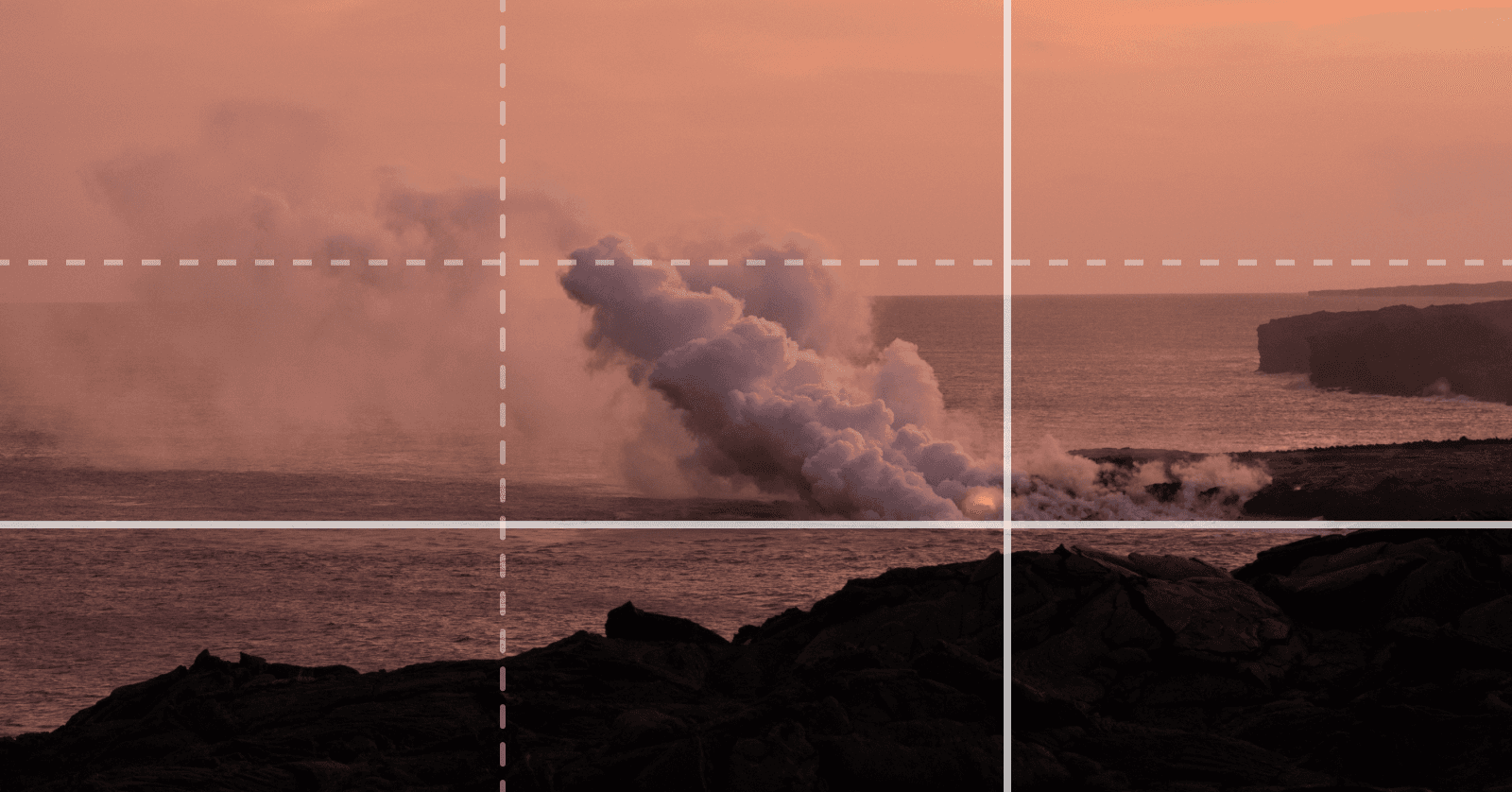
If you're not worried about the horizon line, try anchoring a foreground element to an intersection point, like this highly photographed volcano erupting on the Big Island of Hawaii. When the flames are offset, it draw attention to it first, but then notice how your eye floats out to sea, moving around the image in the blink of an eye.
The same goes for the Golden Gate Bridge shot from afar, anchored to the lower right quadrant, drawing all of its focus at first.

Applying the rule of thirds in design
To create a well balanced design, it doesn't mean that everything should be the same size, or even symmentrical. Emotion, tension, and visual intrigues stems from properly counterbalancing the objects at play. This is important to know why the rule of thirds works so well. It's because it helps force you to counterbalance objects on the screen.
In design, we have a sandbox filled with toys to use. It can be overwhelming to create harmony using typography, color, shapes, and textures. With the rule of thirds, we can deem certain objects as points of interest, as well as using proximity to bring better balance.
Take a landing page with a simple call to action. You might place the primary button near the first vertical line, along the lower left quadrant. By using this rule, you have a better chance at bringing attention to its placement.
Start with a grid
One tip when designing is to start by applying the rule of thirds grid on a blank canvas. Think about your layout ahead of time, and how the rule of thirds will be incorporated into your overall composition. By playing within these constraints, you’ll be able to experiment with alternate ideas quickly.
Hate rules? Here's how to break the rule of thirds
For those of you who think rules are a cheap way to trick the audience, there are a few ways to counter this approach uniquely.
The Z pattern
Our eyes will naturally focus on the top left of a personal website, a magazine, an image, or a Mcdonald's menu (Ok honestly my eyes will always search for the McFlurry first). But this is useful when thinking about other ways to frame or compose a photo. Imagine the letter Z, and place the most important element in the top left first, the second most important element in the top right, then the bottom left, and finally the bottom right.
This creates a visual hierarchy that is natural to how we scan information, so by following this guideline; you're giving us what we would naturally do.
Take multiple shots, or iterate in unconventional ways
When you're designing or taking photos, I recommend making 3-4 variations of the project you're working on. For photography, look to break the rule by taking unconventional shots from lower angles, ignoring the rule of thirds. Remember, it's a guideline and less of a rule.
In design, you can break the rule of thirds by using a different layout that encourages white space in unorthodox ways, or using scale and color to offer a differentiated take on what we're used to seeing. While the rule of thirds is a helpful starter tool, the best of us know how to extend beyond what we think most people will abide by.
Create a new perspective
It's easy to sit back and try and let the rule of thirds guide you on its own. But instead, try moving closer to your subject than you normally would, filling the frame or the design with an intriguing look at the immense detail. Immersing ourselves up close in an environment can create a quixotic vibe, that is normally not one's first attempt at creativity.
Change your world view
The rule of thirds is all around you, and you'll start to recognize why certain images or objects look more aesthetically pleasing. Once you build this habit, you'll never take a picture or design something in the same way again.
Lastly, here's your quick checklist to use the rule of thirds grid:
Pick one key element you want everyone to notice first. It could be text, an object in the foreground, the horizon line, or simply a doorknob.
Turn on your camera’s grid view or create horizontally and vertically equal grid lines in your software tool of choice.
Frame up your image in your camera, or design software of choice, placing your key element at one of the four intersection points, or along the vertical lines or the horizontal lines.
Don’t try to place key elements along every grid line, since this will dilute the overall effect, and reduce the amount of attention overall.
Challenge yourself to learn how to use the rule of thirds in the 80/20 design challenge.

Join 3,800+ solopreneurs & professionals who are:
Building trust with personalized branding
Increasing sales with premium packaging
Creating clear offers that convert
Get dollar-driven design tips in your inbox 2-3x a week.
More Posts