5 MIN READ
•
Design
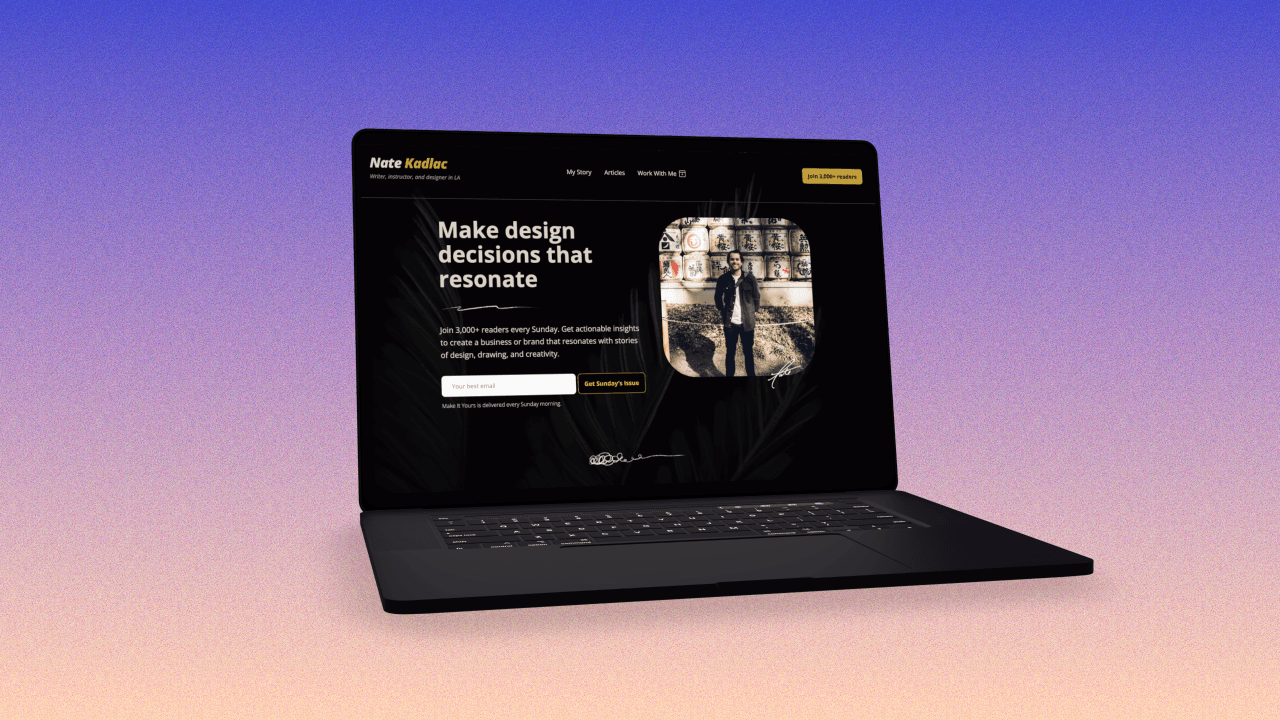
How to Design a “Coming Soon” Landing Page
And why you don't need to overcomplicate it


Over a decade ago, I had a bet with friend over who could eat more hot dogs. (Yes, we're starting there.)
I can't remember where this bet came from, but only where it ended up.
In case you missed it, here are the other three parts to this series:
Part 2: You're Here!
Part 3: How to flip a free workshop into an evergreen product landing page
Part 4: How to design a landing page for a $1,000 product or service offering
To set the stakes even higher (and to prove it publicly) I devised a plan to create an event to prove I could eat more hot dogs.
So of course I created a landing page and website for the "coming soon" Hot Dog Eating Contest.
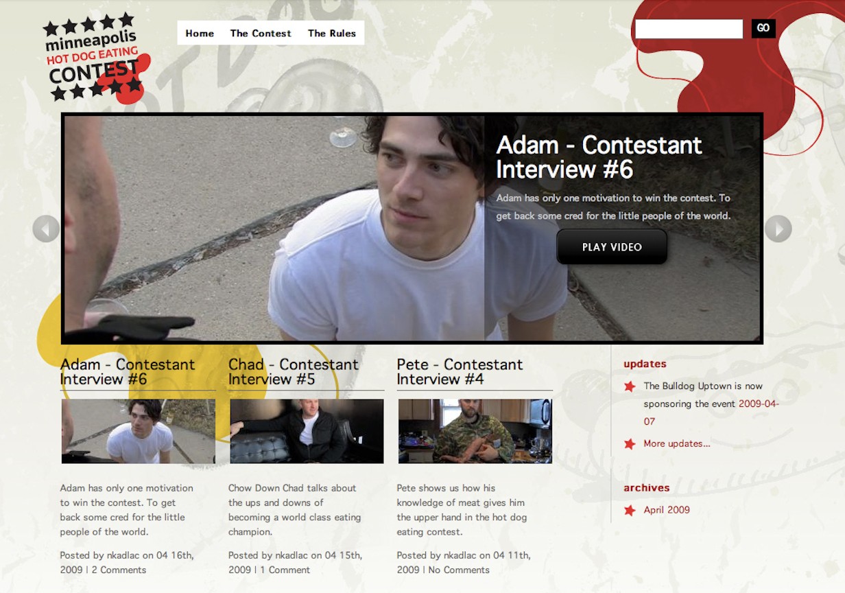
Over the next two months, I turned a silly bet into a full blown contest where we had the local news, the BBC News, and videos of all 14 contestants creating fake identities like wrestling characters promoting the main event.
We even attracted a Nathan's Hot Dog participant who didn't want to be named because this event was in his words, "Non-sanctioned."
Because the "coming-soon" landing page and site felt real, we even found a local bar to sponsor the event and pay for the hot dogs, the space, and the prizes.
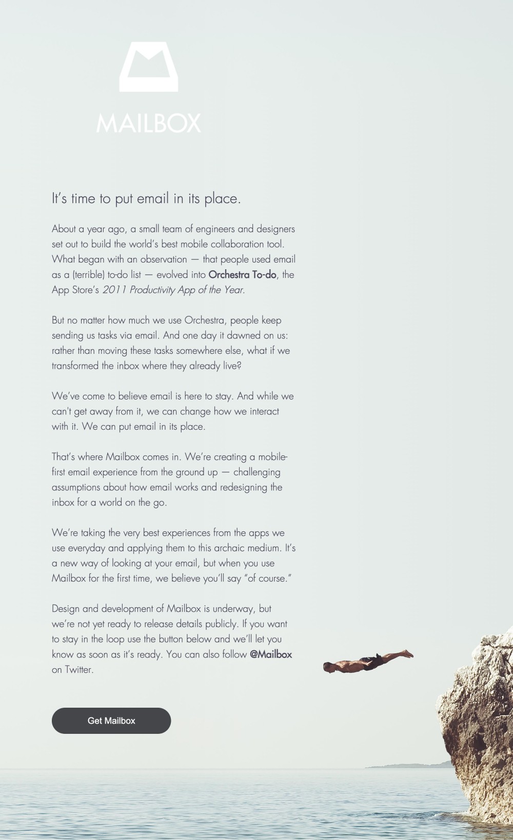
On the more serious side, an email app called Mailbox in 2013 generated 380,000 subscribers before their launch.
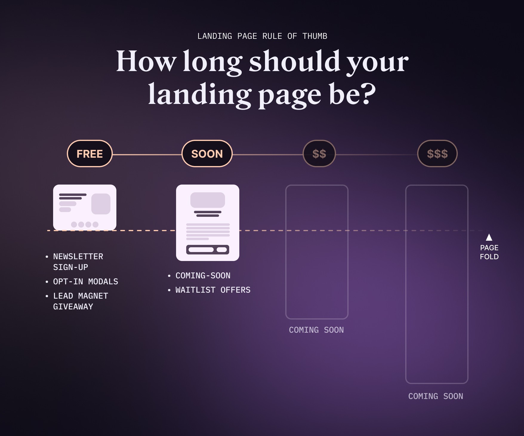
What goes into a perfect waitlist page?
Five things an effective coming-soon landing page needs to have
In many ways, a coming-soon landing page is less complicated than most pages. You don't have to share too many details since there is no product yet.
But your main goal is to drive curiosity and anticipation.
1. A clear mission
Many effective landing pages are stories at the heart.
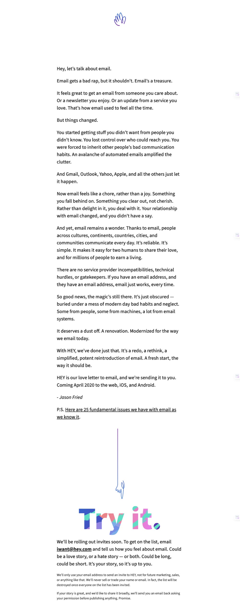
Hey.com and Mailbox—both email apps—launched seven years apart, but used the same method. Write a long form post and put a stake in the ground.
With a lead magnet or newsletter landing page, the offer is immediate and needs to be clear, RIGHT NOW.
If you're building a waitlist, the offer is not immediate, so you need to tug on their emotions a little more to get them to buy into the mission of what you're doing.
2. A clear date
This doesn't always need to be the case, but it helps to ground the aspirational vision you mentioned above.
This doesn't let you off the hook though. You're making a promise with the person who signs up, and so you need to follow-through on your end. Delayed deadlines immediately start to look like manipulation or vapor-ware, so it's fundamental to pick an accurate time frame.
3. Great typography
These types of landing pages rely more on legibility and readability. Images aren't necessarily in command, although they help if you need them.
Here are a few typography rules to create a clean looking landing page:
Use one font with 6+ styles: Unless you're a designer, stick to one font with 6+ styles which gives you plenty of flexibility to create interesting contrast, knowing it will all look great together.
Establish a clear hierarchy: Use different font sizes, weights, and styles to create a clear visual hierarchy. This will guide users through the content and make it easier to understand.
Pay attention to line spacing: Adjust line spacing (leading) to ensure that text is easy to read and doesn't appear crowded or too spaced out. A general rule is to set line spacing at 1.5 times the font size for body text, or 1.1 - 1.2 for large headers.
Optimize line length: Keep lines of text between 50-75 characters long, as this range makes it easier for readers to move from one line to the next without losing their place.
Left align anything longer than three sentences: Left-align text for optimal readability, as it creates a consistent starting point for each line. Avoid using justified alignment, which can create uneven spacing between words.
Avoid all caps: Use capitalization sparingly, such as for headings or emphasizing specific words. Writing entire sentences or paragraphs in all caps can be difficult to read and may come across as aggressive.
4. Authentic visuals if you have them
These types of pages don't necessarily need a lot of visuals, but if you have them, use them.
Don't mistake this for using stock photography. You need to drive authenticity and awareness around your cause, but that message will fail to deliver if you cop out with generic stock photography.
Use actual product photos, or images of yourself. But don't force it if you have nothing at this point.
5. A compelling call to action
Whether you're asking for an email address or to share the link, make sure you give clear instructions and the benefit of doing so.
Does signing up add you to a waitlist? Don't expect them to know. Tell them!
Does sharing with friends bump them up on the waitlist? if you have added this functionality, let them know.
Just don't expect anyone to know what to do unless you're 100% clear.
Conclusion
Coming soon or waitlist pages are handy when you're not ready to launch. Depending on the time between the sign up and the launch, learn to appeal to a customer's dream state, and make it aspirational as possible.
It's what led to my own successful launch of my YouTube Thumbnail Masterclass.
And in the end, I ended up winning the bet against my friend, by eating 10 hot dogs. A feat I never thought I would actually write about.

Join 3,800+ solopreneurs & professionals who are:
Building trust with personalized branding
Increasing sales with premium packaging
Creating clear offers that convert
Get dollar-driven design tips in your inbox 2-3x a week.
More Posts