5 MIN READ
•
Design
How to Build a Presentation Deck That Doesn't Put People to Sleep
Great slide deck presentations are just great stories. Learn how to avoid over-designing your deck and stuffing it with useless information.

Slide deck presentations are broken.
I once sat through a presentation by a CEO who had prepared two 50+ page slide decks for an important all-hands meeting.
Just the act of building two decks ensured the message would be messy. And using 50+ pages to tell a company story left everyone in the room exhausted (and confused).
Why are building slide decks so tricky? Most people think each slide needs to describe every thought in their head, even if they know better. And I bet you have read all of the articles about preparing slide decks and know this. Yet, you’re still wondering how to communicate the inspiring quote, the graph with all of this detailed data, and the story of how big your company will be if you just owned 1% of the trillion-dollar TAM.
The good news is, it doesn’t have to be this way. You can build beautiful, simple, and effective slide decks that will engage your audience and help you make your point with an engaging slide deck.
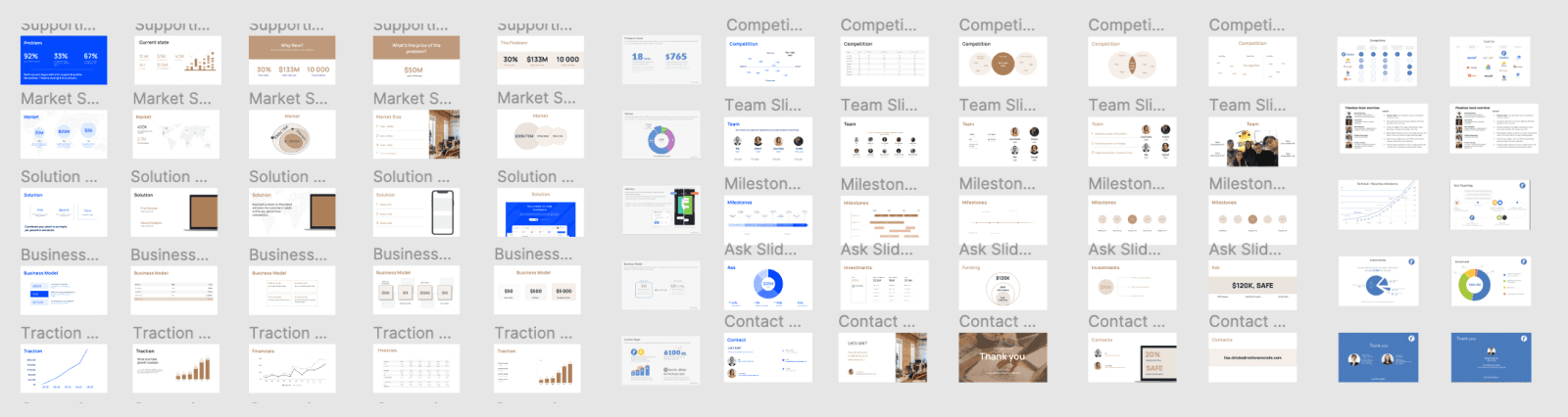
And in this article, I will show you how to avoid retrofitting your content into giant presentation templates like this. (This gives me nightmares)
Understanding the Basics of a Slide Deck
A slide deck is essentially a collection of slides that serve as visual aids during a presentation. Think of it as your trusty sidekick, helping you communicate ideas, showcase information, and keep your audience engaged. Whether you’re pitching a groundbreaking idea, delivering a lecture, or leading a business meeting, a well-crafted slide deck can make all the difference. Each slide in the deck has its own unique content, design, and purpose, working together to tell a cohesive story.
What Should be Included in a Slide Deck?
Creating a slide deck is like cooking a gourmet meal – you need the right ingredients in the right proportions. A good slide deck should include a clear and concise message, engaging visuals, and relevant information that supports your presentation’s goals. Here are the key elements to include:
Title Slide: Start with a bang! Your title slide should grab attention and set the tone for what’s to come.
Introduction: Give your audience a roadmap of what to expect. A brief overview helps set the stage.
Body: This is the meat of your presentation. Break it down into digestible chunks, each slide focusing on a single takeaway.
Conclusion: Wrap it up neatly. Summarize the key points and reinforce your main message.
Call-to-Action: Don’t leave your audience hanging. Tell them what you want them to do next.
Consistency is key. Use a consistent visual theme, including typography, color scheme, and imagery. And don’t forget the high-quality graphics, charts, and tables – they’re your secret weapon for illustrating complex information and keeping your audience engaged.
Preparing for Your Presentation Deck
Define Your Goals and Target Audience
Before you dive into creating your slide deck, take a step back and define your goals and target audience. Ask yourself: What is the purpose of your presentation? Who is your audience? What do you want to achieve? Answering these questions will help you create a focused and effective slide deck that resonates with your audience.
Understanding your audience’s needs, preferences, and level of knowledge on the topic is crucial. Are they experts or novices? Do they prefer data-driven insights or compelling stories? Tailor your content, language, and design to engage and inform your audience effectively. Remember, a well-prepared slide deck is like a well-tailored suit – it should fit your audience perfectly.
First, avoid opening up your slide deck app
If building a slide deck was the length of a 10k race, opening up the presentation software would put you at the 8k mark without all of the preparation. You just skipped all of the most important work, which all happens outside of Powerpoint. (I use Figma!)
It can feel compelling to open up Powerpoint, Google Slides, Keynote, or any other fun piece of software. (I lied, Powerpoint is not fun.) But this forces you to think about the design of your slides and everything else that doesn't matter at this point.
So here's what to do first: Open up your favorite writing app and start thinking about the story you want to tell, not how your slides should look. (We'll get to that in a moment.)
Now, we'll look at ways to think about building your slide decks.
Seven tips for structuring your content for an effective slide deck presentation
Even if you're running a company and your employees are being paid to listen to your presentation, they won't. It's you against the audience, and they don't owe you anything.
Now that many presentations are given virtually, it's more important than ever to make sure every slide needs to be there. It's too easy for someone to shut their camera off and tune out.
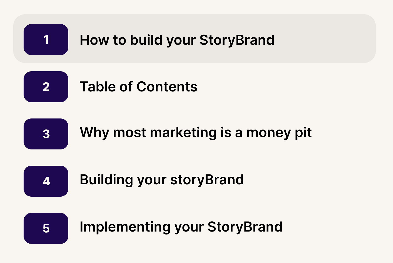
Tip #1: Build your slide deck like a book
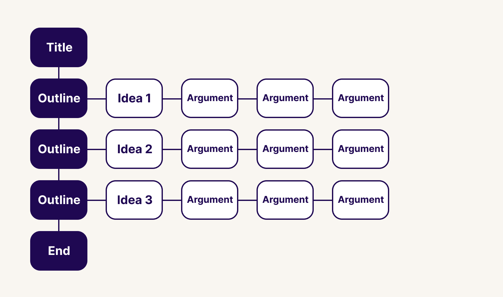
For a moment, think about holding a book in your hands. Just holding it in your hands, it reveals several characteristics that tell us a bit about it. A slide deck template can serve a similar purpose, offering various designs for company meetings, real estate client pitches, educational lesson plans, and financial reporting.
The cover creates intrigue and hints at the story before opening it.
The size of the book tells us how much time it might take us to read it.
The inner flap humanizes it by telling us about the author and showing a portrait of them
The table of contents gives us an idea of the themes discussed in the book, or the adventure it's about to take us on.
Each chapter is a milestone, asking us to pause before we continue on
Each chapter has subheaders breaking up the ideas and stories within the book.
The back of the book gives us a summary of the content and more info about who worked on it, and testimonials of the content inside.
Books are great examples of setting expectations before we even flip to the first page. Our presentations—no matter how big or small—should help our audience similarly.
We want people to know where they are, and how much time they have left. These unanswered thoughts are running through the minds of your audience, and creating a basic structure like this puts them at ease.
Your slide deck presentation should include:
Cover slide with a clear title (or hook!) of the story
Table of contents
Chapter pages highlighting where you are in the deck
Slides with a single takeaway (and supporting evidence)
An end slide with how to contact you and follow-up
Tip #2: Every presentation deck should tell a story
Most people immediately start putting too much information into slides. It's easy to make the mistake that your slide decks need a lot of information.
Instead, the story arc of a slide deck presentation should mimic a movie. You'll have a beginning, middle, and end. Each deck should communicate one large idea, and within that, you're sharing supporting ideas, each on its own slide.
How you organize your slides is up to you to create the narrative you want. If you're designing startup pitch deck templates for your business, your story will take up a large percentage of the presentation.
“Storytelling is an art combined with science. The artistic part is to understand that a story’s goal is to persuade an investor who most likely starts with the fear of losing their money, and to transition that through your story to a fear of missing out.”—Keith Teare, Accelerated Digital Ventures’ US Managing Partner
Even when trying to persuade investors, if you present a deck with too much information, it will complicate the overall story you're telling.
As Keith lays out for executing a great pitch deck to investors, the key is to answer the following questions:
What is your end game?
Why is it worth the effort?
How will you make it happen?
Tip #3: Present one takeaway per slide

It's better to have five slides, each with one main point, versus one slide with five points. One way to focus on this strategy is to title the slide with the ultimate takeaway.
Breaking up static slides with engaging visuals such as images, video animations, and audio can significantly enhance audience engagement and ensure that crucial information stands out during presentations. This helps the overall flow of your slide deck and enables you to think only about what the audience needs to hear.
This helps the overall flow of your slide deck and enables you to think only about what the audience needs to hear.
A trick is to view the slide deck presentation in outline view and read through the titles. It should have an overall flow that your audience can understand, as well as be incredibly informative.
If there's one piece of text your audience will read, it's going to be the title. Make sure it summarizes the insight.
Tip #4: Communicate your ideas using the Pyramid Principle
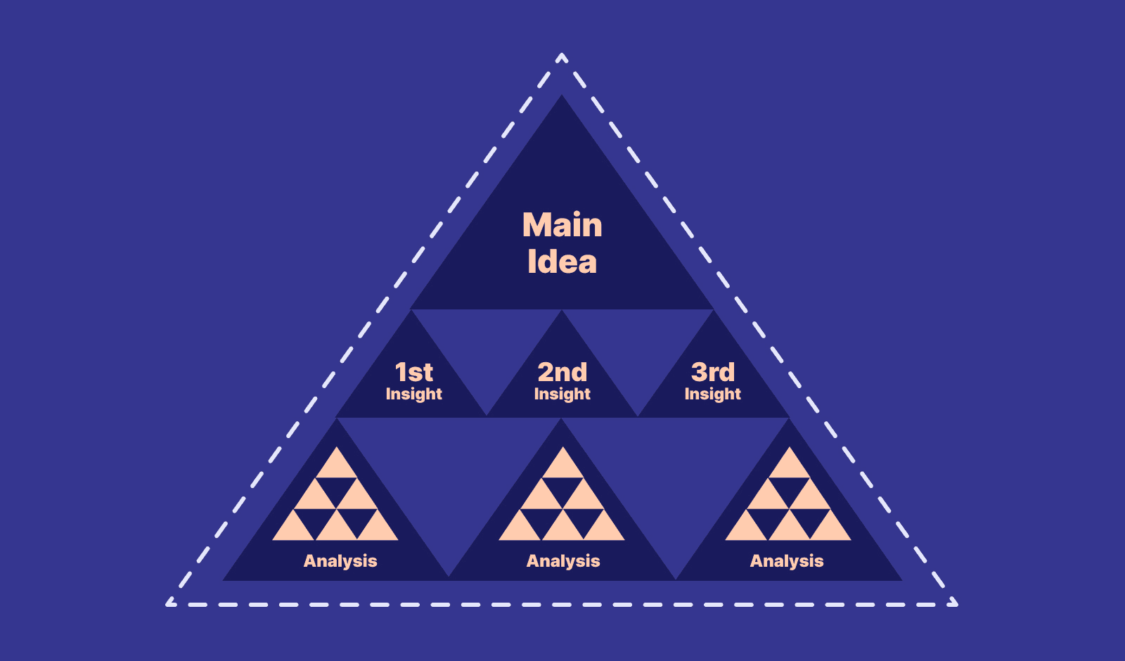
Your audience is busy. If you're presenting to the C-suite, you might not get through all your slides. The Pyramid Principle was created by Barbara Minto at McKinsey as a method for logically structuring your arguments.
Start with the answer first
Group and summarize your supporting arguments
Order your supporting ideas in a logical way
Starting with the answer first and then sharing your supporting ideas seems counterintuitive for many people. But it skips the preamble and delivers the message clearly while giving you time to explore the supporting ideas if there's time.
Tip #5: Avoid too many bullets (stick with 2-3 per slide)
Forgetting what to say is a common fear of giving a presentation. One bad presentation will leave you stuffing your slides with every thought you have, to avoid forgetting everything.
This is how slides with too many bullets create a false sense of safety.
When you're presenting every single thought you have, the audience has to choose one. Should they listen to you or read the words on your slide? When you're reading aloud, it will create a conflict between your voice and their internal dialogue.
This division makes for a poorly formatted presentation, making the audience choose one or the other.
Tip #6: Aim for 10 slides or less
We should all have reasonable goals when creating a slide deck. Giving ourselves a goal to have less than 10 slides might feel impossible, but most slide deck templates tempt you to create more than necessary.
10 slides is a good number to aim for because it forces us to focus on the most important takeaways. Remember, our slide deck creation does not need every thought we have, so start by creating your deck template with just 10 headlines or less, and see if you can still communicate what you need.
Most of the time we spend on our presentation template is due to the number of slides we have. Also, the more slides, the longer it takes to deliver.
Having just 10 slides means we can usually keep the presentation under 20 minutes.
Tip #7: End with a free call-to-action reward
Aside from the main theme you want to articulate in your presentation, what action do you want them to take?
One of the biggest missed opportunities is to leave the audience without something to do at the end. Maybe it's a URL to fill out a form, or simply a way to contact you. Whatever you do, make sure you use this as the reward for listening to you speak
While asking for their information is the default use case, you can take this further and create something for your audience. If you're giving a talk about being more productive in the workplace, create a list of free ideas for them to do just that, and give them a way to download it after the presentation.
Showing up for your audience shows that you care, and it's a way to connect with those afterward.
How to design your presentation slide deck without relying on free templates
I once redesigned a website for a client, and they had never thought about creating one from scratch before. "I just thought you picked a template and filled it in."
This is what most people do with their own slide decks, which leads to an inconsistent experience and stuffing their slide decks with too much info.
My general advice is not to rely on free slide deck templates. Most are over designed, gaudy, and dated. You're also overthinking the layout, and how to retrofit your content into the templates.
This is difficult, and a waste of time.
Instead, start with one idea per slide, then we'll make simple, timeless design decisions to prevent you from redesigning your templates from scratch in the future.
Creating a simple presentation deck template using 2-3 colors, 1-2 fonts, and a basic content structure is all you need to design a slide deck that stands out.
Don't over-design your slide deck presentation
It doesn't matter what kind of slide deck presentation you're giving, you don't need to over-design your slides. This applies to all types of deck formats. A pitch deck template, a strategy deck, an informational deck... these all should be using timeless design principles.
Stick to the basics. Where do you start?
Start with a blank template
While this might seem like I’m adding more work, in the end, this reduces the amount of design decisions most slide deck apps force on you.
Add your titles to each slide
In most apps like Powerpoint or Keynote, you can change the view to “Outline” which will let you see the title of the slide. This is another way to avoid thinking about design for as long as possible, and start putting your content into the slides.
Even if your presentation doesn’t look great yet, don’t worry! We’ll get there, and we won’t even worry about gradients, drop shadows, video, text effects or animations to build a good looking slide deck.
Colors: Use three colors + light and dark versions for the body text
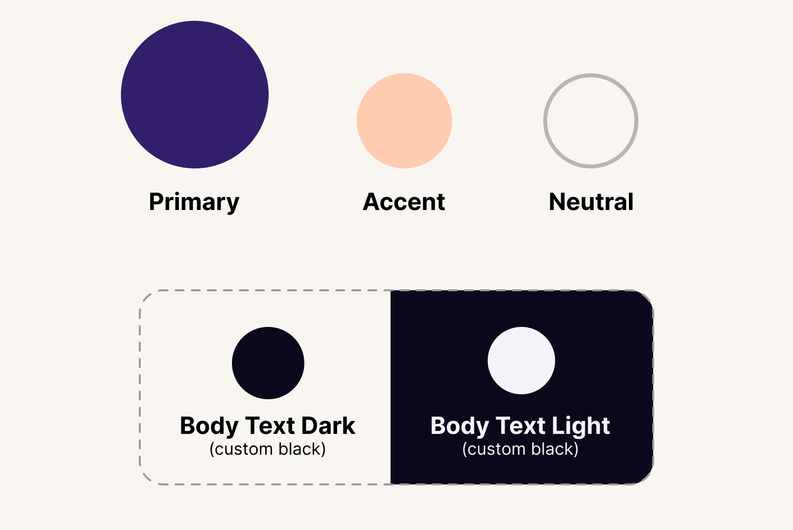
Three colors are all you need when designing a presentation deck. If you have a brand deck, please use those colors and don't deviate from them. Building reputable brands means using the same consistent choices over and over.
Applying brand decisions should be boring.
Here's the simple formula:
One primary color (pick this first)
One neutral color (pick this second)
One accent color (pick this third)
Optional: A custom black for text and a custom white for reversed white text
I always use this combination of
Primary color
Your primary color is your main brand color. You can use this for your dark backgrounds or any other primary instances.
This will be the color you use in 80% of cases. When in doubt, use this color for your design decisions.
I usually bookend my slide decks with this color, using it for the cover slide and end slide. I might also use it for the Table of Contents, and then use a lighter background for the interior pages, just like a book.
This adds a bit of personality and the sterile look and feel most slide decks have.
Neutral color
Neutral colors are great for lowering the amount of contrast in a slide. I like to use my neutral color instead of a pure white background, which often gives the presentation a sophisticated feel.
Feel free to experiment, but neutral colors are almost white. In the example above, I'm using the hex value #F9F5F3.
Accent color
An accent color is useful when you need to call out or highlight an important word or section. If you're trying to highlight one of the most important takeaways, try using this as the slide’s background.
The purpose is not to overuse this color, but to use it strategically when necessary.
Avoid using true black and white for body text
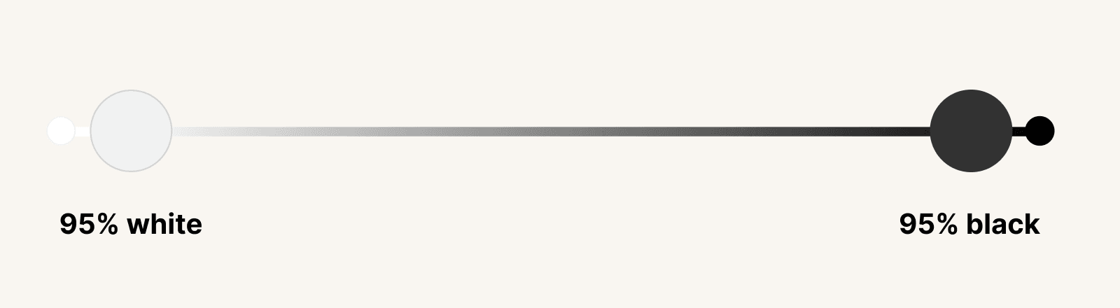
Most templates will use pure black and white for body text. But these colors are high-contrast, and demand unnecessary attention. Pure black and white don't exist in the world because of the way light reflects off surfaces. Even shadows aren’t pure black because they absorb the color of the surface. (Unless maybe you're in a pitch-black float tank?)
Instead of just going with the defaults, I’ll pull in the ends of each just slightly, so to soften the intensity overall.
Imagine a spectrum of white and black on opposite ends. I choose colors that sit at around 95% of each end. It's hard to notice without comparing them, but that's the point. It creates a more soothing experience, even if no one can tell you're not using pure black and white.
Fonts: Choose a maximum of one or two fonts
First, if your company or brand already uses specific fonts, use those and forget this section! Consistency matters, and you'll only make it more difficult when everyone is choosing a font that matches their attitude that particular day.
One font
You only need one typeface, as long as it has multiple weights. A typeface with multiple weights means it has bold, regular, semi-bold, black, and so on. Those give you a much more flexible family to work with than typefaces with just one.
Two fonts
If you need to use two fonts, you'll want to pick fonts with contrast. This creates visual intrigue, and it’s easy to accomplish using a serif or sans-serif combination. Like, Helvetica and Georgia.
Avoid picking two fonts that look too similar, like Helvetica and Arial. These two in particular look similar, but they’re slightly different. This makes the overall design look confusing or off.
Use images that have a clear meaning
If you're in a pinch for a photo, try to resist the temptation to find a generic or cheesy stock photo. They make your slide deck look unprofessional and dated. It's better to use no photo than one that adds skepticism to your presentation deck.
If you do use images, make sure they support your story. They should also touch the edges of your slide deck, without any white padding. This will help give your slide deck a more polished feel and help the placed images avoid looking like clip art.
Illustrations can be useful
I won’t lie and say illustrations can’t be powerful and creative. I’ve used them in my decks. But they aren’t necessary to communicate a good story. The problem with stock illustrations is that they usually look off-brand, or confuse the message more than anything. I try to avoid them at all costs unless you have the budget to hire an illustrator to build them specific to your business.
Charts and graphs
Charts or graphs can be extremely useful to tailor a story with data. Most of the time you’ll end up using screenshots or displaying other existing work, but if possible, try to create these yourself using your brand colors and aesthetic.
I use Figma to create all of my charts, but there are plenty of great creative tools like Canva, Keynote, and Figma. (If you want to learn more about using Figma, you can learn more here.)
Use simple grid layouts in your slide deck
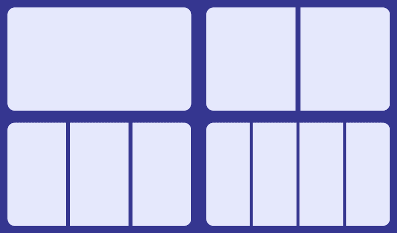
Laying out content can always cause a bit of a struggle. It’s best to keep things simple for your content.
Use a simple grid structure
Imagine your slide deck divided between 1-4 equally spaced columns. This gives you a basic grid when planning how to lay out content in your slide deck.
Don't add a logo or copyright information on every page
Many slide deck templates will have a spot for brand logos, page numbers, and other elements to make your slide deck feel more professional.
If you need to add copyrights, page numbers, or disclaimers, reserve that for a printed copy of the slide deck. Or go ahead and make a duplicate deck for sharing purposes, because that won't help you during a live presentation, and gives the audience more to look at during your presentation.
Presentation takeaways
During that long presentation with two prepared slide decks and over 100+ slides, we all left that conference room confused and unsure of what we should do next.
So in your next slide deck presentation, remember to do these things:
Start by writing a list of insights to talk about, in a story format. (These will be your slide deck titles)
Add any supporting details under each point.
Use the Pyramid Principle to make better arguments
Aim for 10 slides of less, and one insight per slide
Add your cover slide and a closing slide with a CTA
Open your slide deck software and pick 1-2 fonts (Don’t use a deck template)
Choose 3 colors (Primary, neutral, and accent)
Layout your slides using 1-4 columns
Use accent or primary colors for your most important slides

Join 3,800+ solopreneurs & professionals who are:
Building trust with personalized branding
Increasing sales with premium packaging
Creating clear offers that convert
Get dollar-driven design tips in your inbox 2-3x a week.
More Posts